
While booking a flight to Athens with American Airlines, I ran into their problematic collapsed sidebar menu.
In fact, the sidebar menu wasn’t the only problematic element 🧐
The organization of space in general on the American Airlines website could do with some work. This includes improving margins, paddings, and element hierarchies.

Spacing-out elements correctly on a webpage makes all the difference in the impression a page makes on a user.
After all, a user’s experience is shaped by the functionality of the page in addition to its visual display. Both functionality and display build on a brand’s credibility and identity.
See the Pen Collapsed Sidebar Menu by Klea Merkuri (@thehelpfultipper) on CodePen.
This post will focus on how to improve the American Airlines collapsed sidebar menu which appears on small screens, like those on mobile and tablet devices.
What’s not so great with the current sidebar menu
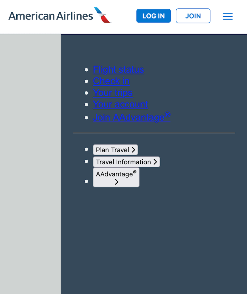
The existing sidebar menu is collapsible – clicking the menu bars on the top right-hand side will expand and retract the mobile menu side panel.
When expanding, the sidebar menu appears to be:
- placed on the right-hand side
- taking on the full height of the page
- pushing out of view the main content by an equivalent width
I’m of the opinion the sidebar menu components are spaced too close to each other, not taking full advantage of the seemingly full height.
And I’m being generous in calling the height full because that’s not quite the case.
For instance, when there is a notification element at the very top of the page, clicking on the mobile menu brings up the sidebar with lots of empty white space in the area the notification is pushed out from.

But keep scrolling to see just how badly the sidebar is integrated within its allotted space.
Clearly, the sidebar menu is taking on a height that isn’t accounting for any other elements making an appearance, or existing, on the page.
In this sense, it’s a static rather than dynamic height that doesn’t respond very well to other elements.
The picture above does a great job of capturing most of everything we’ll tackle in this post to make a killer sidebar menu for American Airlines.
In this post, we’re going to address:
- the sidebar menu’s height to get rid of that empty white space
- the unnecessary (and, quite honestly, unappealing) focus effect on the clicked mobile menu
- spacing of sidebar menu components (so things stop looking cramped and difficult to read)

In the end, we’ll have a navigation that will make anyone want to check American Airlines out 😎 . Just for the fun of it.
Note: I’ll be repurposing the navigation component in How To Build An Easy Animated Hamburger Menu. In that post, I walk you through building an animated hamburger menu that is just the thing we need right here!
Getting started
This section sets up a demo of American Airlines’ navigation by:
- incorporating the America Airlines logo
- creating an animated hamburger menu to toggle the sidebar
1) Defining custom CSS variables
I start by defining theme colors in custom CSS variables to avoid repeating them throughout my code.
:root {
  --nav-mobile: rgb(54, 73, 90);
  --nav-text: rgb(235, 239, 240);
  --nav-border: rgb(245, 245, 247);
  --nav-btn: rgb(0, 120, 210);
  --nav-bg: rgb(255, 255, 255);
}
You can call the variables whatever you want, though, I highly encourage you to keep it real so it’s not difficult to remember what color is meant for what element(s).
The good thing about American Airlines is that they’re not too complex in their color schemes!
2) Repurposing the animated hamburger menu code
We already have a demo navigation component in our code arsenal – I’m going to borrow it and adapt it for our purposes here.
Structuring the HTML
I’ll start with the HTML, changing one thing in #logo and adding a new wrapper to include two buttons along #hbg-menu.
So, in #logo, the img src and alt attributes point to the American Airlines logo (instead of THT).
And I create a new wrapper called #action-btn that holds:
- “Log In” button
- “Join” button
- #hbg-menu (exactly as it is already in our code)
<nav>
  <div id="logo">
    <img src="https://www.aa.com/content/images/chrome/rebrand/aa-logo.png" alt="American Airlines logo." />
  </div>
  <div id="action-btn">
    <button class="btn btn-full">Log In</button>
    <button class="btn btn-outline">Join</button>
    <div id="hbg-menu">
        <span></span>
        <span></span>
        <span></span>
    </div>
 </div>
</nav>
The only new element additions are those of the #action-btn wrapper itself and the two buttons.
Each button gets a generic btn class which will hold common button styles and two specific btn classes (btn-full and btn-outline) to capture any differences.
Changing the CSS
Copy over the existing CSS of the animated hamburger menu and let’s break down the changes that need to happen.
nav:
- changes in background color and box-shadow
- reduced height
- no longer fixed at the top
nav {
  background-color: var(--nav-bg);
  box-shadow: 0 2px 2px var(--nav-border);
  width: 100%;
  height: 70px;
  display: flex;
  align-items: center;
  justify-content: space-between;
}
logo:
- padding for parent wrapper
- responsive image within the parent container
#logo {
  padding-left: 1.2rem;
}

#logo img {
  width: 100%;
  max-width: 250px;
  height: auto;
}
span:
- background-color
span {
  display: block;
  background-color: var(--nav-btn);
  width: 20px;
  height: 2px;
  border-radius: 5px;
  position: absolute;
  top: 0;
  transition: transform .2s;
}
Also, specify a font family on the body element. I went with font-family: Arial, sans-serif.
Bringing over the JavaScript action
This is the easiest of the code repurposing. All you need to do is copy and paste with absolutely no changes!
Note: Although nothing changes right now, keep in mind we’ll be revisiting this portion later on and I can guarantee we’ll need to change quite a few pieces of logic to adapt the menu toggle functionality.
// Grab the menu from the DOM
const menu = document.querySelector('#hbg-menu');

// Get list of all spans
const bars = document.querySelectorAll('span');

// Detect click event on hamburger menu
menu.addEventListener('click', () => {
  // Loop through the bars list
  bars.forEach( (bar, i) => {
    i === 0 && bar.classList.toggle('top-center');
    i === 2 && bar.classList.toggle('bottom-center');
    i === 1 && bar.classList.toggle('turn-90');

  });
  menu.classList.toggle('turn-45');
});
We end up with:

3) Styling the new button components
Not looking too hot with those buttons right now. Things can look much, much better if only we position the elements in the #action-btn wrapper!
#action-btn {
  display: flex;
  justify-content: flex-end;
  align-items: center;
}
All I’m doing is:
- vertically centering the #action-btn elements (using align-items since the cross-axis is a column)
- aligning elements to the right-hand side of the container (using justify-content since the default flex-direction is a row)

Told ya it’ll look way better! Now, on to the button styles.
First, I’ll add styles that apply to both buttons using the btn class. Such styles include:
- uniform width (since I want both buttons to be of equal width despite the length of their content)
- font styles
- sightly round borders
.btn {
  width: 70px;
  padding: 6px 8px;
  border-radius: 5px;
  text-transform: uppercase;
  font-weight: 600;
  cursor: pointer;
}
Second, I’ll customize the “Log In” button with the class of btn-full.
.btn-full {
  margin-right: 10px;
  border: none;
  background: var(--nav-btn);
  color: white;
}
Third, and last, I’ll customize the “Join” button with the class of btn-outline.
.btn-outline {
  border: 1px solid var(--nav-btn);
  color: var(--nav-btn);
  background: inherit;
}
So far, we’ve managed to complete the look (and partial functionality) of our American Airlines demo navigation.
Clicking on the hamburger menu generates a toggling action of nothing in particular at the moment. But this is the control element of the soon-to-exist sidebar menu!
Creating the sidebar menu
Time to actually build the sidebar menu. Question is, how?
Though it’s not a technical challenge to create the sidebar, there’s still some planning that needs to go into it before attempting to code.
For example, take the current sidebar content organization – it isn’t ideal. For one thing, there are lots of menu items hidden in the toggled accordion buttons.
Though the sidebar menu appears lean and simple, it’s choke-full of information and navigation. This can be a good and bad thing.
Too much of anything in a single component increases the likelihood of skipping it or struggling to find it!
We want to display this information and navigation in a user-friendly way that limits sidebar scrolling.
To de-congest the sidebar menu, I’ll create a multi-paneled sidebar.

At all times, the user will only see one sidebar menu but there are going to be different layers in our code with seamless transitions.
Clicking on, let’s say “Plan Travel”, will bring up the sidebar panel for that category with all associated menu links.
Having corresponding panels for the three main menu togglers will enhance the user experience by providing simple, intuitive navigation and a clear display.
This section will focus on the HTML and CSS necessary to bring the sidebar menu into existence.
In the next section, we’ll deal with the last functionality bits to connect the hamburger controller with the sidebar panel.
1) Add an overlay to go on top of the main content
I’ll wrap the sidebar menu in a parent that is going to act as an overlay.
<div class="mask"></div>
The overlay does several things, including:
- putting display focus on the sidebar
- dimming the underlying content to establish element hierarchy
- acting as a buffer between the main body content and the sidebar menu
.mask{
  display: block;
  position: absolute;
  top: 72px;
  width: 100%;
  height: calc(100% - 72px);
  background: rgba(18, 36, 32, .2);
}
Tip: Top distance is determined by the height of the nav and it’s subtracted from the height of the overlay itself!

2) Primary sidebar panel
With the overlay out of the way, I’ll move on to the primary sidebar menu panel. This is the “sidebar menu” – what appears when the user clicks on the hamburger menu.
Navigation to any of the other menu categories will happen from this initial panel.
<div class="sidebar" id="primary-sidepanel" aria-hidden="true"></div>Let’s define the sidebar class that will apply to all sidebar panels.
Each sidebar panel must be:
- full height
- of uniform color themes
- fixed to the right of the screen
- covering most, not all, of the screen width
.sidebar {
  background: var(--nav-mobile);
  color: var(--nav-text);
  height: inherit;
  overflow-y: auto;
  position: fixed;
  right: 0;
  width: 75%;
  padding: 40px 25px;
  font-size: 1.2rem;
}
Moving on, there are two sections specific to the primary sidebar panel separated by a horizontal line.
The first section consists of the menu links while the second section has the three-button togglers.
      <ul id="quick-menu-items" class="no-list">
        <li class="menu-link"><a href="#" class="no-link full-width">Flight status</a></li>
        <li class="menu-link"><a href="#" class="no-link full-width">Check in</a></li>
        <li class="menu-link"><a href="#" class="no-link full-width">Your trips</a></li>
        <li class="menu-link"><a href="#" class="no-link full-width">Your account</a></li>
        <li class="menu-link"><a href="#" class="no-link full-width">Join AAdvantage<sup>®</sup></a></li>
      </ul>
      <div id="btn-small">
        <button class="btn btn-full">Log In</button>
        <button class="btn btn-outline">Join</button>
      </div>
      <hr />
      <ul id="toggle-menu" class="no-list">
        <li>
          <button id="plan-travel-menu" class="no-btn full-width" data-target="#plan-travel-panel">Plan Travel
            <i class="fa-solid fa-chevron-right"></i>
          </button>
        </li>
        <li>
          <button id="travel-info-menu" class="no-btn full-width" data-target="#travel-info-panel">Travel Information
          <i class="fa-solid fa-chevron-right"></i></button>
        </li>
        <li>
          <button id="aadvantage-menu" class="no-btn full-width" data-target="#aadvantage-panel">
            <div>AAdvantage<sup>®</sup></div>
            <i class="fa-solid fa-chevron-right"></i>
          </button>
        </li>
      </ul>
In the first section, #btn-small contains the two action buttons from the top right-hand corner. It indicates a “collapse” of those buttons on smaller screens and we’ll define its styles later in a media query.
For now, hide #btn-small and just know it’s there.
#btn-small {
  display: none;
} 
Note a couple of things:
- I’m not including link addresses (they’re solely dummies)
- none of the classes are yet defined
Note: Why you can’t use span inside of the button element
It would be best to wrap the text of each button in a span.
Unfortunately, if you’re reusing the animated hamburger code and don’t wish to make considerable changes, you’ll soon figure out span won’t work here.
Why?
Because we already applied styles to the span by using it as a selector.
To set new span styles that won’t conflict with previous ones, we’ll need to override them (which is more code to undo).
So, for simplicity’s sake and to avoid going back and renaming things, I’m taking a workaround. Feel free to do it the way you judge as best!
In my case, I’ll resort to wrapping only the text of the last button in a div. This is really the only part that requires wrapping since the plan is to use flexbox for the button items.
Since the text of the last button contains a superscript, <sup>, it’ll be treated as a third element in that wrapper and applied flex spacing. To keep it together with the text that comes before it, wrap it up!
Get rid of default styles for links, lists, and buttons
Define three classes that will take care of defaults for links, lists, and buttons.
You could simply override them with new styles, but we’re not really implementing that many styles on these elements. Most of our work lies in getting rid of existing styles.
/* get rid of list styles */
.no-list {
  list-style-type: none;
  margin: 0;
  padding: 0;
}

/* get rid of link styles  */
.no-link {
  color: var(--nav-text);
  text-decoration: none;
}

/* get rid of button styles */
.no-btn {
  border: none;
  background: inherit;
  color: var(--nav-text);
}
Then make each panel item full width and add spacing between the menu links.
/* menu links */
.menu-link {
  padding: 10px;
}

/* full width */
.full-width {
  display: block;
  width: 100%;
}
Note: These are generic classes that can be used on any element! It’s a handy way to avoid repeating code.
Add a slight indicator to each menu link using the CSS :after pseudo-selector. Totally optional, but American Airlines seems overly fond of their link indicators so, in the spirit of indicator-ship, do:
#quick-menu-items li a:after {
  content: "\00a0\00bb";
}
Suits it rather well, don’t you think?

Fix styles on panel buttons
Though #quick-menu-items is looking good, the same can’t be said for #toggle-menu.
It turns out getting rid of default button styles doesn’t translate into adopting the styles we’ve got going.
Using a flex display, I’ll place the items of each panel button – the text and corresponding right arrow – on opposite ends.
Note: The right arrow, or right chevron, icon is courtesy of Font Awesome. All those
<i>tags are Font Awesome-specific embed tags.
.sidebar button:not(.btn) {
  display: flex;
  justify-content: space-between;
  font-size: inherit;
  padding: 24px 10px;
  cursor: pointer;
}
Tip 🤓
Use the :not() selector to avoid applying toggler styles to all the buttons in elements with a class of sidebar.
Here, I’m excluding all buttons that contain the class of btn. This means the “Log in” and “Join” action buttons won’t inherit the styles just defined.
To finish off the primary sidebar panel styles, give the horizontal line one of our theme colors to tie it more with the overall aesthetic.
But changing the color on the <hr /> element is more nuanced than you’d think though so, I Googled how to change the color of an hr element with CSS to do this:
hr {
  height: 1px;
  background: var(--nav-border);
  border: none;
  margin: 15px;
}
Tip: Of all the properties in that definition, only margin is extra. You need to define all three – height, background, and border – when customizing the horizontal line element!

3) Sub-menu panels
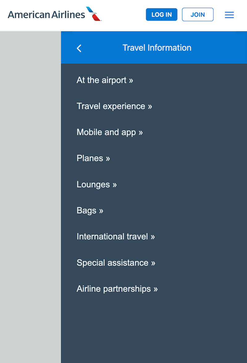
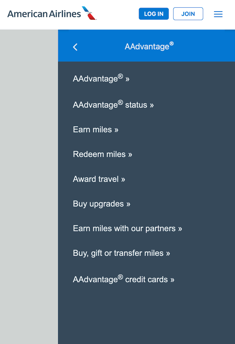
Moving on, let’s tackle the three submenu panels. These are the sidebars you see when clicking on each of the three toggle menu buttons on the primary sidebar.
First, I’ll create a class of hide and apply it to the primary sidebar menu so we won’t see it display.
/* display panels */
.hide {
  display: none;
}
Hide the primary sidebar menu and you should only have the overlay visible.
Note: We’ll remove the hide class later on, this is a tool for development.
All three submenu panels will have the same HTML structure – only the text changes.
    <div class="sidebar sub-menu" id="plan-travel-panel" aria-hidden="true">
      <ul class="no-list">
        <li>
          <button id="plan-travel-submenu" class="no-btn full-width category-title" data-back="#plan-travel-panel">
            <div class="submenu-text">Plan Travel</div>
            <i class="fa-solid fa-chevron-right"></i>
          </button>
        </li>
        <li><a href="#" class="no-link">Flights</a></li>
        <li><a href="#" class="no-link">Hotels</a></li>
        <li><a href="#" class="no-link">Cars</a></li>
        <li><a href="#" class="no-link">Activities</a></li>
        <li><a href="#" class="no-link">Vacations</a></li>
        <li><a href="#" class="no-link">Cruises</a></li>
        <li><a href="#" class="no-link">Travel deals and offers</a></li>
        <li><a href="#" class="no-link">Flights schedules and notifications</a></li>
        <li><a href="#" class="no-link">Discover places open for travel</a></li>
      </ul>
    </div>
    <div class="sidebar sub-menu" id="travel-info-panel" aria-hidden="true">
      <ul class="no-list">
        <li>
          <button id="travel-info-submenu" class="no-btn full-width category-title" data-back="#travel-info-panel">
            <div class="submenu-text">Travel Information</div>
            <i class="fa-solid fa-chevron-right"></i>
          </button>
        </li>
        <li><a href="#" class="no-link">At the airport</a></li>
        <li><a href="#" class="no-link">Travel experience</a></li>
        <li><a href="#" class="no-link">Mobile and app</a></li>
        <li><a href="#" class="no-link">Planes</a></li>
        <li><a href="#" class="no-link">Lounges</a></li>
        <li><a href="#" class="no-link">Bags</a></li>
        <li><a href="#" class="no-link">International travel</a></li>
        <li><a href="#" class="no-link">Special assistance</a></li>
        <li><a href="#" class="no-link">Airline partnerships</a></li>
      </ul>
    </div>
    <div class="sidebar sub-menu" id="aadvantage-panel" aria-hidden="true">
      <ul class="no-list">
        <li>
          <button id="aadvantage-submenu" class="no-btn full-width category-title" data-back="#aadvantage-panel">
            <div class="submenu-text">AAdvantage<sup>®</sup></div>
            <i class="fa-solid fa-chevron-right"></i>
          </button>
        </li>
        <li><a href="#" class="no-link">AAdvantage<sup>®</sup></a></li>
        <li><a href="#" class="no-link">AAdvantage<sup>®</sup> status</a></li>
        <li><a href="#" class="no-link">Earn miles</a></li>
        <li><a href="#" class="no-link">Redeem miles</a></li>
        <li><a href="#" class="no-link">Award travel</a></li>
        <li><a href="#" class="no-link">Buy upgrades</a></li>
        <li><a href="#" class="no-link">Earn miles with our partners</a></li>
        <li><a href="#" class="no-link">Buy, gift or transfer miles</a></li>
        <li><a href="#" class="no-link">AAdvantage<sup>®</sup> credit cards</a></li>
      </ul>
    </div>
I create the sub-menu class to override the padding set using the sidebar class. I want to keep all sidebar styles other than the padding.
Then using the category-title class I reverse the flex-direction of the row to get the arrow icon on the left-hand side and the text on the right.
Of course, the arrow is pointing in the wrong direction. But, instead of replacing it with a left-pointing arrow, I opt for rotating the existing icon!
.sub-menu {
  padding-top: 0;
  padding-left: 0;
  padding-right: 0;
}

.sub-menu ul li {
  padding-right: 10px;
}

.category-title {
  flex-direction: row-reverse;
}

.category-title i {
  transform: rotate(180deg);
}
Next, single out the first list item – the category button – to add custom padding and background color. Follow by styling the rest of the list items.
.sub-menu li:first-of-type {
  background: var(--nav-btn);
  box-shadow: inset 0 4px 5px -3px rgb(0 0 0 / 20%);
  padding: 0 25px;;
}

.sub-menu li:not(:first-of-type) {
  padding: 25px 0 10px 35px;
}

.sub-menu li a:after {
  content: "\00a0\00bb";
}
Lastly, center the button text using the submenu-text class. This is actually tricky since we justified the content of the flex item (aka the button) on either end using space-between.
The align-items property has an alternate align-self which is handy for cases just like this when you happen to have a flex-based item you want to isolate and customize. Justify-content, however, does not 🙄
While browsing Google for how to justify a single flexbox item – basically crying over the non-existent “justify-self” – I came upon the roundabout of using auto margins.
.submenu-text {
  display: inline-block;
  margin: 0 auto!important;
}
And so, we’ve got all three sidebar panels up and rolling.

Making the sidebar menu collapsible
With all sidebar panels ready, we can move to the last part of this project which involves adding interactivity.
As I begin, I’ve assigned the hide class to all three submenu panels – only #primary-sidepanel (and the overlay) are visible.
Controlling sidebar display on click
Time to connect the hamburger menu controller with the sidebar using JavaScript.
Right now clicking on the hamburger menu only results in a play of the transition from a hamburger into an “X”.
We want a click to open and close the sidebar menu and we get that by adding some logic inside the callback of the existing click event.
Note: We already have the JavaScript transferred over for the hamburger menu. We’ll be using the click event already defined because our sidebar actions depend on the click of the hamburger menu.
First, grab the sidebar components – the overlay, panel(s), and buttons – from the DOM, storing them into variables.
Note: We want the toggler buttons and back buttons in the sidebar panels, but not the action buttons.
// Get mask
const mask = document.querySelector('.mask');

// Get primary and sub panels
const primary = document.querySelector('#primary-sidepanel');

const subPnls = document.querySelectorAll('.sub-menu');

// Submenu togglers
const subTogglers = document.querySelectorAll('[data-target]');

// Submenu back buttons
const submenuBtns = document.querySelectorAll('[data-back]');
Second, inside of the menu click callback, toggle the hide class defined earlier on mask: mask.classList.toggle('hide').
Note: We’re toggling the hide class on mask instead of sidebar because it’s the parent element so its display controls that of the child sidepanel.
We’ve now established a connection between the controller and the element to control, though, some re-working is necessary.
Why?
Well, at this moment, we can see the overlay and sidepanel on page load. Clicking the hamburger menu closes the sidebar – this is the opposite of the desired behavior!
But it’s alright since the connection was the point of this section. Next, we’ll make things work as they should.
Animating the overlay
Go to where you defined the mask class and do the following:
- change from
display: blocktovisibility: hidden - add
transition: visibility .2sfor visibility
Then define a mask-open class to apply on click:
.mask-open {
  visibility: visible;
}
The goal here is to transition the display of the overlay.
But you can’t technically transition the display property itself as it’s not an animatable CSS property. This is why we change from display to visibility as visibility is an animatable property.
Mind you, it’s finicky and won’t animate as wonderfully as a calculable property, like opacity, but we can still work with it. All we need to do is transition visibility over a 0.2s duration.
If you’re scratching your head, wondering why even bother transitioning visibility when an element can either go from “not visible” to “visible” (and vice versa) you’re not alone. It’ll make sense after the next part, so follow along!
Note: Why use visibility and not opacity
Using opacity might seem like an ideal solution – it provides smooth animation and the desired visual effect – but using opacity will make you run into a pointer-event problem.
Allow me to demonstrate:
- In the mask class, change visibility into
opacity: 0and do the same in the transition declaration,transition: opacity .2s. - In the mask-open class, assign
opacity: 1. - Go to your click event callback where we toggled the hide class on mask (or whatever variable you stored the overlay element on) and change hide to mask-open:
mask.classList.toggle('mask-open').
What happens?
We get the same visual effect we want, but at a price you won’t realize until you add an underlying element.
Let me show you what I mean. Go to your HTML and, in the body after <nav>, add a simple button:
<div id="test">
  <button>Click me</button>
</div>
Add styles so we can see it clearly on the page:
#test {
  background:pink;
  text-align: left;
}
And a super quick action when the button is clicked:
document.querySelector('#test').addEventListener('click', ()=> {
  alert('clicked!');
});
Try clicking the button. Notice what happens? Nothing!
The button appears not to be clickable. That’s because a fully opaque element still interacts with the mouse, it still has a pointer-event – visibility has no pointer-events.
What you could do is set pointer-events: none on the mask class in addition to a zero opacity. This will make the underlying elements, like the button, clickable.
Setting pointer-events, however, does not eliminate problems. Now, even when the overlay and sidebar appear, we can still interact with the button beneath them.
But you don’t want your user to interact with underlying elements when you bring focus on the ones layered above!
What’s the point of the overlay then?
Summary: Pointer-events coupled with opacity might fool you into thinking it’s the right workaround to avoid the more rigid animation of visibility, yet, that’s not the case.
Tip: Delete the button demo stuff at the end, if following along. We’ve made our point loud and clear 🙃
Animate the sidebar menu
To create the slide-in and slide-out effects of the sidebar, I’ll use scaleX().
Go where you defined the sidebar class and add:
- transform: scaleX(0) – makes the sidebar so small, it’s no longer visible to the eye
- transform-origin: right center – change the scaling from center-out (the default) to the desired direction
- transition: transform .3s cubic-bezier(0.25,0.1,0.25,1) – animation parameters for the effect
Continue by defining a new class of sidebar-open like so:
.sidebar-open {
  transform: scaleX(1);
}
This new class, like that of mask-open, will apply on click of the hamburger menu.
Move on to the click callback, declaring primary.classList.toggle('sidebar-open').
Have you figured out why we animated visibility?
It’s to create an illusion that depends largely on timing!
The width animation on the sidebar is 0.3s long while that on visibility is 0.2s. Both transitions start at the same time, however, visibility finishes faster (by a whopping 0.1s). This is on purpose.
We can actually see the animation on visibility because of the slightly longer duration of the width animation.
If the width is animated under 0.2s, the overlay’s visibility will linger even after the sidebar collapses. When the animations are of equal duration, the transition is jerky.
I highly encourage you to try out the different scenarios to get a better feel for what we just accomplished.
Tip: Have you noticed the horizontal scrollbar that appears once the sidebar menu is opened? Correct by setting
overflow-x: hiddenon the body element!

Displaying the submenu panels
The last portion of this American Airlines project is the display of the submenu panels.
When a user clicks on one of the three togglers, the panel with the corresponding menu links should display.
Each of the submenu panels will transition much the same as the main sidebar – they’ll slide in and out.
This section will set up the necessary JavaScript to make things happen on different clicks.
What should different buttons do?
It’s fair to lay out the functionalities for the different buttons before diving into the logic to make them happen.
If your mind is jumbled, your code isn’t going to be any better 😬
So, when clicking on . . .
1) hamburger menu – primary sidebar slides in and out. When any submenu panel is on the screen, it’ll inherit the toggle effect of the primary sidebar.
For example, if the submenu for “Plan Travel” is on the screen, clicking the hamburger will close it.
2) toggler buttons – located in the primary sidebar. These control the corresponding submenu panels.
Each has a data-target attribute with a value pointing to the ID of a submenu panel.
Note: Data attributes are customizable (e.g. you can specify a name of your choice following the “data-“) and allow us to establish associations.
Here, we’re associating each toggler button with a submenu panel.
3) submenu buttons – function as back buttons. When clicked, each of these buttons will take you back to the primary sidebar.
Each has a data-back attribute with a value equal to that of the ID of each submenu panel.
Note: These close the submenu panels to take you back to the primary sidebar. They don’t open the primary sidebar – they control the submenu panels.
4) outside the sidebar – resetting without clicking on the hamburger menu. When clicking out of the sidebar, the mobile menu should reset (e.g. the “X” will close and turn into a hamburger).
These four identify the click events we’ll need to make the sidebar functional.
Toggling the aria-hidden attribute
As we’ve seen before, the aria-hidden attribute is for accessibility and its value needs real-time updating based on the status of the sidebar.
If any of the sidebar panels – primary or submenu – are open, the aria-hidden value needs updating to false.
Build a function to take care of the aria-hidden updating because we’ll be reusing the same logic.
// Toggler for aria-hidden
const toggler = (panel) => {
  if( panel.getAttribute('aria-hidden') === 'true' ) {
    panel.setAttribute('aria-hidden', 'false');
  } else {
    panel.setAttribute('aria-hidden', 'true');
  }
}
Summary: The toggler() function checks the aria-hidden value and updates it accordingly.
Refactoring the click on the hamburger menu
Time for some code refactoring (aka moving things around to avoid unnecessary repeats!)
I’ll create a function called display() that will:
- consist of the main hamburger menu logic (the one responsible for changing the hamburger into an “X”)
- aria-hidden toggle for primary sidebar
- display of the mask and primary sidebar
- display and aria-hidden toggle for submenu panels
The last bullet will depend on a control variable, isSubOpen, which I define as let isSubOpen = false.
At the start, all submenu panels are closed so isSubOpen is false.
But, when any one of the submenu panels is opened, then isSubOpen is true and two things must happen:
- opened submenu panel must close
- aria-hidden must update
// Display of hamburger menu and panels
const display = () => {
  // Loop through the bars list
  bars.forEach( (bar, i) => {
    i === 0 && bar.classList.toggle('top-center');
    i === 2 && bar.classList.toggle('bottom-center');
    i === 1 && bar.classList.toggle('turn-90');
  });

  menu.classList.toggle('turn-45');

  // Toggle aria-hiden accessibility value
  toggler(primary);

  primary.classList.toggle('sidebar-open');
  mask.classList.toggle('mask-open');

  if( isSubOpen === true ) {
    subPnls.forEach( subPnl => {
      subPnl.classList.remove('sidebar-open');
      toggler(subPnl);
    });
  }
}
Summary: The display() function controls the display of the sidebar, state of aria-hidden, and appearance of the controller (aka hamburger menu).
Defining the click events
Looking at the menu click event, the callback looks very different after refactoring. All we have now is:
// Detect click event on hamburger menu
menu.addEventListener('click', () => {
  display();
});
The logic that previously sat exclusively inside the menu click event callback is, now, a part of the display() function.
We can execute it on click of the hamburger menu as well as when clicking outside of the sidebar and hamburger menu.
To detect a click outside of the sidebar menu, I listen for a click event on the entire document. Then, I check if the click target has a class of mask.
Why check for the first class of the clicked item being “mask”? Because I’m specifically targeting the sidebar wrapper – when detected, execute display().
// Control nav with click outside of hbg-menu
document.addEventListener('click', (e) => {
  if( e.target.classList[0] === 'mask' ){
      display();
  }
});
Now, for the click on the toggler buttons, we need to start by looping over the list.
For each toggler button, listen for a click and . . .
- get the value of the data-target – remember this is equal to the ID of a submenu panel
- use the ID selector to get the associated submenu panel, storing it in a variable
- show the panel and update both the aria-hidden and control variable state
// Detect click on submenu toggler
subTogglers.forEach( sub => {
  sub.addEventListener('click', () => {
    let target = sub.getAttribute('data-target');
    let pnl = document.querySelector(`${target}`);
    pnl.classList.add('sidebar-open');
    toggler(pnl);
    isSubOpen = true;
  });
});
Similarly, for each submenu button loop through the list and do pretty much the same thing as for each toggler button.
Only, this time, we’re looking at the value of the data-back attribute.
// Detect click on submenu back button
submenuBtns.forEach( subBtn => {
  subBtn.addEventListener('click', () => {
    let target = subBtn.getAttribute('data-back');
    let pnl = document.querySelector(`${target}`);
    pnl.classList.remove('sidebar-open');
    toggler(pnl);
    isSubOpen = false;
  });
});
We’re not done yet! In the next section, we’ll put the finishing touches to make the sidebar responsive.
Making the sidebar responsive
I’m going to use two media queries to set the responsiveness of the sidebar.
The first media query adjusts the sizes of the American Airlines logo and #action-btn wrapper on screen sizes 512px or smaller.
@media ( max-width: 512px ) {
  #logo img {
    max-width: 200px;
  }

  #action-btn {
    transform: scale(.9);
  }
}
For screen sizes 415px or smaller, a few more things need to happen. One of them is the adjustment of the sidebar width; another is the size of the #action-btn wrapper.
Now, do you recall the #btn-small wrapper we set up inside of the primary sidebar? We set its display to none, so I don’t blame you if you forgot all about it.
It’s in this media query that we’ll display #btn-small and apply styles to it.
First, don’t show the buttons in #action-btn – the hamburger menu should be the only thing on the right-hand side of the nav.
Second, re-define styles specific to the buttons within #btn-small.
@media ( max-width: 415px ) {
  .sidebar {
    width: 85%!important;
  }

  #action-btn {
    transform: scale(1);
  }

  #action-btn .btn {
    display: none;
  }

  #btn-small {
    display: flex;
    padding-left: 10px;
    margin: 20px 0 15px 0;
  }

  #btn-small .btn-outline {
    background: white;
    margin-left: 10px;
  }
}
Note: You can go ahead and delete the hide class from your stylesheet (if you still have it there!)
And an optimized American Airlines collapsible sidebar menu is complete 👏
We’ve reworked the problematic spacing and re-designed the presentation of information.
What does this mean? Improved navigation which translates into a better user experience!
Grab the full source code on GitHub and don’t forget to follow us on social media.
‘Till the next one 🙂


