
Looking to take your Figma design skills to the next level and build a responsive design that actually works on any device?
If so, you’re not alone – DM happens to be in the same boat ⛴️
A sinking boat might I add…his design-oriented mind is struggling to grasp coding.
So, today, we’ll help DM transform a Figma landing page design into an actual web page!
One advantage of Figma is that it generates the CSS code in the Inspect side panel, but a common misconception is that one can simply copy and paste the styles to create the entire page, which is not the case.
DM’s class instructor managed to spin off a static page that looked okay yet was far from anything usable.
For one, it lacked the most basic yet crucial element in today’s digital age – responsiveness.
I’m of the opinion a designer, especially a UI designer, should never approach design from a static, single-device perspective that lacks scalability 💁♀️
In this blog post, I’ll show you how to build a responsive Figma design using HTML and CSS, correcting the mistakes made in this online Udemy course.
See the Pen Figma Landing Page by Klea Merkuri (@thehelpfultipper) on CodePen.
Read: HTML For Beginners – A Step-by-Step Guide To HTML Tags
Follow along as I walk you through how to take advantage of the provided Figma CSS.
Fair warning, it’s not just a simple copy-and-paste job 😔
If you’re ready to learn how to build a stunning Figma design that works perfectly on any device, keep reading!
Starting with the landing page’s HTML
To begin, we’ll make a container for the landing page that will hold all the different parts of the page.
Inside the container, I divide the landing page into three sections: navigation (I call this nav for short), page hero, and main content.
Navigation component
The navigation is extremely simple as it contains a single item, the brand logo.
In itself, the logo and other images are acquired via the export option on the Figma project page.
<div id="nav">
    <div id="logo">
      <img src="<https://thehelpfultipper.github.io/build_figma_design/imgs/habitual-branding.png>" alt="Habitual branding logo.">
    </div>
  </div>
Tip 🤓
All project images are hosted on GitHub pages for the purposes of this project. It’s my go-to way of using custom images on Codepen – see How To Build An Eye-Catching Personal Portfolio Webpage as another example.
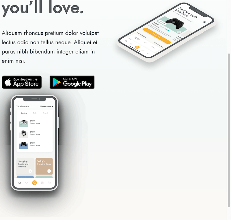
Hero component
The page hero holds the title and intro text alongside the intro visual.
Think of this as a single box divided into two side-by-side areas. Then each of the two areas is either divided or contains more elements.
In the case of the intro box, we have the text as well as the action buttons. Bear in mind the buttons aren’t actual buttons but faux button-looking links.
<div id="hero">
    <div id="hero-intro">
      <div id="hero-text">
        <h1>Find the stuff you’ll love.</h1>
        <p>Aliquam rhoncus pretium dolor volutpat lectus odio non tellus neque. Aliquet et purus nibh bibendum integer etiam in enim nisi.</p>
      </div>
      <div id="hero-action-btn">
        <div id="apple" class="hero-btn">
          <a href="">
            <img src="<https://thehelpfultipper.github.io/build_figma_design/imgs/App-Store-Web.png>" alt="App Store Web button.">
          </a>
        </div>
        <div id="google" class="hero-btn"><a href="">
            <img src="<https://thehelpfultipper.github.io/build_figma_design/imgs/Google-Play-Web.png>" alt="Google Play button.">
          </a>

        </div>
      </div>
    </div>
    <div id="hero-visual">
      <div id="hero-img">
        <img src="<https://thehelpfultipper.github.io/build_figma_design/imgs/iPhone-15.png>" alt="iPhone 15 display.">
      </div>
    </div>
  </div>
Main component
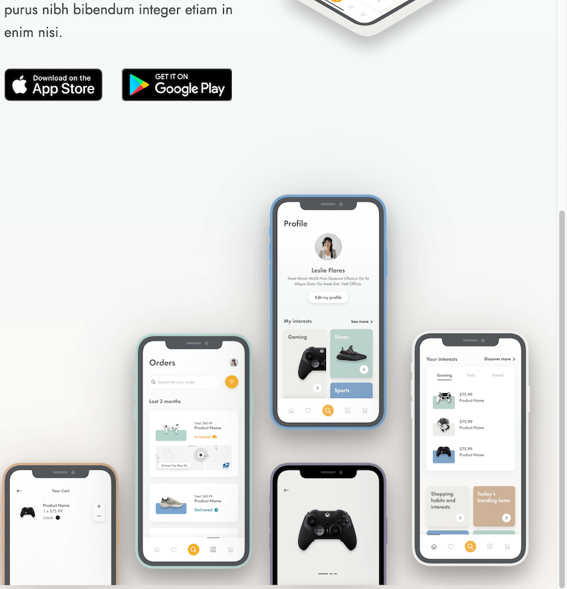
Lastly, the main content wrapper displays the five design visuals.
<div id="main">
    <div class="main-img">
      <img src="<https://thehelpfultipper.github.io/build_figma_design/imgs/Cart.png>" alt="Cart visual.">
    </div>
    <div class="main-img">
      <img src="<https://thehelpfultipper.github.io/build_figma_design/imgs/Orders.png>" alt="Orders visual.">
    </div>
    <div class="main-img">
      <img src="<https://thehelpfultipper.github.io/build_figma_design/imgs/Profile.png>" alt="Profile visual.">
    </div>
    <div class="main-img">
      <img src="<https://thehelpfultipper.github.io/build_figma_design/imgs/Product.png>" alt="Product visual.">
    </div>
    <div class="main-img">
      <img src="<https://thehelpfultipper.github.io/build_figma_design/imgs/Home.png>" alt="Home visual.">
    </div>
  </div>
Feel free to change the names given to the wrappers, though, if you’re following along I’d recommend you stick with the ones I use to avoid confusion.
In the end, the landing page HTML we’ve achieved looks something like this:
I know, terrifying 😱
Making the landing page pretty with CSS
So far, we’ve looked at the Figma design and broken the page down into different components.
Then we used those components to create the structure of the HTML document.
Moving on, we’ll be working with the Figma CSS to add some extremely necessary styles to the current mess.
1) General document styles
I’ll start with basic things like importing a font family that’s similar albeit not the same as the one on the design.
I chose Jost as it’s a free Google font that looks really similar to the Figma design font, Futura PT.
For how to import Google fonts, read How To Import Google Fonts And Custom Fonts To WordPress.
@import url("<https://fonts.googleapis.com/css2?family=Jost:wght@400;500&display=swap>");

* {
  box-sizing: border-box;
}

body {
  margin: 0;
  background: linear-gradient(
    180deg,
    #ffffff 0%,
    #f3f8f7 49.91%,
    #fff9f5 94.19%
  );
}
Use box-sizing to contain margins and paddings within the given dimensions and copy the background color for the body from the Figma Inspect side panel.

2) Navigation and page wrapper
Next up, we’ll tackle the width of the landing page alongside the styling of the simple nav.
#product-landing {
  max-width: 900px;
  width: 98%;
  margin: 0 auto;
  padding-top: 30px;
}

img {
  width: 100%;
}

#logo {
  width: 193px;
  height: 47.64px;
}
For the landing page, I set a width of 98% of a maximum width constraint of 900px. This means the page will always be 98% of the given screen width but never more than 900px.
Then set the width of all the images to 100% of their container, allowing the images to scale to fit their parent element.
I’ll define the actual dimensions on the image wrappers, thus, adjusting the image widths to be responsive to their container size which is exactly what’s going on with the logo.
For more responsive images in action, check out How To Use JavaScript Loops With A BTS Example.
3) Hero component and its children
Now, for the hero, we want to have two columns. I’ll use Flexbox to generate the two-column layout.
#hero {
  display: flex;
  align-items: center;
  margin-top: 80px;
}
Find more on Flexbox in 2 Ways To Build A Technical Documentation Page (freeCodeCamp Challenge).
Continue by adding sizes to the two main hero components children elements (i.e. text and visual).
#hero-text {
  font-family: "Jost", sans-serif;
  color: #54575a;
}

#hero-text h1 {
  font-size: 58px;
  line-height: 68px;
}

#hero-text p {
  font-size: 20px;
  line-height: 32px;
  font-weight: 400;
}

.hero-btn {
  display: inline-block;
  height: 46.28px;
  margin-top: 15px;
}

#apple {
  max-width: 138.44px;
  margin-right: 22px;
}

#google {
  max-width: 156.19px;
}

#hero-visual {
  position: relative;
}

#hero-img {
  position: relative;
  top: 30px;
}
Some of the size dimensions, like those of the action buttons, are from the Figma CSS. Though notice how, for the most part, I’m adjusting or downright changing the numbers provided by Figma.
Tip 💫
Think of Figma CSS as your companion, a helpful CSS guide that assists you as you style, instead of handing-off the final product. Most of the dimensions (i.e. widths and heights) that Figma provides are actually relative to the design workspace so they don’t translate well when developing.
This is one of the areas the DM’s class instructor failed to account for when he was setting static numbers based on those Figma provides.
Remember that we want responsive not static!

4) Main visual display
Another area DM’s class instructor fell short of adjusting for actual development was the positioning of elements.
In the main component, we have the visual display of five different images of mobile screens that have a unique layout on the page.
To create the special layout of the display, I’ll be using absolute positioning. That is, each image will be placed absolutely relative to its parent wrapper.
Tip: By using wrappers and nested elements, you can effectively manage absolute positioned elements. Wrappers provide a containment boundary for the absolutely positioned element, ensuring that it remains within the confines of its parent.
Read: CSS Visual Formatting: Floating, Positioning, & Layout
#main {
  position: relative;
  height: 680px;
}

.main-img {
  width: calc(100% / 4 + 34px);
  position: absolute;
}

.main-img img {
  filter: drop-shadow(0px 20px 40px rgba(0, 0, 0, 0.25));
}
Notice I give the wrapper #main an absolute height of 680px. This is because giving the children elements within that wrapper an absolute position removes them from the flow of the page thus rendering the wrapper “empty”.
An empty wrapper isn’t going to be of much help when trying to place the images relative to its bottom, as we in fact have to do 💁♀️
At this point, all mobile images are lying one on top of the other which is exactly what we want.
I’ll target each image using the CSS :nth-of-type() pseudo-class to place it at the correct spot on the page.
See the CSS
:nth-of-type()pseudo-class in action by reading How To Build An Easy Animated Hamburger Menu.
.main-img:nth-of-type(1) {
  left: -34px;
  bottom: 0;
}

.main-img:nth-of-type(2) {
  left: 20%;
  bottom: 0;
}

.main-img:nth-of-type(3) {
  right: 26%;
  bottom: calc(224px - 50px);
}

.main-img:nth-of-type(4) {
  right: 26%;
  bottom: 0;
}

.main-img:nth-of-type(5) {
  right: 0;
  bottom: 0;
}
I’m keeping the first and last image static using an absolute measure, but the three middle images have relative measures making them respond to screen width changes.
How to make the landing page responsive
So far, we’ve adjusted measures to considerably improve the landing page’s responsiveness but there’s still more we can do.
In this section, I’ll define three media queries that will take care of adjusting the page across device sizes.
I’ll start with the media query for screen sizes 914px or less before continuing with further adjustments for screens 720px or less and ending with screens 600px or smaller.
@media (max-width: 914px) {
  #hero-text h1 {
    font-size: 45px;
  }a

  #hero-text p {
    font-size: 18px;
  }

  #apple,
  #google {
    width: 80% !important;
  }

  .main-img:nth-of-type(2) {
    left: 20%;
  }

  .main-img:nth-of-type(3),
  .main-img:nth-of-type(4) {
    right: 26%;
  }
}
The above media query adjusts the:
- font sizes of the text
- action button sizes
- position of the middle mobile visuals
Then the other two take care of further minor adjustments for even smaller screens.
@media (max-width: 720px) {
  #apple,
  #google {
    width: 40% !important;
  }

  #hero-text h1 {
    font-size: 40px;
  }

  #hero-text p {
    font-size: 16px;
  }

  #main .main-img {
    transform: translateX(10%);
  }

  .main-img:nth-of-type(2) {
    left: 19%;
  }

  #main {
    height: 600px;
  }
}

@media (max-width: 600px) {
  #hero-visual {
    display: none;
  }

  #hero-intro {
    width: 100%;
    text-align: center;
  }
}
When screens reach the smaller side of 600px or less, I opt to collapse the hero visual entirely and center the text.
Wrapping up
Using media queries we created breakpoints resulting in a responsive landing page.
During the process, we consulted the Figma CSS styles for color and some sizing, but we discovered that it is not a dependable source for positioning elements on the screen.
Hopefully, DM can now get on with his class and stop bothering me 😒
Code on, design strong!
More HTML & CSS practice: How To Create An HTML Project For Beginners (guided tutorial)


