
Choosing the topic of this technical documentation page was the easiest of all the freeCodeCamp challenges we’ve done so far on THT.
To create a technical documentation app similar to fCC’s, I’ll be using our post 5 Ways To Access HTML Elements With JavaScript.
So, in this post, I’ll build a JS Methods Documentation page by refurbishing the existing THT post in two different ways.
The first way will walk you through an HTML and CSS only version of the technical documentation page like that of the reference.
See the Pen Technical Documentation SIMPLE (FCC) by Klea Merkuri (@thehelpfultipper) on CodePen.
While the second way will use JavaScript to make the technical documentation app efficient by cutting back on the hard-coded navigation list.
See the Pen Technical Documentation ADVANCED (FCC) by Klea Merkuri (@thehelpfultipper) on CodePen.
In cases of longer documentation content, the second way (with JavaScript) will be your best friend – we’ll show you exactly why that is so!
Technical Documentation Page – HTML & CSS
I’ll start with the HTML and CSS only version of the technical documentation page.
For the JavaScript version, later on, I’ll be reformatting this version as needed.
1. Setting the page layout
Looking at the reference, the technical documentation page has two sections:
- side panel navigation with clickable elements for regular-sized devices
- top panel scrollable navigation with clickable elements for mobile devices
- main-content body with sections referenced by the side/top menu
I’ll use flexbox to create the two-section layout for regular-sized devices, then have the two containers (nav and main-doc) wrap on mobile.
Setting up a skeleton nav and the #main-doc layout looks like this:
<nav id="navbar">
<header>JS Methods Documentation</header>
</nav>
<main id="main-doc">
<section class="main-section">
<header>Intro</header>
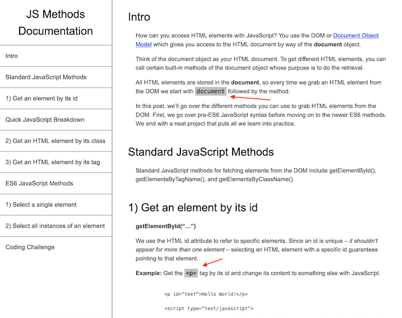
<p>How can you access HTML elements with JavaScript? You use the DOM or <a href="https://developer.mozilla.org/en-US/docs/Web/API/Document_Object_Model/Introduction">Document Object Model</a> which gives you access to the HTML document by way of the <strong>document</strong> object.</p>
<p>Think of the document object as your HTML document. To get different HTML elements, you can call certain built-in methods of the document object whose purpose is to do the retrieval.</p>
<p>All HTML elements are stored in the <strong>document</strong>, so every time we grab an HTML element from the DOM we start with <code>document</code> followed by the method.</p>
<p>In this post, we’ll go over the different methods you can use to grab HTML elements from the DOM. First, we go over pre-ES6 JavaScript syntax before moving on to the newer ES6 methods. We end with a neat project that puts all we learn into practice.</p>
</section>
<section class="main-section">
<header>Standard JavaScript Methods</header>
<p>Standard JavaScript methods for fetching elements from the DOM include getElementById(), getElementsByTagName(), and getElementsByClassName().</p>
</section>
<section class="main-section">
<header>1) Get an element by its id</header>
<p><strong>getElementById(“…”)</strong></p>
<p>We use the HTML id attribute to refer to specific elements. Since an id is unique – <em>it shouldn’t appear for more than one element</em> – selecting an HTML element with a specific id guarantees pointing to that element.</p>
<p><strong>Example:</strong> Get the <code><p></code> tag by its id and change its content to something else with JavaScript.</p>
<pre>
<code>
<p id="text">Hello World!</p>
<script type="text/javascript">
document.getElementById("text").innerHTML = "Hello THT!";
</script>
</code>
</pre>
</section>
<section class="main-section">
<header>Quick JavaScript Breakdown</header>
<ul><li><strong>document</strong></li></ul>
<p>Points at the DOM, telling the browser to look within our HTML document.</p>
<ul><li><strong>.</strong> (dot/fullstop/period following <code>document</code>)</li></ul>
<p>Tells the browser to go <em>in</em> the document object.</p>
<ul><li><strong>getElementById(“text”)</strong></li></ul>
<p>Gets the element with an id of “text” from the document.</p>
<ul><li><strong>innerHTML = “Hello THT!”</strong></li></ul>
<p>Specifies <em>how</em> we want to change the selected element – in this case, changing its content.</p>
<p>In the above example, we told the browser to go within this document, get the element with the id of text and change the content of that element.</p>
</section>
<section class="main-section">
<header>2) Get an HTML element by its class</header>
<p><strong>document.getElementsByClassName(“…”)</strong></p>
<p>Getting elements by class name returns a <strong>list of all elements in the document with the specified class</strong>. Since class isn’t a unique identifier like id – <em>there can be more than one element with the same class</em> – the return response is a list.</p>
<p>It’s important to understand this because doing anything to the elements retrieved this way requires to <strong>loop through the list</strong> to either (1) pull the element we want to affect or (2) affect all elements.</p>
<p><strong>Challenge:</strong> Get the elements with a class of “demo” and turn the first element’s content to upper case so it reads “I’M THE FIRST ELEMENT WITH A CLASS OF DEMO”.</p>
<pre>
<code>
<p class="demo">I'm the FIRST element with a class of demo.</p>
<p class="demo">I'm the SECOND element with a class of demo.</p>
<p class="demo">I'm the THIRD element with a class of demo.</p>
<p class="demo">I'm the FOURTH element with a class of demo.</p>
</code>
</pre>
<p>Steps to follow:</p>
<ol>
<li>Store the list retrieved with <strong>getElementsByClassName()</strong> in a variable.</li>
<li>Get the first item in that list <em>(hint: it has an index of zero)</em>.</li>
<li>Take the first item’s content and turn it to upper case using the built-in JavaScript method <strong>toUpperCase()</strong>.</li>
</ol>
<pre>
<code>
<script type="text/javascript">
const demoList = document.getElementsByClassName("demo");
demoList[0].innerHTML = demoList[0].innerHTML.toUpperCase();
</script>
</code>
</pre>
</section>
<section class="main-section">
<header>3) Get an HTML element by its tag</header>
<p><strong>getElementsByTagName(“…”)</strong></p>
<p>Like getElementsByClassName() returns a list of all elements of a particular class, getElementsByTagName() returns a <strong>list of all elements of a specific tag</strong>.</p>
<p>When we say “tags”, we’re talking about HTML tags like p, div, li, ul, and so forth.</p>
<p>In the previous example, we can easily get the p tags by their tag name instead of searching using class name.</p>
<pre>
<code>
<script type="text/javascript">
const demoList = document.getElementsByTagName("p");
demoList[0].innerHTML = demoList[0].innerHTML.toUpperCase();
</script>
</code>
</pre>
<h4>Summary</h4>
<ul>
<li>getElementById(“…”) returns a single item.</li>
<li>getElementsByClassName(“…”) and getElementsByTagName(“…”) each return a list.</li>
</ul>
</section>
<section class="main-section">
<header>ES6 JavaScript Methods</header>
<p>The newer syntax allows us to grab either a single element or all instances of an element by way of two relatively flexible methods.</p>
<p>Both methods make use of <a href="https://thehelpfultipper.com/how-to-use-classes-ids-to-select-elements-in-css/">CSS selectors</a> to identify the element(s) to grab. This means when selecting an element by its id, you’ll search for “#myID” because that’s how you reference the element in CSS. Likewise, if searching by class, it would be “.myClass”, or by tag, “p”.</p>
</section>
<section class="main-section">
<header>1) Select a single element</header>
<p><strong>querySelector(“…”)</strong></p>
<p>This will return a single element – if more occur in the document, it will return the first instance <em>only</em>.</p>
<p>In the example above, we can get the first p element either by tag name or class name using a single method.</p>
<p><strong>Challenge:</strong> Turn the first paragraph to upper case and give it a background color by selecting the first <code><p></code> in two different ways.</p>
<ol>
<li>Get the content by <strong>tag name</strong> using querySelector() and turn them into upper case.</li>
<li>Get the content by <strong>class name</strong> using querySelector() and set a background color of yellow.</li>
</ol>
<pre>
<code>
<script type="text/javascript">
const byTag = document.querySelector("p");
byTag.innerHTML = byTag.innerHTML.toUpperCase();
const byClass = document.querySelector(".demo");
byClass.style.backgroundColor = 'yellow';
</script>
</code>
</pre>
<p>There’s redundancy in the example as we’re selecting the same element in different ways, but it drives home the point, no?</p>
</section>
<section class="main-section">
<header>2) Select all instances of an element</header>
<p><strong>querySelectorAll(“…”)</strong></p>
<p>Adding “All” to the previous method gives you access to a different method that returns a <strong>list of all element occurrences</strong>.</p>
<p>Similarly to querySelector(), querySelectorAll() looks for elements using CSS selectors. Again, this means to reference a class you’ll need the fullstop in front (.myClass); for an id, the hash (#myID) and for, let’s say an attribute selection, it’ll be something like a[href=’mylink’].</p>
</section>
<section class="main-section">
<header>Coding Challenge</header>
<p>Ready for a coding challenge to put all this new knowledge into use? Head over to <a href="https://thehelpfultipper.com/5-ways-to-access-html-elements-with-javascript/" target="_blank" rel="noopener">THT for the Click the Button</a> coding challenge!</p>
</section>
</main>Some pointers from the above HTML code:
- I wrap inline code in
<code> - But I wrap code blocks in
<pre><code> - Escape “<” and “>” with HTML entities to avoid rendering of HTML code
Note: There’s no strict way for using code vs pre, though,
<pre>(which stands for preformatted text) has default styles that you might need to overwrite.
I admit, refurbishing the previous post was tedious work made possible thanks to Google’s Inspect tool and Page Source.
At this time, I don’t know if I have all the required elements (because someone can’t be bothered counting 👉 👈 ). But we can remedy that later on!
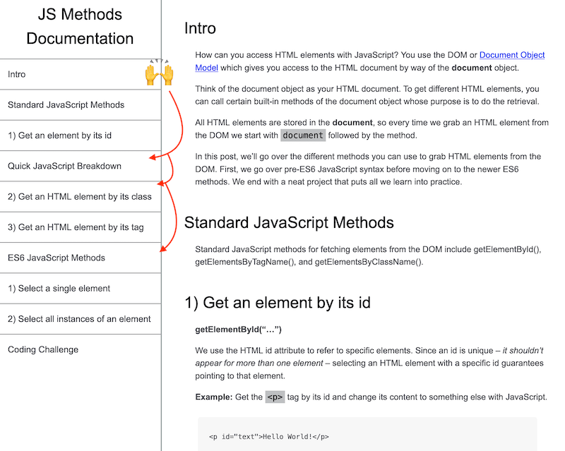
2. Adding nav elements
So far, all I have for the nav is the wrapper and the title – in other words, not much.
Since we’ve determined the headers for each of the sections, we can create the nav links pointing to those sections.
I have ten sections so I’ll need ten anchor links.
Tip: To create anchor links, the href of the link tag points to the ID of the linked sections. Remember to, also, add IDs to each main-section!
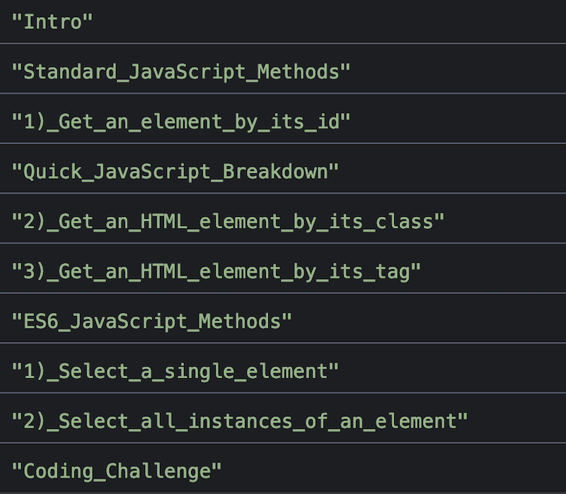
In #navbar, add the link elements after the header in an unordered list format:
  <ul>
    <a href="#Intro" class="nav-link"><li>Intro</li></a>
    <a href="#Standard_JavaScript_Methods" class="nav-link"><li>Standard JavaScript Methods</li></a>
    <a href="#1)_Get_an_element_by_its_id" class="nav-link"><li>1) Get an element by its id</li></a>
    <a href="#Quick_JavaScript_Breakdown" class="nav-link"><li>Quick JavaScript Breakdown</li></a>
    <a href="#2)_Get_an_HTML_element_by_its_class" class="nav-link"><li>2) Get an HTML element by its class</li></a>
    <a href="#3)_Get_an_HTML_element_by_its_tag" class="nav-link"><li>3) Get an HTML element by its tag</li></a>
    <a href="#ES6_JavaScript_Methods" class="nav-link"><li>ES6 JavaScript Methods</li></a>
    <a href="#1)_Select_a_single_element" class="nav-link"><li>1) Select a single element</li></a>
    <a href="#2)_Select_all_instances_of_an_element" class="nav-link"><li>2) Select all instances of an element</li></a>
    <a href="#Coding_Challenge" class="nav-link"><li>Coding Challenge</li></a>
  </ul>
Note: Due to the project requirements, the IDs (and anchor references) are super long because they correspond to section headers.
I wrapped the <li>s in anchor tags so the entire list item is clickable – not just the text wrapped in anchor tags!
What we have so far:
3. Fixing the nav to the left for regular-sized devices
Regular-sized devices have a fixed #navbar on the left side. When a user scrolls in #main-doc, the #navbar stays untouched.
As a twist, I’m going to show you how to create a fixed element without setting a fixed position. Instead, I’ll use flexbox!
First, place the two containers – nav and main – next to each other by setting the display of the body to flex.
body {
  margin: 0;
  padding: 0;
  box-sizing: border-box;
  font-family: 'Open Sans', Arial, sans-serif;
  line-height: 1.5;
  display: flex;
  justify-content: flex-start;
  align-items: flex-start;
}
Second, turn to the nav and give it a display of flex followed by a flex-direction of column.
Note: The default flex-direction is row which is why we have to explicitly state column here. All we’re doing is stacking the elements in nav – the header and list.
#navbar {
  display: flex;
  flex: 0 0 290px;
  flex-direction: column;
}
Now, to set the fixed width of a flex element like the nav, I use the flex property. This property compiles three different flexbox properties: flex-grow, flex-shrink, and flex-basis.
Here I set flex-grow and flex-shrink to zero because I don’t want #navbar to change widths when the screen is resized.
While flex-basis, the third property, I set equal to what I want the width of #navbar to be (290px in this case).
So that single line setting the flex property tells the browser that, whatever spatial redistribution happens on resizing, the #navbar will always occupy 290px of the screen.
Note: Visualize flex-grow and flex-basis by checking out the behavior of #main-doc which has a fluid width!
How to make a flex element scrollable
When you scroll down the page, though, the nav doesn’t appear fixed any longer – it also scrolls!
There’s still one thing left to do to mimic the fixed position, broken down into two steps:
- On the body, set
height: calc(100vh - 80px)andoverflow: hidden.
Note: The calculated height is that of the full viewport minus the top and bottom padding of #main-doc.
Setting overflow to hidden will hide any content beyond the specified height (with no scrolling ability).
If you don’t account for the 40px top and bottom padding, using instead a height of 100vh, the padding won’t be accounted for.
- Give #main-doc
height: 100%(so it takes that of its parent) andoverflow: auto. The overflow here will add a scrollbar for #main-doc.
Note: Just setting overflow won’t work – you need to set a height for the element you want to implement scroll.
4. Style the navbar and menu links
I’ve given #navbar some structure, but it’s still missing the looks.
Start with the header and do a few things:
- make it bigger and center align
- give it padding and a bottom border
#navbar header {
  text-align: center;
  padding: 15px 5px;
  font-size: 1.8rem;
  border-bottom: 1px solid #4d4e53;
}
For the border separating #navbar from #main-doc, give #main-doc border-left: 2px solid rgba(0, 22, 22, 0.4).
Remove default list styles, formatting the list items as menu options:
#navbar ul {
  list-style: none;
  margin: 0;
  padding: 0;
}

.nav-link {
  display: block;
  color: #4d4e53;
  text-decoration: none;
  padding: 15px;
}

.nav-link:not(:last-of-type) {
  border-bottom: 1px solid #4d4e53;
}
Note: I use :last-of-type to specify not including a bottom border for the last nav-link.
5. Adding styles to the main document
With the navbar out of the way, let’s move on to #main-doc. There are a few things to tackle here:
- make the headers prominent (in size and color)
- add spacing using margins and padding
- format code blocks – in our case, inline code and code blocks
I’ll start with spacing. Give #main-doc padding: 40px, then move onto each main-section adding a bottom margin and making the header larger.
.main-section {
  margin-bottom: 40px;
}

#main-doc header {
  font-size: 1.8em;
}
To create the indent for all children of a section except the header I’ll use:
- a child selector (the greater-than sign)
- universal selector (the asterisk)
- :not() pseudo-class
- :first-child pseudo-class
.main-section > *:not(:first-child) {
  padding-left: 20px;
}
This will select all children ( > *) of main-section with the exception of the first child ( *:not(:first-child) ), the header.

In that last part, include the slight variation in font-size and color for everything in main-section other than the header.
Then I, also, adjust the indentations of the lists so everything that’s not the header in main-section looks like this:
.main-section > *:not(:first-child) {
  padding-left: 20px;
  font-size: 0.95em;
  color: #4d4e53;
}

.main-section ul, ul + p, .main-section ol {
  margin-left: 40px;
}

.main-section li {
  margin-bottom: 10px;
}
Formatting inline code and code blocks
I’ll use a relatively dark background with a black font color for inline code. Some padding will also serve us well.
p code {
  background-color: #BEC0C2;
  color: black;
  padding: 2px 4px;
}
Then for all code – inline and blocks – I’ll assign monospace as the main font family.
p code,
pre {
  font-family: monospace, mono;
}
Lastly, for code blocks, I’ll use a lighter background color and give the code block containers a slightly rounded border.
pre {
  background-color: #F7F7F7;
  margin: 25px;
  white-space: pre-line;
  border-radius: 5px;
}
Tip: Use white-space as pre-line to collapse existing white space!

6. Setting a mobile layout
For screens with a width of 952px and smaller, I’ll change the direction of the flex elements in the body to column so they stack.
Note: Create a media query!
Follow by making #navbar full-width and giving it a bottom border.
  #navbar {
    width: 100%;
    overflow: scroll;
    border-bottom: 2px solid black;
  }
To get rid of the space at the bottom specify overflow-y instead of overflow. That space is designated for a horizontal scroll bar which we’ve no need of right now.

Try scrolling and you’ll see that the header isn’t fixed, going out of view when scrolling within #navbar.
Let’s fix that and add a bottom border at the bottom similar to the one added on #navbar.
  #navbar header {
    position: fixed;
    top: 0;
    border-bottom: 2px solid black;
  }
Since we took header out of the flow of the page, it doesn’t inherit its parent’s full-width so we explicitly state width: 100%.
The last thing left is the positioning of #navbar and #main-doc (both casualties of a fixed header).
  #navbar, #main-doc {
    position: relative;
    top: 80px;
  }
Tip 🤓
If you’d like to reduce the height of #navbar, you can set flex-basis!
In the media query, I added flex-basis: 250px to #navbar.
Since the flex-direction for the nav is column, the flex-basis value affects the height (instead of the width, like in our code for regular screens).
I ran the code through the checker and it passed with flying colors!
Now, onto the advanced version for anyone willing to delve into JavaScript for a little automation.
Technical Documentation Page with JavaScript
Using JavaScript for this rather simple project might be overkill. But imagine the documentation was far longer than what we have.
If there were double, triple, or quadruple the number of sections, you’ll have to go section by section issuing IDs.
Not only that, you’d have to make sure they corresponded with the text of their respective headers and get rid of any white space with underscores.
But you’d still not be finished – oh no, you’ll also have to go back and create menu links in #navbar for all sections added.
That’s lots of time-consuming manual labor you don’t need to do thanks to JavaScript.
JavaScript can take care of:
- issuing IDs corresponding to the text of the section headers
- replacing white space with underscores
- creating menu links anchoring to the various sections
So, once you come back and update your documentation by adding a section or two, you won’t worry about a thing.
An ID will be generated for that section based on the header’s title and a menu link anchoring to said section. Magic 🧙🏼
1. Repurposing the code we wrote
Start by using much of what we built already. Remember, JavaScript is going to help automate certain functions of the technical documentation page.
Most of the content and styles relating to #main-doc are unchanged. The only differences in the HTML of this version are:
- navbar is stripped down – only create an empty unordered list
<nav id="navbar">
  <header>JS Methods Documentation</header>
  <ul>

  </ul>
</nav>
We will populate the list automatically so you don’t have to hardcode a single menu link again!
- each section is missing an ID – everything else is the same
Tip 📝
Copy and paste the code of the simple version if you followed along earlier.
Otherwise, go through the steps outlined in the simple version, making sure that:
(a) the nav resembles that shown above (without hardcoded links)
(b) you don’t add IDs to the sections
If you carry over our CSS as well, you should have this:

2. Automating functions using JavaScript
My first step is to grab the unordered list from #navbar and the headers from #main-doc.
Note: The headers variable is going to use JavaScript selector querySelectorAll() so it’s going to be a list.
const menuList = document.querySelector('#navbar ul');
const titles = document.querySelectorAll('#main-doc header');
Next, loop through titles, and for each title do two things:
- remove any trailing spaces using trim()
- replace any white space with an underscore using replace()
for(let title of titles) {
  // get rid of trailing spaces
  let cleanTitle = title.innerText.trim();

  // replace white space with underscore
  let titleAsId = cleanTitle.replace(/\s/g, '_');

}
Console logging titleAsId shows it now matches the format we want for our section IDs and anchor links.
Let’s move on to issuing those section IDs. What we effectively want to do is:
- get the parent node of each title as that is the section
- assign to that parent node an ID attribute equal to the value of titleAsId
So in the loop add the following:
title.parentNode.setAttribute('id', `${titleAsId}`);As for generating the anchor link as a menu item, we’ll create some elements using the JavaScript createElement() method.
Those elements will be:
- an anchor element that’ll take two attributes – class and href
- a list item element with innerText set to the value of cleanTitle
Then I append listItem as a child to the link and the link as a child to the menuList.
  // generate an anchor menu link for nav
  let link = document.createElement('a');
  link.setAttribute('class', 'nav-link');
  link.setAttribute('href',`#${titleAsId}`);

  let listItem = document.createElement('li');
  listItem.innerText = cleanTitle;

  link.appendChild(listItem);
  menuList.appendChild(link);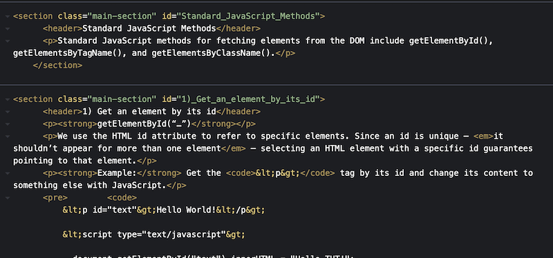
And we’re done! That’s all the JavaScript code you need to automate all that hardcoding work we did in the simpler version. Neat, huh?
To test our automation out, I added a new section right after Intro called “TESTING”:
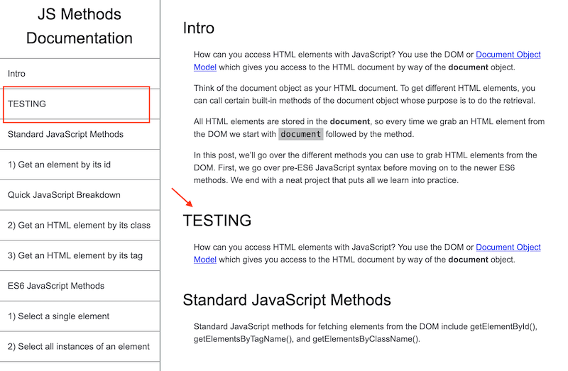
Works like a charm 😎
It also clears fCC’s checker which, I admit, surprised me. So you have two options to choose from when it comes to submitting.
One last project left – the Personal Portfolio Webpage – for the Responsive Web Design certification. It’ll showcase all our amazing work so far, can’t wait to get started.
For the full technical documentation page code (for both versions), visit our GitHub page.
Happy coding!


