
Can you believe it? We’ve come to the last project for freeCodeCamp’s Responsive Web Design certification, the Personal Portfolio Webpage!
I’m going all out on this one (DM’s rolling his eyes yet again) – it’ll have plenty of animations and a sleek finish.
See the Pen Personal Portfolio Advanced (FCC) by Klea Merkuri (@thehelpfultipper) on CodePen.
I’ll make sure to include a simple alternative as always!
See the Pen Personal Portfolio Simple (FCC) by Klea Merkuri (@thehelpfultipper) on CodePen.
Although it might seem simple, this will be a very functional personal portfolio webpage that you can build onto as you learn and create.
A personal portfolio is, often, a developer’s passport to the world of employment (LOL). Its main purpose is to showcase your work, what you’ve learned, what you’re capable of, and who you are – the list goes on.
Portfolios tend to reflect your stylistic choices, design themes, and experimental innovations so it makes sense to put effort into them.
In my un-asked-for opinion, the best portfolios aren’t flashy (though, those certainly catch your eye). Instead, they’re constantly updated, upgraded, and uploaded for all to see.
You can definitely use website builders, like Wix or Squarespace, to get your portfolio up and running. But a developer who builds their own portfolio deserves another level of respect.
Building and creating are what you do anyways – a personal portfolio is a cherry on top of all your work!
So, without further adieu, I’ll stop preaching to delve into how to build a personal portfolio webpage to ring us that certification at last 🙂
Setting up an HTML skeleton based on project requirements
As is usually the case, I start by drafting a bare HTML markup that takes into account most (not all) user story requirements.
<nav id="navbar"></nav>
<main>
<section id="welcome-section">
<header>
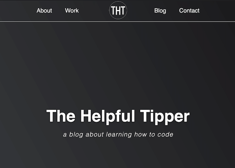
<h1>The Helpful Tipper</h1>
<p>a blog about learning how to code</p>
</header>
</section>
<section id="projects">
<ul>
<li class="project-title"></li>
<li class="project-title"></li>
<li class="project-title"></li>
<li class="project-title"></li>
<li class="project-title"></li>
<li class="project-title"></li>
</ul>
</section>
<section id="contacts">
<div id="contanct-links">
<a href="" id="profile-link"></a>
</div>
</section>
</main>
<footer></footer>Remove default margins and paddings from the document body, adding any other styles you want like background color and font family.
body {
  margin: 0;
  padding: 0;
  background: linear-gradient(62deg, #3a3d40 0%, #181719 100%);
  scroll-behavior: smooth;
  box-sizing: border-box;
  font-family: Helvetica, Arial, sans-serif;
  color: white;
}
Lastly, give #welcome-section the required full viewport height by setting height: 100vh.
Option #1: Animated header
Follow the steps below to create an animated header for the personal portfolio page.
If you’d like to skip this, opting for a simple header, jump to Option #2: Simple Header.
1) Creating an animated header
Next, I want to include a header inside #welcome-section that is going to be animated.
Tip: Center the content inside header using
text-align: center.
The first component in this animated header is going to be a logo. That logo can be broken apart into two main parts:
- a ring outlining a circle
- “THT” broken into letters, each composed of div parts (this way I’ve more room to make the “font” look similar to our actual logo!)
   <div id="logo-animation">
       <div id="logo-name">
        <span></span>
        <span></span>
        <span></span>
        <span></span>
        <span></span>
        <span></span>
        <span></span>
      </div>
      <div class="logo-ring">
        <div></div>
        <div></div>
        <div></div>
        <div></div>
      </div>
    </div>
Note that:
- Each span in #logo-name is a rectangle. These will be formed into the letters for “THT”.
- Each div in #logo-ring is a circle. I’ll play with the borders to create the illusion of tracing a circle.
I’ll give both #logo-name and #logo-ring an outer shell of a box with a relative position since each child component will be placed absolutely to its parent.
 #logo-name, .logo-ring {
  display: inline-block;
  position: relative;
  width: 350px;
  height: 350px;
}
For the #logo-ring animation:
.logo-ring div {
  display: block;
  position: absolute;
  width: 334px;
  height: 334px;
  margin: 8px;
  border: 2px solid #fff;
  border-radius: 50%;
  animation: logo-ring 1.5s cubic-bezier(0.5, 0, 0.5, 1);
  border-color: #fff transparent transparent transparent;
}

.logo-ring div:nth-child(1) {
  animation: right 1.4s cubic-bezier(0.5, 0, 0.5, 1) forwards;
}

.logo-ring div:nth-child(2) {
  animation: bottom 1.4s cubic-bezier(0.5, 0, 0.5, 1) forwards;
}

.logo-ring div:nth-child(3) {
  animation: left 1.4s cubic-bezier(0.5, 0, 0.5, 1) forwards;
}

@keyframes right {
  100% { transform: rotate(90deg); }
}

@keyframes bottom {
  100% { transform: rotate(180deg); }
}

@keyframes left {
  100% { transform: rotate(270deg); }
}

@keyframes logo-ring {
  0% {
    transform: rotate(0deg);
  }
  100% {
    transform: rotate(360deg);
  }
}
When removing the animations for each of the children divs, your starting point will also be where the animation ends.
But I want the traced circle to remain visible, hence, the added animations for each child.
Tip: To actually make the animation for each child
divstay in place, set animation-iteration-count to forwards.
Here’s our animated ring:
I’ll move on to #logo-name now.
Like I did with #logo-ring, I’ll set all span styles and then proceed on hitting each individually to transform into letters.
#logo-name {
  display: inline-block;
  position: absolute;
  width: 350px;
  height: 350px;
}

#logo-name span {
  position: absolute;
  left: 20%;
  display: inline-block;
  width: 200px;
  height: 20px;
  border-radius: 2px;
  background: white;
  opacity: 0;
  animation: show 1s 1.5s ease-in forwards;
}

#logo-name span:nth-child(1) {
  top: 30%;
  left: 43px;
  width: 80px;
}

#logo-name span:nth-child(2) {
  top: 50%;
  left: 8px;
  width: 150px;
  transform: rotate(90deg);
  transform-origin: center;
}

#logo-name span:nth-child(3) {
  top: 50%;
  left: 65px;
  width: 160px;
  transform: rotate(90deg);
  transform-origin: center;
}

#logo-name span:nth-child(4) {
  top: 50%;
  left: 135px;
  width: 80px;
}

#logo-name span:nth-child(5) {
  top: 50%;
  left: 128px;
  width: 160px;
  transform: rotate(90deg);
  transform-origin: center;
}

#logo-name span:nth-child(6) {
  top: 30%;
  left: 230px;
  width: 80px;
}

#logo-name span:nth-child(7) {
  top: 50%;
  left: 195px;
  width: 150px;
  transform: rotate(90deg);
  transform-origin: center;
}

@keyframes show {
  0% {
    opacity: 1;
    transform: scale(0.5);
  }

  100% {
    opacity: 1;
  }
}
I didn’t achieve this in one go – there was plenty of trial and error with different effects. So play around until you reach the desired effect.
A lot of the animations depend on timing . . . once you get that right, then it all comes together!
2) Adding navigation components
Currently, we have an empty #navbar – let’s fill it up!
What needs to go there for sure is a menu with items that link to each section of the personal portfolio.
Each menu item actually is an anchor link very much the same as we used in the menu panel for the Technical Documentation page.
Only one of the menu items will not lead to a section on the personal portfolio and that’s “Blog”. Instead, it’ll open up on an external page – using target="_blank" – redirecting users to our killer blog 😁
  <ul>
    <div class="left">
      <li><a href="#welcome-section">About</a></li>
      <li><a href="#projects">Work</a></li>
    </div>
    <div class="right">
      <li><a href="https://thehelpfultipper.com/" target="_blank">Blog</a></li>
      <li><a href="#contact">Contact</a></li>
    </div>
  </ul>
I envision the nav like so:
The logo plays out its animation and then gradually slides up in the center of the nav, decreasing in size along the way. A horizontal line designating the nav appears with two menu items on either side of the centered logo.
Begin by creating a fixed nav with a bottom border animation.
nav {
  position: fixed;
  height: 80px;
  width: 100%;
  animation: line 0.5s ease-in 3s forwards;
}

@keyframes line {
  0% { width: 0; }
  100% { border-bottom: 1px solid white; }
}
Note: The 3s represents the animation-delay property and it’s necessary to get right for the line to appear right after the logo animation.
My animation-delay calculation takes into account the 1.5s for the #logo-ring animation plus 1s #logo-name animation plus 0.5s #logo-animation (which we haven’t set yet).
The last bit is the animation for the scaling and positioning of the logo on the nav – we’ll handle this right now.
#logo-animation {
  position: fixed;
  top: 100px;
  left: calc(50% - 350px/2);
  animation: slide-up 0.5s ease-out 2.5s forwards;
}

@keyframes slide-up {
  100% {
    top: -140px;
    transform: scale(0.2);
  }
}
Note: I made #logo-animation fixed so that it doesn’t scroll out of view.
The left positioning takes into account that we want the middle of the circle to be in the center of the page – not the left edge.
3) Complete the welcome section
Let’s complete the welcome section styling the text and fixing its positioning on the page.
I decided to add a caption, like in the reference, right below the heading.
Keep in mind that the logo is also part of the welcome section, inside the header.
For the position, we need to account for the fixed logo that distorts the space since it takes #logo-animation out of the flow of the page.
I wrapped the H1 and caption in a wrapper with an ID of #text-welcome to center it vertically so any welcome text lies in the very middle of the page.
#text-welcome {
  position: relative;
  top: calc(100vh/2);
}
Next, adjust font styles for the header text and apply the show-text animation with a longer delay. This way, the header text becomes visible as soon as the nav animations are complete!
h1 {
  font-size: 3.9em;
  margin: 0;
  text-shadow: 0 1px 5px black;
}

h1 + p {
  font-size: 1.5em;
  font-style: italic;
  letter-spacing: 0.1rem;
  font-weight: 300;
  color: #fffafa;
}

h1, h1 + p {
  opacity: 0;
  animation: show-text 0.5s ease-in 4s forwards;
}

@keyframes show-text {
  0% { opacity: 0; }
  100% { opacity: 1; }
}
4) Placing the nav menu items
Let’s show some love and affection to the forgotten menu items. Admittedly, with my current background color, you can barely see them as it is.
To get two on either side of the logo, I’m going to make use of flexbox.
First, get rid of default list styles to avoid having them mess up our styles!
I’ll create a generic no-list class that I can apply to any lists on the page whose default styles must be removed. Call it intuition, but I’ve got a feeling we’ll need to do this a time or two more before we finish.
.no-list {
  list-style-type: none;
  margin: 0;
  padding: 0;
}
Assign the no-list class to the nav list and follow with positioning list items.
nav ul {
  display: flex;
  height: inherit;
  align-items: center;
  justify-content: space-evenly;
}
I use flex properties once setting the display to flex for placing the children within the menu list.
Since the menu items should be grouped in two with either part on opposite ends of the nav, I wrapped each <li> pair into a wrapper – one with a class of left, the other of right.
And within each wrapper, we want the two items to be on the same line so set display: flex.
Space out each menu item pair and get rid of those ghastly styles!
.left li:first-of-type,
.right li:first-of-type {
  margin-right: 50px;
}

nav ul li a {
  color: white;
  text-decoration: none;
  font-size: 1.4em;
}
Note: We’ll use media querries later on to correct nav item spacing for bigger and smaller screens.
Adjusting the nav animation to account for menu items
At this point, the menu items are visible in the nav on page load.
But I need them to become visible only when the nav animation plays out (i.e. bottom border expands).
I’ll use opacity to play on the visibility of the menu items. On page load, the menu links will have an opacity of zero which will change to that of one over the course of 0.5s with a 3.5s delay.
The delay accounts for the 3s logo animation plus the 0.5s nav bottom border animation!
Add to each menu link (nav ul li a) opacity: 0 and animation: show-text 0.5s ease-in 3.5s forwards. Then define your animation like so:
@keyframes show-text {
  0% { opacity: 0; }
  100% { opacity: 1; }
}
Option #2: Simple header
As an alternative to the animated header, create a simple header that follows along the lines of the reference.
Start by creating a simple unordered list of anchor links placed inside the nav element:
  <ul>
      <li><a href="#welcome-section">About</a></li>
      <li><a href="#projects">Work</a></li>
      <li><a href="https://thehelpfultipper.com/" target="_blank">Blog</a></li>
      <li><a href="#contact">Contact</a></li>
  </ul>
Then style the nav, making sure to:
- have it fixed at the top of the page
- make it full-width
- add the line animation (defined in the advanced section above)
nav {
  position: fixed;
  height: 80px;
  width: 100%;
  animation: line 0.5s ease-in forwards;
  z-index: 99;
}

@keyframes line {
  0% {
    width: 0;
  }
  100% {
    border-bottom: 1px solid white;
    background: inherit;
  }
}
Of course, nothing so far helps the terrible-looking menu list we’ve got going there.
Let’s tackle the default list styles first using a generic class I call no-list.
Follow by placing the anchor links beside each other on the right-hand side of the nav.
.no-list {
  list-style-type: none;
  margin: 0;
  padding: 0;
}

nav ul {
  display: flex;
  height: inherit;
  align-items: center;
  justify-content: flex-end;
}

nav ul li {
  margin: 15px;
}
>> Tip <<
Give the list a height equal to that of the nav to center the list items vertically using align-items.
Simply setting align-items as center without a specified height for the list won’t do much for you.
That’s because the list defaults to auto-height of whatever content it houses so there isn’t vertical space to maneuver in.
Even though the nav’s taking shape, I still can’t see a darn thing due to the font colors.
Plus, we want to add the show-text animation (we applied this to #welcome-section earlier) so the anchor links appear after the nav animation plays out! Hence, the 0.5s delay.
nav ul li a {
  color: white;
  text-decoration: none;
  font-size: 1.4em;
  opacity: 0;
  animation: show-text 0.5s ease-in 0.5s forwards;
}
One more thing left to do to keep our simple nav “simple”, yet, classy (you’ve my full permission to roll your eyes).
Add an expandable bottom border on hover for each menu item. I do this by creating a pseudo-element with a transition like so:
nav ul li a::after {
  content: '';
  display: block;
  width: 0%;
  height: 1px;
  position: absolute;
  bottom: -5px;
  left: 0;
  background-color: white;
  transition: width 0.2s ease-out;
}

nav ul li:hover a::after {
  width: 100%;
}
To make the above work, give each anchor link position: relative as the pseudo-element is placed absolutely relative to each anchor parent.
We’re not actually using a bottom border here, merely imitating one! It adds flair, don’t you think?
Displaying projects in your portfolio
Time to work on the projects section where we display some of our best projects and link to all our other work.
I will link to six projects in a 3×2 grid created using CSS Grid.
The temptation to opt for flexbox is very strong, but I’ll challenge myself with Grid…hope you follow along!
But first, I’m going to make some minor adjustments that I notice.
Adjustment 1:
Give nav a background color so the elements scrolled up and below it aren’t visible to the eye.
To do this, we need to keep in mind the z-index hierarchy for different positions.
Fixed and absolute positioned elements tend to be lower in status than relative elements. We saw this in action during the How To Build An Interactive Menu Component project.
So we’ll do two things:
- set a high(er) z-index,
z-index: 99, for both the nav and #logo-animation - add
background: inheritin the line animation
Adjustment 2:
Change the element type from a list of current projects to that of a parent div with links.
    <div id="projects-grid">
      <a href="" class="project-tile"></a>
      <a href="" class="project-tile"></a>
      <a href="" class="project-tile"></a>
      <a href="" class="project-tile"></a>
      <a href="" class="project-tile"></a>
      <a href="" class="project-tile"></a>
    </div>
Each link will contain:
- an image of the project
- a title for the project
Also, don’t forget to add a title for the projects section! Then add some styles to #projects and the section title.
#projects {
  text-align: center;
  padding: 6rem 2rem;
  background: #f5f5f5;
}

#projects h2 {
  font-size: 2.8em;
  margin-bottom: 4rem;
  color: #181719;
  text-shadow: 0 1px 1px black;
}
Now we can continue with the grid.
1) Setting up the Grid container
The grid container, #projects-grid, holds six project cards that are made up of the project image and its title.
Once I add everything to the bare-bones HTML we created above, I get this:
    <div id="projects-grid">
      <a href="https://thehelpfultipper.com/how-to-create-a-beating-heart-using-html-and-css/" class="project-title" target="_blank">
        <img src="https://thehelpfultipper.com/wp-content/uploads/2022/03/beating-heart-css-html-project.jpg" alt="Beating Heart">
        <p>Beating Heart</p>
      </a>
      <a href="https://thehelpfultipper.com/how-to-make-an-animated-button-with-css/" class="project-title" target="_blank">
        <img src="https://thehelpfultipper.com/wp-content/uploads/2022/03/How-To-Make-An-Animated-Button-With-CSS-1.jpg" alt="Animated Button">
        <p>Animated Button</p>
      </a>
      <a href="https://thehelpfultipper.com/how-to-build-an-interactive-menu-component/" class="project-title" target="_blank">
        <img src="https://thehelpfultipper.com/wp-content/uploads/2022/04/interactive-menu-with-fade-out-and-mouse-follow-effect.png" alt="Interactive Menu">
        <p>Interactive Menu</p>
      </a>
      <a href="https://thehelpfultipper.com/how-to-build-a-responsive-timeline-for-a-webpage/" class="project-title" target="_blank">
        <img src="https://thehelpfultipper.com/wp-content/uploads/2022/06/How-To-Build-A-Responsive-Timeline-For-A-Webpage.png" alt="Responsive Timeline">
        <p>Responsive Timeline</p>
      </a>
      <a href="https://thehelpfultipper.com/how-to-build-a-dynamic-input-field-with-a-floating-label/" class="project-title" target="_blank">
        <img src="https://thehelpfultipper.com/wp-content/uploads/2022/05/styling-the-input-and-button-7.png" alt="Floating Label Input">
        <p>Floating Label Input</p>
      </a>
      <a href="https://thehelpfultipper.com/how-to-make-a-css-loading-dot-animation/" class="project-title" target="_blank">
        <img src="https://thehelpfultipper.com/wp-content/uploads/2022/05/loading-dot-animation-css.png" alt="Loading Animation">
        <p>Loading Animation</p>
      </a>
    </div>
A few things to note:
- the grid container comes after the projects section H2 title and before the section button
- each project card is a link that opens on a new page (using
target="_blank") - the images I’m pulling are hosted on the THT blog server – you can host yours on Github pages and pull from there
Read: Learn how to host your images on Github pages to use in an IDE like Codepen.
To build the grid, I first give #projects-grid a width and center it on the page. Then, give it a display of grid followed by the number of columns and rows.
#projects-grid {
  width: 100%;
  max-width: 1280px;
  margin: 0 auto;
  display: grid;
  grid-template-columns: repeat(auto-fit, minmax(320px, 1fr));
  grid-template-rows: auto;
  gap: 2em;
}- For columns, use the CSS Grid repeat() function to save some typing time. The function says: Fit as many columns as is possible in the given space. Each column is no smaller than 320px and no bigger than 1 fraction unit. At maximum, we should have 3 columns.
- For rows, we allow the container and its items to give them shape by using auto.
- Add space between the rows and columns by setting a gap.
2) Adding styles to each project card
Style each card, removing default link styles (like text-decoration). And for each image contain it inside the parent card.
.project-tile {
  text-decoration: none;
  color: inherit;
  border: 1px solid #3a3d40;
}

.project-tile img {
  display: block;
  width: 100%;
  height: calc(100% - 3.2rem);
  object-fit: cover;
}
Moving onto the project titles, I opt for pseudo-elements to create the illusion of each title being an HTML tag on hover.
.project-tile p {
  margin: 0;
  padding: 1rem 2rem;
  font-size: 1.2rem;
  background: linear-gradient(62deg, #3a3d40 0%, #181719 100%);
}

.project-tile p::before {
  content: '< ';
  margin-right: 5px;
  font-size: 0.9rem;
  visibility: hidden;
}

.project-tile p::after {
  content: ' / >';
  margin-left: 5px;
  font-size: 0.9rem;
  visibility: hidden;
}

.project-tile:hover p::before,
.project-tile:hover p::after {
  visibility: visible;
  color: #cd7f32;
}
Note: I set visibility to hidden on page load and then to visible on hover to keep the width of the title from changing.
Setting visibility, instead of display, keeps the element’s reserved space available so you don’t get a pop-out movement on the hover state.

3) Including a button for the projects’ section
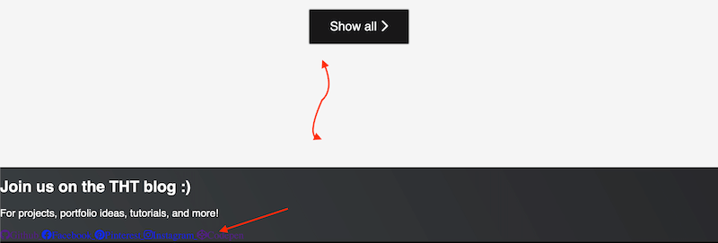
The last component of this section is the “Show all” button which links to our Codepen page!
FYI it doesn’t have to link to a Codepen page if you don’t have one. You do you 🙃
I’ll create a link with a class of button that will use the power of styling to mimic a button.
You can use an actual button, but you’ll have to remove lots of defaults (and add a link) and it never hurts to practice your styling skills.
    <a href="https://codepen.io/thehelpfultipper" target="_blank" class="btn">
      <span>Show all</span>
      <i class="fa-solid fa-chevron-right"></i>
    </a>
Note 📝
Notice the strange <i></i> tag here? This is actually part of Font Awesome which I use here to bring in the nice-lookin’ right chevron.
If you’d like to do something similar, for this or other projects, go on their website and follow their instructions. It’s really easy to set-up and free!
Now, to make the link into a button with a couple of transitions in background color and chevron placement I do this:
.btn {
  display: inline-block;
  padding: 1rem 2rem;
  margin: 5em;
  text-decoration: none;
  color: white;
  background: #181719;
  font-size: 1.2rem;
  transition: background 0.3s ease-in-out;
  box-shadow: 0 0 2px black;
}

.btn i {
  transition: transform 0.3s ease-out 0.1s;
}

.btn:hover {
  background: #cd7f32;
}

.btn:hover i {
  transform: translateX(5px);
}
You should get:
Moving onto the contacts section
Our last section before the footer is the contacts section which must contain at least one link with an ID of profile-link.
Begin by adding a title for the section and an optional caption to it. Then include the contact links you want to display.
Note: I use Font Awesome icons here considering I inserted the Font Awesome script earlier on!
  <section id="contact">
    <h2>Join us on the THT blog :)</h2>
    <p>For projects, portfolio ideas, tutorials, and more!</p>
    <div id="contact-links">
      <a href="https://github.com/thehelpfultipper" id="profile-link" target="_blank">
        <i class="fa-brands fa-github" aria-label="Github"></i>
      </a>
      <a href="https://www.facebook.com/helpfultippertht" target="_blank">
        <i class="fa-brands fa-facebook" aria-label="Facebook"></i>
      </a>
      <a href="https://in.pinterest.com/thehelpfultipper/_created/" target="_blank">
        <i class="fa-brands fa-pinterest" aria-label="Pinterest"></i>
      </a>
      <a href="https://www.instagram.com/dm.tht/?hl=en" target="_blank">
        <i class="fa-brands fa-instagram" aria-label="Instagram"></i>
      </a>
      <a href="https://codepen.io/thehelpfultipper" target="_blank">
        <i class="fa-brands fa-codepen" aria-label="Codepen"></i>
      </a>
    </div>
  </section>
A few things to note:
- All links open to a new page
- Each link is composed of an icon
- The aria-label serves as a description for accessibility
Onto the styling. We currently have:
So we need to address:
- the extra white space between the end of the projects section and the contacts section
- left-aligned content for #contact should be centered
- hard-to-see icons which need (a) resizing and (b) a little, teeny bit of animation 🙃
For the white space, it’s an easy fix of simply removing the bottom padding from #projects, padding: 6rem 2rem 0 2rem. Since the button in that section already has its own margin, I find it sufficient.
Follow by correcting the size and alignment of the #contact content.
#contact {
  text-align: center;
  padding: 10rem;
}

#contact h2 {
  font-size: 3.5rem;
  margin: 0;
  text-shadow: 0 1px 5px black;
}

#contact p {
  font-size: 1.3rem;
  font-style: italic;
  text-shadow: 0 1px 5px black;
}

#contact-links {
  margin-top: 4em;
}

#contact-links a {
  text-decoration: none;
  color: white;
  font-size: 1.8rem;
  margin: 10px;
}

#contact-links a i {
  transition: transform 0.2s ease-out;
}

#contact-links a i:hover {
  transform: scale(1.2);
}
The last bit hitting the <i>, the custom Font Awesome tag, adds slight animation to each icon by making the icon interact with the user when they hover over it.
And that’s a wrap for this section!
Adding the footer and media query
This last portion of the personal portfolio tutorial will focus on the footer and the responsiveness aspect of the page.
Setting a footer
I’ll start with the footer because it’s low-maintenance.
  <footer>
    <p>A not so fake portfolio. All projects and contact details are absolutely real.</p>
    <p>©2022. The Helpful Tipper.</p>
  </footer>
The main goal here is to place the two elements in the footer next to each other on either end of the row.
I’m going to use flexbox to achieve the two-column look, though, you can totally go for CSS Grid again.
footer {
  display: flex;
  justify-content: space-around;
  padding: 10px 20px;
  border-top: 4px solid white;
  column-gap: 10px;
  letter-spacing: .05rem;
  font-weight: 300;
}
Note: I set a column-gap to declare consistent space between the two columns.
On regular screens, the justify-content property takes care of the distribution of the space between the columns.
But reducing the screen size leads the in-between space to collapse unless something like a gap is set.
Make the width of that first footer element smaller (if yours is as long as mine) using:
footer p:nth-of-type(1) {
  width: 50%;
}
Nav (and other things) on small screens
On screens 820px and smaller, the nav items – logo and anchor links – overlap.

Instead of the overlapping, I’ll use a media query to expand the height of the nav and bring the menu items under the logo.
This will simulate two stacked columns, though, keep in mind we’re not dealing with two columns here. The logo is a fixed positioned element that exists outside the flow of the page (and we want to keep it that way).
@media ( max-width: 820px ) {

/*   nav adjustments */
  nav {
    height: 140px;
  }

  nav ul {
    height: 80%;
    align-items: flex-end;
  }

  .left li:first-of-type,
  .right li:first-of-type {
    margin-right: 20px;
  }
 /* end nav adjustments */

}
Now two more areas to address for small screens in the above media query – the projects button width and the contact components.
In terms of the button, it all comes down to specifying a width and centering using auto margins. There’s no need to include anything button specific in the media query.
Revisit the btn class and make sure you have max-width: 200px and margin: 5em auto.
As for the contact components, we take care of them using a single padding change inside the media query:
  #contact {
    padding: 10rem 2rem;
  }
Note: Media query placement
It’s best to include any media queries at the bottom of the stylesheet, after all the declared styles.
If, for example, this media query we just defined was placed before the declared styles for #contact, the 2rem left and right paddings would be overwritten by the 10rem all-around paddings declared outside the media query.
To avoid head-scratching, and potentially hair-pulling moments, don’t forget that CSS stands for “Cascading Style Sheets” so the order is important!
Nav (only nav) on big screens
The only issue I see with our code on big screens is the placement of the anchor links in the menu on the nav. They’re spaced too far apart from the logo.
Though there are various ways of achieving the same thing, I opted to set a definite width for the menu list on screens 1190px and larger.
Note: If you set a relative width, like a percentage, keep in mind you’ll eventually run into the same spacing problem as the screen size increases beyond your minimum media query parameter.
@media ( min-width: 1190px ) {

  nav {
    display: flex;
    justify-content: center;
  }

  nav ul {
    width: 800px;
    justify-content: space-around;
  }
}
And that’s it, we’re D.O.N.E.
As in really done with all projects for the Responsive Web Design certification.
Submit either version of your personal portfolio and it should be an easy pass!
Plus, we’ve managed to pad our portfolios with interesting twists and neat little upgrades with every project.
The best thing you can do to become better at coding is to code, build, create and learn.
Grab the full source code on GitHub. ‘Till next time, coding mates 😎


