
Ready to create an accessible accordion UI with SCSS?
In this blog post, we’ll be taking inspiration from a smashing dribbble design and turning it into reality, all while keeping accessibility at the forefront.
Now, I know what you’re thinking.
“Why should I care about accessibility?”
Well, my friend, it’s not just about ticking off a box or appeasing some regulations.
Designing with accessibility in mind means creating an inclusive experience for all users, regardless of their abilities 💁♀️
And trust me, that’s a pretty amazing thing to strive for.
So, here’s the plan: We’ll be harnessing the power of aria-controls, a nifty attribute that helps make our accordion UI accessible.
We want everyone to be able to navigate our content with ease, whether they’re using a screen reader or a fancy new browser extension.
But wait, there’s more! We won’t settle for a plain accordion that looks like every other accordion out there.
We’ll be spicing things up by adding some style with the help of SCSS (Sassy CSS) 🔥
By the end of this post, you’ll be armed with the knowledge to create an accordion UI that not only looks stunning but is also accessible.
Let’s get started, shall we?
See the Pen Accordion UI +SCSS by Klea Merkuri (@thehelpfultipper) on CodePen.
Setting up the accordion HTML
The presentation of the accordion has a straightforward structure consisting of:
- a main wrapper that acts like a card
- an intro composed of text and information
- the accordion containing a header and corresponding panel
I’ll be following the design very closely so the outlined structure is heavily based on the reference.
Feel free to modify and customize to your heart’s content (once, ya know, you build it right 😉).
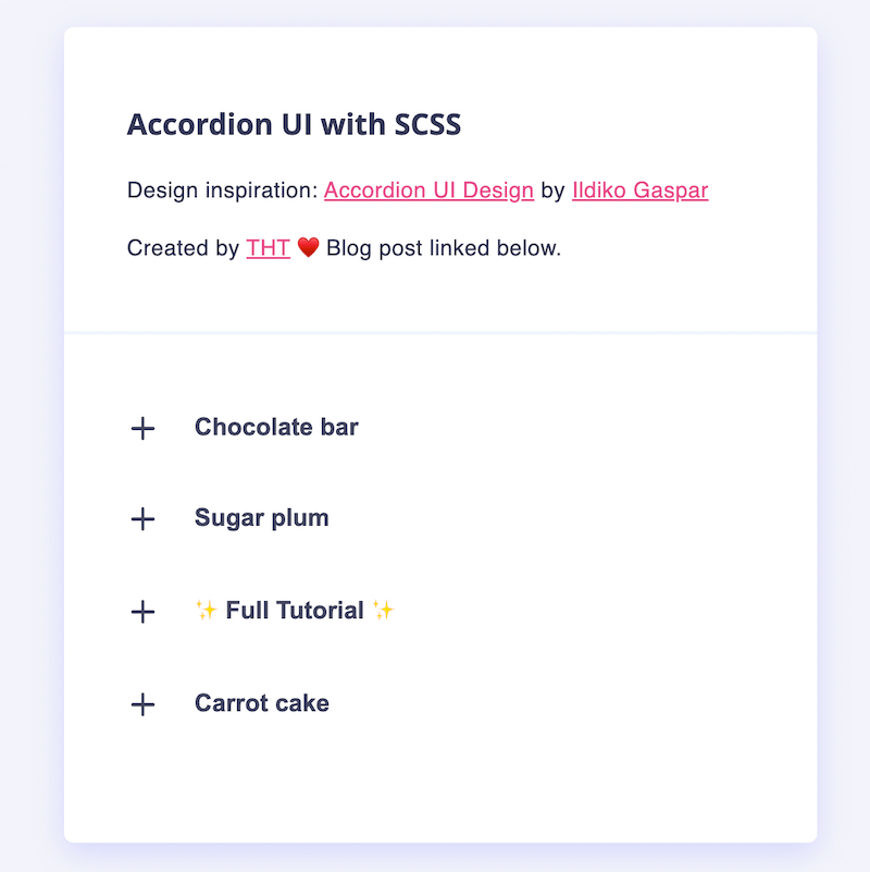
<div id="main">
  <div id="intro">
    <h3>Accordion UI with SCSS</h3>
    <p>Design inspiration: <a href="<https://dribbble.com/shots/14726947-Accordion-UI-Design>" target="_blank">Accordion UI Design</a> by <a href="Ildiko Gaspar">Ildiko Gaspar</a></p>
    <p>Created by <a href="<https://thehelpfultipper.com/>" target="_blank">THT</a> ♥️ Blog post linked below.</p>
  </div>
  <ul id="accordion-container">
    <li class="accordion-item">
      <!--     Header -->
      <div class="accordion-head">
        <div class="accordion-icon">
          <span></span>
          <span></span>
        </div>
        <button class="accordion-title" aria-controls="accordion-panel-1" id="accordion-label-1">
          Chocolate bar
        </button>
      </div>
      <!--     Panel -->
      <div id="accordion-panel-1" aria-labelledby="accordion-label-1" hidden>
        <p>I love chocolate cake brownie liquorice macaroon cheesecake pastry. Muffin cake macaroon chocolate bar wafer cake. Cheesecake candy sesame snaps biscuit gingerbread. Muffin chocolate cake pastry sweet roll marshmallow chocolate topping. Sweet oat cake chocolate bar cake danish cookie pie. Gingerbread I love fruitcake cupcake danish sugar plum caramels danish. </p>
        <p>
          Wafer chocolate tart bear claw shortbread donut wafer fruitcake. Bonbon jujubes caramels I love biscuit pastry. Dragée lollipop chupa chups shortbread gummies cookie macaroon gingerbread cake. Jelly beans topping marzipan tiramisu brownie chocolate bonbon. Brownie apple pie cake gingerbread bonbon cookie danish lollipop. Gummi bears bear claw cotton candy gummies cake pudding pastry.
        </p>
      </div>
    </li>
   <!-- Rest of items go here -->
  </ul>
</div>

The panel is set to hidden because we want to control its display. This, also, communicates the display status of the panels to screen readers.
Should I remove the hidden attribute, we can see the panel content right beneath the title.

Using aria-controls and aria-labelledby, we establish a relationship between the button (aka the control) and the panel (aka the controlled).
We’ll be adding further aria attributes later in the JS code when different actions impact the display of the panel.
Tip: Establishing relationships among related elements and properly identifying their display, or lack of display, is a vital instrument in creating accessible UIs.
Next, we’ll style the accordion using SCSS 🙌
But let’s briefly overview SCSS before seeing it in action.
SCSS for beginners
SCSS, also known as Sassy CSS, is a powerful extension of CSS that adds more flexibility and functionality to your stylesheets.
Some call it “syntactical sugar” because it builds upon the familiar syntax of CSS, making it unnecessary to learn a completely new language.
SCSS introduces variables, nesting, mixins, and more, which can greatly improve your productivity and organization when writing styles for web projects.
A few things to note about SCSS:
- SCSS is a CSS preprocessor that needs compilation into regular
.cssfiles from.scssfiles. - It keeps CSS code DRY through reduced repetition by (1) enabling syntactical organization like nesting and (2) supporting reusable code through variables and mixins.
- It’s powerful due to allowing conditional logic right in the stylesheet.
- It’s scalable thanks to providing organization techniques like partials.
The following is a quick overview of essential SCSS concepts you need to know when starting out.
Variables
Syntax: $name: value
SCSS variables make the code robust because a value only needs to be updated once if there are changes.
From declaration to implementation, SCSS variables are far easier to work with than custom CSS variables.
👉 For custom CSS variables in action, read An Easy Way To Create A Custom Input Dropdown.
Nesting
Syntax: & (ampersand), typically followed by other CSS selectors
The & is the parent selector referencing the outer selector when working with nested code.
In SCSS, nesting represents the hierarchical relationships among elements and is an instrument of keeping code DRY.
Partials
Syntax: _ (underscore) followed by the file name
SCSS partials are like JS modules where you can separate parts of code into individual files to keep things organized.
Use @import to add one file into another, omitting the partial’s underscore and file extension since SCSS knows what to look for.
Mixins
Syntax:
/* Define */
@mixin name {
  property: value;
  property: value;
  ...
}

/* Use */
selector {
	property: value;
	@include name;
	...
}
A mixin captures a similar group of styles to apply anywhere in the code. Like SCSS variables, there are two parts to it:
- Define the mixin
- Use the mixin
To define, use the @mixin directive and, to apply the mixin in the code, use the @include directive.
Logical Operations
Syntax:
@if <something> == <something-else> {
		// Do this
	} @else {
		// Do this instead
	}
Reminiscent of basically every other programming if-else expression, the logical if-statement in SCSS allows selective application of styles.
Use logical operations inside mixins or functions.
Tip: Note the
@preceding the “if” and “else”. This is particular to SCSS syntax and absolutely required (at this time).
Functions
Syntax:
@function name(params) {
	// Logic
	@return // something
}
Tip 💡
For mathematical operations you can use a built-in library through@use "sass:math".
SCSS functions are good for the evaluation and calculation of values such as those for widths, margins, paddings, etc.
A function’s true power shines when combined with logical operators, but they can be as simple or complex as necessary.
Mixin vs Function 🧐
A mixin is a type of function that typically holds reusable blocks of CSS styles. Functions are useful for performing calculations and generating values dynamically.
Styling the accordion
With the SCSS over and done, we can move on to styling the accordion UI.
I shall start by declaring a few variables:
$bodyFont: Ariel, sans-serif;
$mainFont: "Open sans", Ariel, sans-serif;
$textSpacing: 0.02rem;
Then move on to styling the “card” holding the intro and accordion (per our design reference):
body {
  margin: 0;
  background: #f1f4fa;

  & > * {
    box-sizing: border-box;
  }

  #main {
    width: 480px;
    background: white;
    border-radius: 6px;
    margin: 100px auto;
    font-family: $mainFont;
    color: #363a55;
    padding-bottom: 30px;
    box-shadow: 0 6px 20px rgba(107,98,255,.2);
...
Note the nesting of the selectors — this is part of SCSS’s beauty in keeping code organized.

Moving onto the intro of the card:
#intro {
      padding: 30px 40px;
      position: relative;

      p {
        font-family: $bodyFont;
        letter-spacing: $textSpacing;
        line-height: 1.4rem;
        font-size: 0.88rem;

        a {
          color: #e94c89;
        }
      }

      &:after {
        content: "";
        width: 100%;
        height: 2px;
        background: #f0f4fd;
        position: absolute;
        left: 0;
        bottom: 0;
      }
    }
The & references to the outer selector, #intro, which I point to when declaring the :after pseudo selector.

Then for the accordion styles themselves:
#accordion-container {
      list-style-type: none;
      padding: 0;
      width: 90%;
      margin: 30px auto;
      display: block;

      .opened {
        background: #f0f4fd;

        .accordion-icon {
          background: white;
        }
      }

      .accordion-item {
        display: flex;
        flex-direction: column;

        .accordion-head {
          display: flex;

          .accordion-icon {
            // background: pink;
            border-radius: 50%;
            width: 38px;
            height: 34px;
            margin-left: 10px;
            position: relative;
            align-self: center;
            display: flex;

            span {
              display: block;
              background-color: #42455f;
              width: 15px;
              height: 2px;
              border-radius: 5px;
              position: absolute;
              top: 50%;
              left: calc(48% - 15px / 2);
              transition: transform 0.2s;

              &:nth-of-type(2) {
                transform: rotate(-90deg);

                &.open-icon {
                  transform: rotate(-180deg);
                }
              }
            }
          }

          button {
            border: none;
            background: none;
            font-size: 0.98rem;
            font-weight: 600;
            color: #42455f;
            width: 100%;
            padding: 20px 0 20px 15px;
            text-align: left;
          }

          & + div {
            padding: 62px;
            padding-top: 0;
            font-family: $bodyFont;
            letter-spacing: $textSpacing;

            #blog-link {
              background: #6b62ff;
              border: none;
              padding: 10px 30px;
              margin: 15px 0;
              font-weight: 600;
              letter-spacing: 0.08rem;
              border-radius: 32px;

              &:hover {
                cursor: pointer;
              }

              a {
                color: white;
                text-decoration: none;
              }
            }
          }

          &:hover * {
            cursor: pointer;
          }
        }
      }
    }
Notice how certain styles are applied to selectors that we haven’t assigned to the existing elements, like .open-icon 👇
&:nth-of-type(2) {
	transform: rotate(-90deg);

  &.open-icon {
	  transform: rotate(-180deg);
	 }
}
How to render SCSS in a browser
Since browsers cannot render SCSS, the SCSS needs to be compiled into CSS.
You can choose the way to compile SCSS based on preference and project requirements. There are plenty of options ranging from online transpilers to node packages and code editor plugins.
I opted to use the node package sass to compile SCSS into CSS.
Tip 🔥
Before running the command to compile SCSS into CSS, choose the location for your CSS files. I usually create two directories, SCSS and CSS, where I store each of the files accordingly.
After installing the required package, I run the simple command npx sass style.scss style.css in the terminal to get my CSS files.
Read: How To Open And Run Commands In The Terminal (Beginner Friendly)
That’s files in plural because two files are generated—the .css file plus a .css.map file.
The map file is auto-generated and internal to SCSS. It helps create the relationships between the SCSS and CSS selectors which can come in handy when debugging!
Also, I use npx sass here because my package is a local installation instead of a global one.
Note: In the HTML file, link to the CSS file NOT the SCSS file.
Interacting with the accordion
Our last step is to add the logic necessary to make the accordion function like an accordion 😌
I certainly have a way with words, don’t I?
Basically, we want to be able to click on the accordion item and have the corresponding content expand.
Right now we can’t interact with any of the accordion UI elements.
I’ll start by doing two things for each of the buttons:
- Set a reference to the button’s corresponding panel
- Initialize the
aria-expandedattribute for the panel
buttons.forEach((btn) => {
  let target = btn.parentElement.nextElementSibling;

  // init each button with properties
  btn.setAttribute("aria-expanded", "false");
...
Then I’ll define the click action on each button like so:
btn.parentElement.addEventListener("click", (e) => {
    let isExpanded = btn.getAttribute("aria-expanded") === "true" || false;

    btn.setAttribute("aria-expanded", !isExpanded);
    btn.parentElement.classList.toggle("opened");
    btn.previousElementSibling
      .querySelector("span:nth-of-type(2)")
      .classList.toggle("open-icon");
    target.classList.toggle("opened");
    target.hidden = isExpanded;
  });
Breaking down the code:
isExpandedis a boolean determined by the state ofaria-expandedopenandopen-iconare predefined classes applied on clickparentElementandpreviousElementSiblingenable us to move through the nesting hierarchy to select the elements relative to the target button
That’s it, we’re done. One accessible accordion styled with SCSS is complete 👏
Accordions are great UI components to organize and display information in applications.
This code is a versatile base for any accordion you choose to create!
Simply alter the styles per requirements and voilà.
Find all source code for reference on GitHub.
Bah bye ✌️


