
Are you tired of using the browser datepicker and want to create a custom one that best matches your design?
If so, this is the post for you. We’ll show you how to create a custom datepicker based on a dribbble design.
We know that building a datepicker from scratch can be time-consuming and frustrating.
That’s why we’re going to show you how to use refactoring techniques from a reference code project to make the development process much more straightforward.
And the best part is that you don’t need to be a coding expert to follow along!
Our step-by-step guide will walk you through the process of analyzing design requirements, breaking them down into components, and customizing a datepicker to match your design.
We’ll be using JavaScript, CSS, and HTML to create our custom datepicker.
See the Pen Custom Datepicker by Klea Merkuri (@thehelpfultipper) on CodePen.
Ready? 🤗
Setting up the custom datepicker HTML
Since I try to understand what I do in life (for the most part), I start every project by taking it apart.
Let’s break down the custom datepicker design to understand the different components and logical parts we’ll need to incorporate.
First, there are two main components:
- input: Acts as a toggle button, displays selected date
- calendar: Provides date selection
Second, breaking down the calendar even further we have:
- Calendar header
- navigation arrows
- month and year display
- Calendar body
- 6 rows with the first listing the days from Monday to Sunday
- 7 columns for each day of the week
- dates not of the current month are disabled
- current date is pre-selected
Third, I decided to skip the footer because canceling will be done by clicking the input, and choosing the date will automatically occur once clicking on a date.
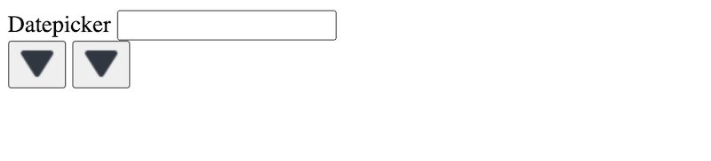
Putting these different parts into HTML gives the following:
<div id="date_picker">
  <div id="date_picker_input">
    <label>Datepicker</label>
    <input type="text" id="date" />
  </div>
  <div id="date_picker_calendar">
    <div id="calendar_header">
      <button class="cal-btn back"><img src="data:image/png;base64,iVBORw0KGgoAAAANSUhEUgAAABgAAAAYCAYAAADgdz34AAAACXBIWXMAAAsTAAALEwEAmpwYAAABJUlEQVR4nO2Uv0oDQRCHR9BKrAQJ2FgIdnc7njtzSbMzd7lGC80T5DXMW+gzpNJHsPEJYuELBA60EBELsfIfBGIixvNyt0IKP9h2vt3fb1iAfxaCXZt0DGuOrO8+jmHNQ3JHnwLDeutrOI4lJDcTAcngDwSDSUSkCbK++RSEJAdfejCkfX+31/63oq1N15H0rn7Bch80s42Z22SsdGsLrHQLVxZJLioLSC8BYKlQELLbQpanCrk/Y+y2C4dPFd6bP3s9hrI455aR9GqO219HUbRSWjB6xV5qDcnL7wJ5RZs2oQpIelqi2BOoShBkq0g6LMg932m11qAOhnX/5+zlEHyALOczhp+BL6x1DSR9mPoOHsM42QSfGE6yUR+kQxO7ttfhC80HheuaG9wAq10AAAAASUVORK5CYII="></button>
      <span></span>
      <button class="cal-btn front"><img src="data:image/png;base64,iVBORw0KGgoAAAANSUhEUgAAABgAAAAYCAYAAADgdz34AAAACXBIWXMAAAsTAAALEwEAmpwYAAABJUlEQVR4nO2Uv0oDQRCHR9BKrAQJ2FgIdnc7njtzSbMzd7lGC80T5DXMW+gzpNJHsPEJYuELBA60EBELsfIfBGIixvNyt0IKP9h2vt3fb1iAfxaCXZt0DGuOrO8+jmHNQ3JHnwLDeutrOI4lJDcTAcngDwSDSUSkCbK++RSEJAdfejCkfX+31/63oq1N15H0rn7Bch80s42Z22SsdGsLrHQLVxZJLioLSC8BYKlQELLbQpanCrk/Y+y2C4dPFd6bP3s9hrI455aR9GqO219HUbRSWjB6xV5qDcnL7wJ5RZs2oQpIelqi2BOoShBkq0g6LMg932m11qAOhnX/5+zlEHyALOczhp+BL6x1DSR9mPoOHsM42QSfGE6yUR+kQxO7ttfhC80HheuaG9wAq10AAAAASUVORK5CYII="></button>
    </div>
    <div id="cal_wrapper">
      <div id="cal_days"></div>
      <div id="calendar_main"></div>
    </div>
  </div>
</div>
Note: For the calendar navigation buttons I’m using triangle icons from a third-party repository hence the cryptic code 🥸
What’s worthy of note are the three wrappers that will get populated via JavaScript:
- the
<span>under#date_picker_calendarthat holds the header month and year cal_daysrepresenting the first row of the calendar body holding the names of the dayscalendar_mainwhich holds the dates of the calendar based on the month in a display
Adding styles using CSS
I’ll start with styles by setting the main colors in :root as custom CSS variables.
:root {
  --dark-body-bg: #232429;
  --light-body-bg: #F5F7FB;

  --dark-input: #323741;
  --light-input: #ffffff;

  --dark-border: #484D5A;
  --light-border: #B8BCCB;

  --dark-date-foreground: #FFFFFF;
  --dark-inactive-fg: #636A78;
  --dark-active-fg: #9CA0B1;
  --dark-current-year: #3B414A;
  --dark-current-year-fg: #B2B8C9;
  --dark-selected: #1D5EFF;
  --dark-hover: #2C437B;
  --dark-arrows-bg: #B0B8CC;
  --dark-arrows-fill: #333641;
}
The custom datepicker by default will be dark-themed. Despite defining three light-theme alternatives, I won’t add a theme selection option to this project.
But, should you be in for a challenge, continue by defining the light theme alternatives just like we did in An Easy Way To Create A Custom Input Dropdown.
Next, declare universal box-sizing with inheritance to keep, as Meghan Trainor puts it, “all the right junk in all the right places”.
html {
  box-sizing: border-box;
}

*, *:before, *:after {
  box-sizing: inherit;
}

body {
  height: 100vh;
  background: var(--dark-body-bg);
  font-family: Helvetica, sans-serif;
}
Jk, it’s to make working with our layout easier and consistent 😛
Datepicker input
Moving on, we’ll tackle the datepicker input, label, and wrapper.
#date_picker {
  width: 300px;
  margin: 0 auto;
  transform: scale(1.2);
  position: relative;
  top: 15%;
}

#date_picker_input {
  margin-bottom: 8px;
}

label {
  display: block;
  color: #8A8F9F;
  font-size: 1.02rem;
  font-weight: 300;
  margin-bottom: 10px;
}

#date {
  color: var(--dark-date-foreground);
  font-size: 16px;
  padding: 12px 20px;
}
Some styles, such as those of the input and main calendar wrapper, #date_picker_calendar, happen to be the same so I’ll use a CSS multi-selector to avoid repeating code.
Read: Common CSS Selectors To Know And How To Use Them
#date_picker_calendar {
    min-height: fit-content;
    box-shadow: 10px 10px 40px rgba(0,0,0,0.2);
    overflow: hidden;
    padding: 12px;
}

#date,
#date_picker_calendar {
    border-radius: 15px;
    background: var(--dark-input);
    border: 2px solid var(--dark-border);
    width: 100%;
}
Awesome! The input is looking much finer now 😊
Pop-up calendar body
Our next stylistic goal is to prep the calendar body which includes the header and main body.
First, for the header, we’ll take care of those ridiculous-looking arrow buttons. They’re an eyesore and, regardless of DM’s teasing, they actually bother me. A lot 😒
#calendar_header {
  width: 100%;
  min-height: 30px;
/*   background: pink; */
  margin-bottom: 8px;
  color: var(--dark-date-foreground);
  display: flex;
  align-items: center;
  justify-content: space-between;
}

.cal-btn {
  width: 20px;
  height: 20px;
  background: var(--dark-arrows-bg);
  border: none;
  padding: 0;
  margin: 0;
  border-radius: 6px;
}

.cal-btn img {
  width: 42%;
  height: 42%;
}

.cal-btn.back img {
  transform: rotate(90deg);
}

.cal-btn.front img {
  transform: rotate(-90deg);
}
Hint: I use a flex container to position the arrow icons on either end of the calendar header. For flexbox in action check out How To Build An Easy Animated Hamburger Menu.
Then finish off with the remaining styles for the popup calendar’s main body.
#cal_days,
#calendar_main {
  display: grid;
  grid-template-columns: repeat(7, 1fr);
  row-gap: 5px;
  column-gap: 5px;
  color: var(--dark-inactive-fg);
}

#cal_days {
  margin-top: 10px;
  margin-bottom: 10px;
}

#calendar_main {
  grid-template-rows: repeat(5, min(30px));
}

.cell_wrapper {
/*   background: yellow; */
  display: flex;
  justify-content: center;
  align-items: center;
  border-radius: 8px;
  position: relative;
}

.current {
  background: var(--dark-current-year);
  color: var(--dark-current-year-fg);
}

.current:not(.active):hover {
  background: var(--dark-hover);
  color: var(--dark-date-foreground);
  border: 2px solid var(--dark-selected);
}

.cal-btn:hover,
.current:hover {
  cursor: pointer;
}

.active {
  background: var(--dark-selected);
  color: var(--dark-date-foreground);
}

.inactive_indicator:after {
/*   text-decoration: underline; */
  content: '';
  width: 3px;
  height: 3px;
  background: red;
  border-radius: 50%;
  position: absolute;
  bottom: 3px;
  left: 50%;
}
The slightly troubling fact is you won’t see visible changes with any of the above code. At least not yet.
Most of the elements we’re targeting with most classes defined above don’t exist because we’ll assign them to elements using JavaScript.
Hint: The first part of the code uses CSS Grid to create the calendar layout of rows and columns. For CSS Grid in action read How To Use JavaScript Loops With A BTS Example.
Refactoring code from JSX to vanilla JavaScript
Time to make our custom datepicker act as one…finally 😅
I’ll begin by refactoring the JSX code from our reference into vanilla JS.
Refactoring can be a nuanced process because, even when things look like they work, they don’t.
Keep in mind, we’ll be modifying things as we go and I already kinda regret doing this to myself but onwards we go 💪
How to approach code refactoring
The best question when it comes to refactoring code is: where do I start?
And it’s a totally valid question because damn but it’s intimidating. The logical structure and flow of one syntax don’t translate line by line into another.
So, for the logic steps, my approach is to adopt the React code run-through mentality.
Much like a debugger with breakpoints 🤖, I’ll walk through the logic line by line by doing the following:
- looking at the rendered JSX
- locating the event handler
- referencing the pointer in the event handler
As an example, let’s figure out how to dynamically populate the month and year in the header.
- First, note the JSX code rendering
{this.getMonthStr(this.state.month)}. It tells us we need to locate thegetMonthStr()function which takes the current month as an argument. - Second, see that we already have a variable pulling the current month from
date.getMonth(). - Third, refactor
getMonthStr()toconst getMonthStr = month => months[Math.max(Math.min(11, month), 0)] || 'Month'. The function takes in a month and grabs the corresponding month string from themonthsarray.
Following this pattern, I’ll proceed to refactor the rest of the logic. Let’s go!
Define the initial variables
What I call “initial variables” are the basic pointers to DOM calendar elements, static variables like days and months lists, and day-specific variables.
const calendar = document.querySelector("#calendar_main"),
  input = document.querySelector("#date"),
  calHeader = document.querySelector("#calendar_header"),
  calHeaderTitle = document.querySelector("#calendar_header span"),
  calDays = document.querySelector("#cal_days"),
  days = [
    "Sunday",
    "Monday",
    "Tuesday",
    "Wednesday",
    "Thursday",
    "Friday",
    "Saturday"
  ],
  months = [
    "January",
    "February",
    "March",
    "April",
    "May",
    "June",
    "July",
    "August",
    "September",
    "October",
    "November",
    "December"
  ];

let oneDay = 60 * 60 * 24 * 1000;

let todayTimestamp =
  Date.now() -
  (Date.now() % oneDay) +
  new Date().getTimezoneOffset() * 1000 * 60;

let selectedDay = todayTimestamp;
For the days, I started Mon – Sun like the design does but I noticed two things:
- The design calendar is incorrect since April 2021 has 30 days with the first being on a Thursday 🫢
- Starting on Monday created strange date cutoffs like Jan 2022 starting on the second. I found this plain awkward so to satisfy myself more than anyone else I tweaked the design and switched the days to a Sun – Sa calendar 😏

Then we use the number of milliseconds in a day to calculate the current day’s timestamp and proceed to set that as the selected day. This part of the code is all from the reference.
Get the number of days in a month
The reference code makes use of the built-in JavaScript Date objects for a lot of the calculations.
To retrieve the number of days based on a given month and year, we use a function that takes in a year and a month and returns the number of days.
const getNumberOfDays = (year, month) => {
  return 40 - new Date(year, month, 40).getDate();
};
Since month is passed into the Date object, it needs to be a zero-based value with zero indicating the first month of the year.
Calculate day and month details
Let’s refactor the two functions charged with providing the details we need for each day of the month.
First, there’s the getDayDetails() function that takes in an object and uses the properties of that object to return another object.
const getDayDetails = (args) => {
  let date = args.index - args.firstDay;
  let day = args.index % 7;
  // console.log(day)
  let prevMonth = args.month - 1;
  let prevYear = args.year;
  if (prevMonth < 0) {
    prevMonth = 11;
    prevYear--;
  }
  let prevMonthNumberOfDays = getNumberOfDays(prevYear, prevMonth);

  let _date =
    (date < 0 ? prevMonthNumberOfDays + date : date % args.numberOfDays) + 1;
  // console.log(_date)
  let month = date < 0 ? -1 : date >= args.numberOfDays ? 1 : 0;
  let timestamp = new Date(args.year, args.month, _date).getTime();
  // console.log(timestamp)
  return {
    date: _date,
    day,
    month,
    timestamp,
    dayString: days[day]
  };
};
Second, the getMonthDetails() function provides the properties of the object that’s passed as an argument to the function defined above.
This way we get a list of objects with each object holding the details for each month.
const getMonthDetails = (year, month) => {
  let firstDay = new Date(year, month).getDay();
  let numberOfDays = getNumberOfDays(year, month);
  let monthArray = [];
  let rows = 5;
  let currentDay = null;
  let index = 0;
  let cols = 7;

  for (let row = 0; row < rows; row++) {
    for (let col = 0; col < cols; col++) {
      currentDay = getDayDetails({
        index,
        numberOfDays,
        firstDay,
        year,
        month
      });
      monthArray.push(currentDay);
      index++;
    }
  }
  return monthArray;
};
Tip 🤓
Change the index variable from zero toindex = 1if starting on Monday (like the design) and re-adjust the days array.
Define stateful variables
In React, state plays a huge role since it keeps track of the values of variables.
In fact, React’s ability to keep track of state with minimal effort on the developer’s side is what makes it ideal for front-end web dev.
Vanilla JS, on the other hand, is cumbersome in doing the very same thing but we’ll do it anyway.
So let’s define the stateful variables from the reference:
let date = new Date();
let year = date.getFullYear();
let month = date.getMonth();
let monthDetails = getMonthDetails(year, month);
All these variables change. For example, if either arrow button is clicked, monthDetails changes to reflect the days of the new month.
Picking a new date on the calendar will result in date changing.
I think you get the gist.
Then, I’ll define two functions that check if a specific day on the calendar is (a) the current day and (b) the selected day.
const isCurrentDay = (day, cell) => {
  if (day.timestamp === todayTimestamp) {
    cell.classList.add("active");
    cell.classList.add("isCurrent");

  }
};

const isSelectedDay = (day, cell) => {
  if (day.timestamp === selectedDay) {
    cell.classList.add("active");
    cell.classList.add("isSelected");
  }
};
The class isCurrent will help me identify which day is today. This shouldn’t change within a given day no matter what other day is chosen on the calendar.
While isSelected is a class that will always change based on user selection.
Note: Both functions have similar alternatives on the reference code, but they’re adjusted to do something else!
Set the calendar header
The calendar header is comprised of two parts:
- a display of the calendar month and year
- two arrow buttons that control the given month
Use getMonthStr() to retrieve the full month as a string. Recall that month actually contains the month as a zero-based value hence the necessary conversion.
const getMonthStr = (month) =>
  months[Math.max(Math.min(11, month), 0)] || "Month";
To set the dynamic calendar header use setHeader().
const setHeader = (year, month) => {
  calHeaderTitle.innerHTML = getMonthStr(month) + " " + year;
};

// Set calendar header
setHeader(year, month);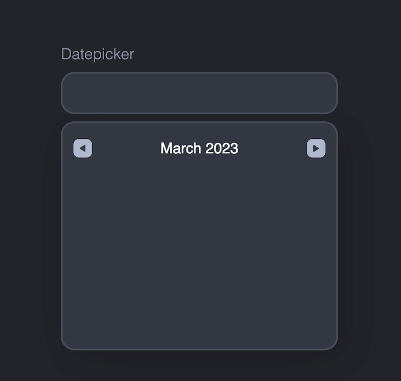
Follow with setHeaderNav() which is responsible for adding functionality to the arrow buttons by letting them control incrementally the year and month.
const setHeaderNav = (offset) => {
  month = month + offset;
  if (month === -1) {
    month = 11;
    year--;
  } else if (month === 12) {
    month = 0;
    year++;
  }
  monthDetails = getMonthDetails(year, month);
  // console.log(getMonthDetails(year, month))
  return {
    year,
    month,
    monthDetails
  };
};
Note 🧐
This function increments the month and determines the year based on the month. Such behavior is unlike that in other pop-up calendars which allow you to increment the month and year individually, like that in the reference (there are two sets of arrows).
We’ll come back to setHeaderNav() once we get our calendar body up and running.
Show the date in the input field
Now, I’d like the current day or selected day to display on the input field as an indicator.
To show the date in the input field, we first need to extract a date from the timestamp by way of the Date object methods like the getDate() method.
const getDateStringFromTimestamp = (timestamp) => {
  let dateObject = new Date(timestamp);
  let month = dateObject.getMonth();
  let date = dateObject.getDate();

  return `${getMonthStr(month)} ${date}, ${dateObject.getFullYear()}`;
};
I adjusted the refactored function to return a slightly different date string. Instead of the original form, “2023-02-23”, getDateStringFromTimestamp() returns “February 23, 2023”.
Then set this date string to the input like so:
const setDateToInput = (timestamp) => {
  let dateString = getDateStringFromTimestamp(timestamp);
  input.value = dateString;
};

setDateToInput(todayTimestamp);
Marvelous 😁 Things are moving along rather nicely.
Populate the calendar body
We’ve neglected the calendar body thus far but no more. Time to get our calendar look on!
I start by adding the day rows to the calendar first using a for-loop.
Read: Introducing 4 Different Types Of JavaScript Loops With Examples
for (let i = 0; i < days.length; i++) {
  let div = document.createElement("div"),
    span = document.createElement("span");

  div.classList.add("cell_wrapper");
  span.classList.add("cell_item");

  span.innerText = days[i].slice(0, 2);

  div.appendChild(span);
  calDays.appendChild(div);
}
A few things to keep in mind:
- This is a one-time addition hence no need for a function. For instance, you don’t need to reconstruct the days’ row every time you change the month.
- A new element representing the cell is added to the calendar.
- Two predefined classes are assigned to the cell and its corresponding text.
- Using the string method, the day is truncated to only the first three letters.
Follow by adding dates to the calendar’s main body.
const setCalBody = (monthDetails) => {
  // Add dates to calendar
  for (let i = 0; i < monthDetails.length; i++) {
    let div = document.createElement("div"),
      span = document.createElement("span");

    div.classList.add("cell_wrapper");
    div.classList.add("cal_date");
    monthDetails[i].month === 0 && div.classList.add("current");
    monthDetails[i].month === 0 && isCurrentDay(monthDetails[i], div);
    span.classList.add("cell_item");

    span.innerText = monthDetails[i].date;

    div.appendChild(span);
    calendar.appendChild(div);
  }
};

setCalBody(monthDetails);
Function setCalBody() is similar to the days loop above only we define it as a function because we’ll be repeating this process every time one of the calendar arrows is clicked to update the calendar.
All this function does is iterate over the monthDetails array to generate cells for each of the days of the month.
Two conditional classes are applied:
- If the month is current, we’re setting the
currentclass (Hint: The current month has a value of zero pergetDayDetails(); a not-current month has a value of -1). - The classes pre-defined in
isCurrentDay().

Update the calendar based on arrow buttons
Are we there yet? Yes, we are 🙂
Time to add functionality to the arrow buttons. A good start is asking yourself, what happens when a button is clicked?
Two things happen:
- The calendar header reflects the new month (and, possibly, the new year)
- The calendar body is updated to display the dates of the new month
To make this happen, we use the updateCalendar() function.
const updateCalendar = (btn) => {
  let newCal, offset;
  if (btn.classList.contains("back")) {
    offset = -1;
  } else if (btn.classList.contains("front")) {
    offset = 1;
  }
  newCal = setHeaderNav(offset);
  // console.log(monthDetails)
  setHeader(newCal.year, newCal.month);
  calendar.innerHTML = "";
  setCalBody(newCal.monthDetails);
};

document.querySelectorAll(".cal-btn").forEach((btn) => {
  btn.addEventListener("click", () => {
    updateCalendar(btn);
  });
});
Based on the arrow button that’s clicked, we generate an incremental value as the offset.
We run the offset through setHeaderNav() defined earlier to get an object that contains the details we need to update the calendar’s header and body.
Tip: Setting the
innerHTMLof the calendar to an empty string resets the calendar body prior to updating it to avoid adding on top of the existing calendar body.
Everything looks good. We’re now able to move backward and forwards month- and year-wise, however, we can’t do things like select a date other than the current date 😔
Update the input based on the selected date
We want to be able to (a) select a date from the calendar and (b) have the selected date display on the input.
In updateInput() , we’ll add a click event to each of the current month’s calendar dates.
Then we check with which value each clicked target matches from the monthDetails array to update the selected date and display it in the input field.
FYI, this is the part that React does a stellar job of managing without all this extraneous looping.
const updateInput = () => {
  let currentDay = document.querySelector(".isCurrent");
  // Update input based on clicked cell
  document.querySelectorAll(".cell_wrapper").forEach((cell) => {
    if (cell.classList.contains("current")) {
      cell.addEventListener("click", (e) => {
        let cell_date = e.target.textContent;

        // Remove active state from current day

        for (let i = 0; i < monthDetails.length; i++) {
          if (monthDetails[i].month === 0) {
            if (monthDetails[i].date.toString() === cell_date) {
              selectedDay = monthDetails[i].timestamp;
              setDateToInput(selectedDay);

              // Assure only one calendar day is selected

              isSelectedDay(monthDetails[i], cell);

              // Remove inactive state if current day is clicked

            }
          }
        }
      });
    }
  });
};

updateInput();
Hold up, pause. Did you notice those JS comments in the code above 👆
Read: This Is How To Comment In HTML, CSS, And JavaScript
And do you see how clicking on any of the calendar dates sets them to active but never removes the active state?
We need to correct that. There should only be one active date on the calendar at a time and to do that:
- Remove the active state from the current day
- Assure only one calendar day is selected
- Remove the inactive state if the current day is clicked
1. currentDay !== null && currentDay.classList.remove("active");

2. selectOnClick();

3. cell.querySelector('span').classList.contains('inactive_indicator')
              && cell.querySelector('span').classList.remove('inactive_indicator');
Numbers 1 and 3 are self-explanatory but 2 needs some defining since the function doesn’t exist yet 😬
The selectOnClick() function will be the one enforcing the one-day-click rule.
const selectOnClick = () => {
  document.querySelectorAll(".cell_wrapper").forEach((cell) => {
    cell.classList.contains("isSelected") && cell.classList.remove("active");

    if(cell.classList.contains("isCurrent") &&
      !cell.classList.contains("active")) {
      cell.querySelector("span").classList.add("inactive_indicator");
    }
  });
};
Define selectOnClick() before updateInput() since we call it inside of the latter.
Where you call the function is just as important since it needs to come before setting the selected date.
What selectOnClick() does is to remove the active state from any calendar date that has it. Then it adds a special inactive class to the current date when it’s not active (this is removed using number 3 above).
And voila, this is what we get:
Don’t forget to call
updateInput()again on click of the arrow buttons since the calendar body changes based on the offset!
Finishing things off
To add the finishing touches and call it a day (or not, who else grew sick of days or dates 🥴) start by making the input field non-editable by setting the readonly attribute.
We do this because the input’s role is solely superficial – it’s there to look pretty and show the date. C’est tout!
Next, change the cursor into a pointer when hovering over the input. This serves as an indication to the user that there’s some action that’ll take place.
Pointer cursors always make me want to click something. Who can relate?
#date:hover {
  cursor: pointer;
}
Follow by adding an arrow indicator to the input as we did An Easy Way To Create A Custom Input Dropdown.
#date_picker_input:after {
  content: "▾";
  padding: 12px 15px;
  position: absolute;
  right: 4px;
  top: 42%;
  color: #8A8F9F;
}
Now, we are left off with three toggle actions both occurring on click of the input.
One is to toggle the calendar, the other is to toggle the showCal class, and the last is to control the outline while on focus using the onFocus class.
#date.onFocus:focus {
  outline: none;
}

#date_picker_input.showCal:after {
  transform: rotate(180deg);
}

.hidden {
  visibility: hidden;
}
Tip: Assign
class="onFocus"to the input so there’s no default outline to start off with! Otherwise, you’re in for the reverse behavior when toggling on click.
The transformation will rotate the arrow indicator so it points the correct way!
And don’t forget to add class="hidden” to the calendar so it’s not visible on page load.
input.addEventListener('click', () => {
  document.querySelector('#date_picker_calendar').classList.toggle('hidden');
  document.querySelector('#date_picker_input').classList.toggle('showCal');
    document.querySelector('#date').classList.toggle('onFocus');
});
This brings us to the end of the custom datepicker project 👏
Thanks to some code refactoring, we built a pop-up calendar datepicker from scratch customizing it per our design.
Easy? No. Heck, not.
Even with the existing code, refactoring was a serious pain. But we persevered (even though someone’s going to need scalp therapy afterward 😒).
Find the source code on GitHub for your reference.
‘Till then, veloma!


