
Table of Contents
Want to add some flair and creativity to your select menus?
In this tutorial, I’ll walk you through the steps of creating a custom input dropdown that is both stylish and functional.
With just a little bit of HTML, CSS, and JavaScript, you can create a dropdown menu that stands out and perfectly matches the design of your website.
For this project, we’re going way beyond the built-in HTML <select> tag since our fancy, modern input dropdown provides a filter capability.
A user can either click and select (the traditional behavior) or search and select (the modern approach).
It might not be that mind-blowing for simple selections, but think of long lists (like selecting countries or timezones) and you’d thank your lucky stars there’s a way to search without scrolling.
Of course, we’re THT, we don’t stop at merely creating an awesome component 😏
As a bonus, we’ll be implementing a dark/light theme to go along with our custom input dropdown.
Are we being extra? Heck ya, it’s programming after all 💁♀️
See the Pen Input Dropdown Light/Dark by Klea Merkuri (@thehelpfultipper) on CodePen.
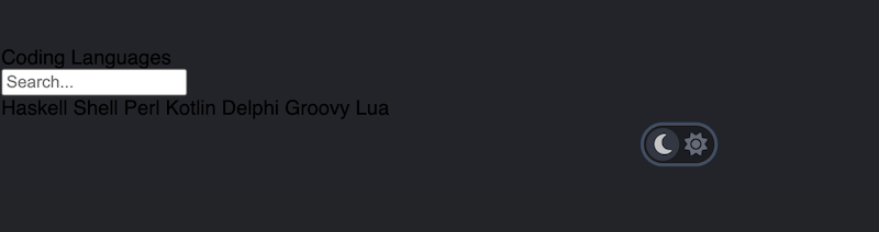
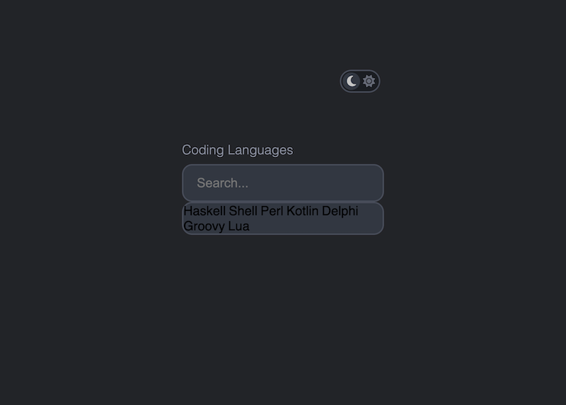
What the project looks like
The end product should:
- allow the user to toggle between light and dark themes
- provide the ability to search by input
- filter the options based on a search query
Style-wise, I’ll be implementing Jan Hoffmann’s design for light and dark UI elements from dribbble.
The input itself will be for selecting from a list of coding languages ’cause some are hilariously unique (as you’ll see).
Starting out with <datalist>, and why it won’t work
Before fully diving into the project I want to bring attention to my failed attempt at using the built-in HTML datalist element.
A <datalist> pretty much constructs the input dropdown we want with the desired functionality. Using <datalist> simplifies a lot of the customization I expected to do.
Apparently, I’m still fooled by things that are too good to be true 😔
I went so far as to use a webkit prefix, one of quite a few vendor prefixes, to remove the datalist dropdown arrow from a browser like Chrome.
All was going well until I ran into the rather huge issue of being unable to customize the datalist styles.
As it turns out, datalist styles are browser dependent and offer little flexibility when it comes to design. A sad fact since their functionality is on point 😢
So, how do we get our dropdown and make it consistent with our design?
We turn to full-on customization meaning we give up on the built-in datalist element and replace it with a div-span job!
Setting up a theme toggler and dropdown input
I chose a dark theme as the default project theme so I’ll begin by giving the body container a class of dark. That’s because I’ll use a body class to determine toggled preferences later on with JavaScript.
Note: I’m not taking system preferences into consideration for this example.
Since the focus of this article isn’t on how to build a toggle switch, I’ll be borrowing the wickedly cool one W3Schools provides and modifying it.
Then I add two Font Awesome icons within the slider span – a moon and a sun.
<body class="dark">

  <label class="switch">
    <input type="checkbox">
    <span class="slider round">
      <i class="fa-solid fa-moon"></i>
      <i class="fa-solid fa-sun"></i>
    </span>
  </label>

</body>
Need help embedding Font Awesome icons in your projects? Check out How To Install Font Awesome Icons In HTML.
By structuring the toggle switch using a checkbox input you can have the “toggle” effect with plain CSS. I found this an interesting approach as I’d probably have used divs instead 💁♀️
Next, I’m going to create a form with an input and corresponding dropdown selection.
  <form>
    <label>Coding Languages</label>
    <div class="dropdown">
      <input type="text" placeholder="Search..." id="language" autocomplete='off' />
    </div>

    <div class="dropdown_wrapper">
      <div class="languages_wrapper">
        <div id="languages">
          <span>Haskell</span>
          <span>Shell</span>
          <span>Perl</span>
          <span>Kotlin</span>
          <span>Delphi</span>
          <span>Groovy</span>
          <span>Lua</span>
        </div>
      </div>
    </div>
  </form>
The input has:
- a label identifying its selection
- an arrow that’s a Unicode character for a small compact down triangle (added as a pseudo element in CSS later on)
- a wrapper container around the input to apply the
:afterpseudo selector since pseudo selectors can only be defined inside container elements
What the label doesn’t have is the usual for-attribute that creates an association with the element of reference such as an input. The reason why I’m skipping it is to avoid triggering the dropdown on click of the label area.
Tip: Applying a pseudo selector directly on the input will not work. Instead, wrap the input in a container element and apply the pseudo selector to that.

Defining theme colors in :root
Before diving into styling our sad-looking elements, take a minute to figure out the color scheme for each theme.
I use custom CSS variables to set colors for the dark and light themes.
For CSS variables in action read How To Make A CSS Loading Dot Animation.
First, note what colors change between the light and dark themes such as:
- background-color
- selection and inputs
- inactive list items
- active foreground list items
- list item hover highlight
- border-color
- toggle switch
- background
- moon
- sun
Second, set the respective colors in variables with descriptive names to avoid confusion as you apply them.
:root {
  --dark-body-bg: #232429;
  --light-body-bg: #F5F7FB;

  --dark-input: #323741;
  --light-input: #ffffff;

  --dark-border: #484D5A;
  --light-border: #B8BCCB;

  --dark-inactive-list: #A2AABE;
  --light-inactive-list: #7C8294;

  --dark-active-list: #ffffff;
  --light-active-list: #1C5EFF;

  --dark-list-hover: #2A2E34;
  --light-list-hover: #E9EFFF;

  --dark-toggle-bg: #1B1D22;
  --light-toggle-bg: #ffffff;

  --dark-toggle-moon: #C4C4C4;
  --dark-toggle-sun: #656B77;

  --light-toggle-moon: #7A849B;
  --light-toggle-sun: #ffffff;
}
Tip 🤫
Use descriptive names for your custom CSS variables! They can be called anything you fancy but it’s better to make them easily identifiable. I recommend constructing custom variables with keywords like the “theme”, “color name”, “function”, etc.
Now apply your first CSS variables to the body like so:
body {
  height: 100vh;
  font-family: Helvetica, sans-serif;
  background: var(--dark-body-bg);
}

body.light {
  background: var(--light-body-bg);
}
Good, onto the rest of the elements 👇
Adding styles to the toggle switch
Let’s begin with the existing CSS code for the toggle switch that needs slight modifications.
/*
*
* Switch styles
* W3Schools => <https://www.w3schools.com/howto/howto_css_switch.asp>
*
*/

/* The switch - the box around the slider */
.switch {
  position: relative;
  top: 15%;
  left: 60%;
  display: inline-block;
  width: 60px;
  height: 34px;
}

/* Hide default HTML checkbox */
.switch input {
  opacity: 0;
  width: 0;
  height: 0;
}

/* The slider */
.slider {
  position: absolute;
  cursor: pointer;
  top: 0;
  left: 0;
  right: 0;
  bottom: 0;
  background-color: var(--dark-toggle-bg);
  border: 2px solid var(--dark-border);
  -webkit-transition: .4s;
  transition: .4s;
}

.slider:before {
  position: absolute;
  content: "";
  height: 26px;
  width: 26px;
  left: 2px;
  bottom: 2px;
  background: var(--dark-input);
  -webkit-transition: .4s;
  transition: .4s;
}

body.light .slider {
  background-color: var(--light-toggle-bg);
  border: 2px solid var(--light-border);
}

body.light .slider:before {
  background: var(--light-active-list);
}

input:focus + .slider {
  box-shadow: 0 0 1px #2196F3;
}

input:checked + .slider:before {
  -webkit-transform: translateX(26px);
  -ms-transform: translateX(26px);
  transform: translateX(26px);
}

/* Rounded sliders */
.slider.round {
  border-radius: 34px;
}

.slider.round:before {
  border-radius: 50%;
}
Other than colors, positioning is something you’d want to modify to get the switch moved to the correct place on the page.
Then style the Font Awesome icons while also positioning them appropriately inside the toggle switch.
.fa-solid {
  font-size: 18px;
  position: absolute;
  top: 21.6%;
/*   color: white; */
}

.fa-moon {
  left: 15.6%;
  color: var(--dark-toggle-moon);
}

.fa-sun {
  left: 58%;
  color: var(--dark-toggle-sun);
}

body.light .fa-moon {
  color: var(--light-toggle-moon);
}

body.light .fa-sun {
  color: var(--light-toggle-sun);
}
Although the switch moves when clicking (since the code manipulates a checkbox so CSS can do all the heavy lifting), notice that the color of the sun doesn’t change to mark it as the active choice. Nor does anything on the page change.
The switch looks like a switch but we’re still not quite there to make it function like one.
Nevertheless, it’s good enough at the moment. Onto creating the dropdown!
How to create a custom dropdown
Start by positioning the form element on the page, setting the styles on the label, and defining basic input styles.
form {
  width: 300px;
  margin: 0 auto;
  position: relative;
  top: 25%;
}

label {
  display: block;
  color: #8A8F9F;
  font-size: 1.2rem;
  font-weight: 300;
  margin-bottom: 10px;
}

input {
  width: 100%;
  padding: 15px 20px;
  box-sizing: border-box;
  color: var(--dark-active-list);
}

body.light input {
  color: var(--light-active-list);
}
I say basic input styles because a look back at the design we’re following reveals that the input and dropdown containers share styles like border color, border radius, background, etc.
We typically want to avoid repeating the same code across different elements to preserve readability and avoid conflicts or overrides.
In the programming world, we call this DRY (Don’t Repeat Yourself) 🤓
So in the spirit of digital DRY-ness, I section off the following common styles for the input and dropdown elements.
/* Common styles to keep DRY */
input,
#languages span {
  font-size: 1.2rem;
}

input,
.languages_wrapper {
  border: 2px solid var(--dark-border);
  border-radius: 15px;
  box-sizing: border-box;
  background: var(--dark-input);
}

body.light input,
body.light .languages_wrapper {
  border: 2px solid var(--light-border);
  background: var(--light-input);
}

/* ***** */
As a little recap, up to this point, we have:
- a dashing toggle switch
- a smashing label and input
- yet a seemingly pathetic dropdown list
Finishing touches on the input element
Let me spruce up the input placeholder a bit before hitting the dropdown because it just so happens the placeholder is one of the elements affected by a theme toggle.
input::placeholder {
  color: var(--dark-inactive-list);
  opacity: .7;
  letter-spacing: .05rem;
}

body.light input::placeholder {
  color: var(--light-inactive-list);
}
To customize the default placeholder of an input or textarea you can use the pseudo CSS selector
::placeholder.
Then proceed on adding the little arrow indicator at the right end of the input.
.dropdown {
  position: relative;
/*   background: salmon; */
}

.dropdown:after {
  content: "▾";
  padding: 12px 15px;
  position: absolute;
  right: 5px;
  top: 8px;
  color: var(--dark-active-list);
}

body.light .dropdown:after {
  color: var(--light-active-list);
}

.dropdown.active:after {
  transform: rotate(180deg);
}
When the dropdown list is active (a class added to the dropdown container once a user clicks in the input), the arrow will point upwards by a rotation.
Styling the custom dropdown list
Now let’s get things going with the two main wrappers for the dropdown list – dropdown_wrapper and languages_wrapper.
.dropdown_wrapper {
  padding-top: 8px;
  height: 250px;
/*   display: none; */
}

.dropdown_wrapper.active {
  display: block;
}

.languages_wrapper {
  overflow-y: hidden;
  height: 100%;
  padding: 8px;
  padding-right: 0;
  background: var(--dark-input);
}

body.light .languages_wrapper {
  background: var(--light-input);
}
Two things to note:
- I comment out the
display: nonefor dropdown_wrapper so I can see it as I style. It will, however, not be displayed until the input is clicked. - I’m setting
overflow-y: hiddenfor languages_wrapper because I want the container to stay within the 250px height.
Then I have the languages container inherit the height and scroll of its parent.
#languages {
  overflow-y: auto;
  height: inherit;
}
I added background colors to the dropdown layers to visualize what we did so far.
- set a height and control display using the parent node that’s dropdown_wrapper
- allow the second child, languages_wrapper, to inherit certain features and control dimensions like padding
Tip: Removing the right padding serves to control the scrollbar display! It’s one of the reasons having layers is important 😏
- have the third child, languages, simply inherit from its predecessors
If you’re wondering why the heck do we have this nesting of containers, read the note below for enlightenment 🙃
Note: Working With The Scrollbar
Since the dropdown list contains more options than its height can accommodate, it’s not as simple as the design I’m following.
There are two options here:
- Hide the scrollbar while keeping its scroll functionality but making for terrible usability.
- Include the scrollbar but risk ruining the border-radius on the right-hand corners of the container.
What a pickle.
Don’t despair though, the detective inside of me found a workaround to apply border radius to scrollbars by using a parent wrapper for the languages dropdown list.
Hence the reason for the languages_wrapper. Notice how I set its overflow-y to hidden but proceed to apply a scroll to its child, the languages container.
But if you remove languages_wrapper and apply its styles directly to the languages container itself (as I did at first 👉 👈), you’ll face the blasted square corners of the scrollbar.
Layering the containers like so helps keep the scrollbar appearing entirely within the bounds of the dropdown. This way no scrollbar corners peak through the border radius!
Now transform the list items into a vertical list with each span shaped into a pill form (per design 😇).
#languages span {
  display: block;
  padding: 12px;
  border-radius: 15px;
  letter-spacing: .025rem;
  color: var(--dark-inactive-list);
}
To get the same alignment of the dropdown list items as that of the text in the input, apply some padding.
Finish off the list with a hover effect on each list item. Here I’m also defining the color changes per each theme.
#languages span:hover {
  background: var(--dark-list-hover);
  color: var(--dark-active-list);
  cursor: pointer;
}

body.light #languages span {
  color: var(--light-inactive-list);
}

body.light #languages span:hover {
  background: var(--light-list-hover);
  color: var(--light-active-list);
}
This wraps up the display of the onscreen components so we can move on to JavaScript!
Adding functionality to the custom dropdown input
It’s time to make the dropdown element and theme selector switch actionable so they do something other than exist as pretty digital elements.
1. How to toggle the dropdown list on click
I’ll start by toggling the dropdown list based on a click in the search input.
Don’t forget to set the default display to none for the dropdown!
When the input is clicked:
- a focus border is applied to the input (built-in browser behavior)
- the dropdown list “expands” (in our case, it displays)
- the dropdown arrow direction mirrors (arrow points up)
As usual, my first step is to define the variables I’ll be using. Each variable points to an element on the DOM.
// variables
const body = document.querySelector("body"),
  input = document.querySelector("#language"),
  dropdown = document.querySelector(".dropdown"),
  dropdownList = document.querySelector(".dropdown_wrapper"),
  listItems = document.querySelectorAll("#languages span"),
themeSwitch = document.querySelector(".switch input");Then, I’ll toggle the active class on the dropdown based on click of the input field.
const addActiveClass = (e) => {
  // Adds active class to dropdown
  dropdown.classList.toggle("active");
  dropdownList.classList.toggle("active");

  // Reset search input value
  e.target.value !== "" ? (e.target.value = "") : null;
};
input.addEventListener("click", addActiveClass);
I’m using e.target.value to check whether the input field has content so that I clear it on successive clicks to avoid the situation below:
Resetting the value of the search input doesn’t force the user to select and delete prior inputs thus making for a better user experience.
2. How to hide the dropdown on click outside of input
Next, let’s hide the dropdown when clicking outside of the search input.
To do this, I check if e.target has a certain class by using the contains() method available on the classList object.
document.addEventListener("click", (e) => {
  console.log(e.target)
  // Check clicked outside of input
  e.target.id !== "language" &&
  e.target.classList.contains("dropdown_wrapper") === false &&
    e.target.classList.contains("languages_wrapper") === false
    ? rmvActiveClass()
    : null;
});
Breaking down the steps in detail:
- add conditional logic constraints so that clicking on the dropdown itself won’t hide it
- consider the layers of the dropdown in the conditional
- remove the active class should the clicked target be anything other than the dropdown
- do nothing if the clicked target is the dropdown
Tip: I’m using a ternary operator to perform the conditional check, but you’re free to use the usual
if(...) {...}syntax!
The function rmvActiveClass() I define as such:
const rmvActiveClass = () => {
  // Removes active class
  dropdown.classList.remove("active");
  dropdownList.classList.remove("active");
};
The logical check above, e.target.id !== "language", is important because we’ve already applied logic to toggle the active class on input click.
If we don’t check against a click on the input, we’ll be overriding the toggle logic defined earlier and the dropdown will never display. Try it out!
3. How to populate the search input with a list selection
This far we’ve created conditions that allow a click to control the display of the dropdown.
As long as the click happens outside of the input and dropdown components, the dropdown will be stripped of its active class.
This means clicking on one of the list items (which are wrapped in span tags) will hide the dropdown from view. That’s what I want but the functionality is not complete.
Clicking on a list item should do two things:
- hide the display of the dropdown list
- populate the list section in the search input
So far, we’re only accomplishing the first part; Time to make the second happen.
listItems.forEach((item) => {
  item.addEventListener("click", (e) => {
    let val = e.target.innerHTML;
    // Update value of search input to chosen span
    input.value = val;
  });
});
To populate the list item selection in the search input:
- loop over each list item listening to the click event
- get the content of the clicked item
- update the input value with the content of the clicked item
4. How to filter the dropdown list
Time to tackle the list filter! My objective, per design, is to filter the list based on user input.
This entails applying a hover background color to mark a searched item match as “active”.
I’ll create the following filter function that:
- gets the input value (standardized in lower caps and trimmed of empty spaces)
- loops over the list items (recall the variable definitions at the start)
- checks if each list item includes the input value and applies the appropriate styles
const filterList = () => {
  let filter = input.value.toLowerCase().trim();

  for (let i = 0; i < listItems.length; i++) {
    let txtVal = listItems[i].innerText.toLowerCase();

    if (txtVal.includes(filter) && filter !== "") {
      listItems[i].style.background = "#E9EFFF";
      listItems[i].style.color = "#5B6278";
    } else {
      listItems[i].style.background = "";
      listItems[i].style.color = "";
    }
  }
};
Keep in mind that passing an empty string into includes will always return true so we need to control for this in the filter logic.
If we don’t account for an empty string, then all dropdown list items will get selected since our conditional resolves to true.
For example, removing && filter !== "" from the logical if-conditional when executing the filterList function, input.addEventListener("keyup", filterList) , results in the following:
Instead, this is the behavior we’re looking for:
How to toggle themes between dark and light
Our last action is to make the toggle switch work so we can change between the two themes.
I start by listening for a click on the toggle switch then check whether or not the switch is checked.
themeSwitch.addEventListener("click", () => {
  if (themeSwitch.checked) {
    // console.log(themeSwitch.checked);
    body.classList.remove("dark");
    body.classList.add("light");
  } else {
    // console.log(themeSwitch.checked);
    body.classList.remove("light");
    body.classList.add("dark");
  }
});
Recall our embedded code for the switch manipulates an input with a type of checkbox so we have access to the checked property.
If true, the body will get a new class of “light”; if false, it’ll get that of “dark”. In the logic of each block, I’m effectively removing the other class to avoid assigning both classes to the body.
And voilà 👇
Extra cool features to challenge you
We’ve just created a dynamic custom dropdown list that allows a user to filter results and toggle themes. Pretty cool.
But you can go even further, challenging yourself while building on the abilities of your component.
As an example, I can improve the functionality of the input’s search and select actions by adding keyboard recognition so the enter and backspace keys become controls.
document.addEventListener('keydown', e => {
        if(e.key === 'Enter') {
          input.value = txtVal;
          rmvActiveClass();
        }
        if( e.key === 'Backspace') {
          // Adds active class (no toggle)
          dropdown.classList.add("active");
          dropdownList.classList.add("active");
        }
      });
Add the above to the filterList function and make sure to prevent form submission using document.querySelector('form').addEventListener('submit', e => e.preventDefault());
This way we can search and select using keyboard keys instead of clicks 😎
Go where the wind takes you with every one of our projects! Find the source code on GitHub.
I’ll see ya at the next one 😊