
Table of Contents
Ready to build a simple progress bar CSS animation to indicate how much of a page is left for viewing?
‘Cause we sure are!
I keep telling DM that trying to make sense of my personal finances was possibly one of the most inspiring endeavors.
Not only did I come upon a rather chic link hover animation while browsing various CD rates on NextAdvisor, but also a dashing progress bar 🙌
Want to build a loading animation? Check out How To Make A CSS Loading Dot Animation.
As a user, I’m not too picky about whether or not my progress on a page is displayed.
However, there are cases when I’m reading an article (especially when it’s about taxes and finances) and would like to know how much more there’s left so I can decide whether to bail entirely or continue reading.
Don’t judge, at least I’m trying 👉 👈
Anyways a progress bar is perfect for such cases. In itself, as a component, a progress bar doesn’t occupy too much virtual real estate.
If it’s not ringing a bell, a progress bar is typically used for reading material like blog posts, articles, and general long-ish bits of information.
See the Pen Progress Bar CSS by Klea Merkuri (@thehelpfultipper) on CodePen.
It’s simple in its premise and relatively easy in implementation with a tiny bit of calculation using JavaScript.
We’ll be using HTML, CSS, and JavaScript in this project. Without further adieu, let’s build a progress bar animation.
Setting up a mock scrollable webpage
To start, a scrollable page is necessary because a progress bar measures progress over lengthy content.
This mock webpage will be super simple with three components:
- navbar
- progress bar
- content
We’ll tackle the navbar and content in this step – the progress bar is next.
Recreating the navbar
Since this isn’t a how-to-build-an-HTML-wepage-from-scratch project, I opted for reusing the navbar code from How To Build An Easy Animated Hamburger Menu.
For anyone looking to learn how to build an HTML webpage from scratch, check out How To Create An HTML Project For Beginners (guided tutorial).
All I did was copy the necessary HTML, CSS, and JavaScript code.
It’s by no means perfect – a couple of adjustments need to be made – but saves us a ton of time.
Then proceed to add the main content. I place this in a container with an id of content.
<main id="content">
  <h2>This Is How To Comment In HTML, CSS, And JavaScript</h2>
  <p>It took us one month to make our way back to the US dear fans but we eventually found our way.</p>

<p>The break was definitely necessary.</p>

<p>I was getting older by the day working my expensive hair off my head. By that point, I was producing less content than ideas.</p>

<p>To reduce my stress, we took a little vacation to Eastern Europe and settled for a strange mix of tours in Greece.</p>

<p>These were local tours — everything said and done was in Greek. Can’t say I was fully aware of this when reserving the darn things.</p>

<p>There were lots of half-assed translations on my end to DM (who insists he speaks Greek because he was born there but understands absolutely nada).</p>

. . .

<p>I confess to having had a...</p>
  <p><a href="https://thehelpfultipper.com/launching-a-blog-redesign-traveling-in-greece-and-new-free-guide/">Click for full post</a></p>
  </main>
Note: The above is only part of the actual content code – you can find the entire markup on this project’s pen.
Now, don’t you worry, things won’t appear problem-free. Adding that content element throws things off which is quite normal when reusing code.
Styling what we have so far
Before moving on to the progress bar, let’s adjust and add some styles.
On the nav element, I change the background color while for #content I use position to correct the skewed appearance.
#content {
  width: 630px;
  margin: 0 auto;
  padding: 20px;
  position: relative;
  top: 80px;
}
Notice that on scroll there’s an element stacking issue as the content is visible through the nav. This isn’t the behavior we’re aiming for.
Correct that by using z-index to specify the layering of elements on the page.
I give #content a z-index of 1 and nav a z-index of 3.
For more on z-index and the role positioning plays in element stacking order see How To Build An Interactive Menu Component.
In that post, we go over how to avoid running into the annoyance of having your z-index “not work”.
Adding a progress bar in HTML
By this point, we have a scrollable webpage with a top navigation bar.
Right underneath the nav, we’ll add our progress bar.
<div id="progress-bar">
  <div id="progress-wrapper">
    <span id="progress"></span>
  </div>
</div>
The progress bar is composed of two wrappers and a span within the second wrapper that “fills” #progress-wrapper based on user progress on the page.
Since I’m using a span tag, I need to adjust the span CSS selectors used to style the hamburger menu.
So let’s exclude the #progress span from the nav hamburger menu selectors using a negating selector such as :not(#progress).
Fantastic – one less chance of odd behavior going down the road 😁
On the page itself, you won’t see anything so far because we need to add some styles.
Customizing the progress bar with CSS
I’ll start styling #progress-bar so we can get something visible (and so you don’t think I’m crazy LOL).
There are two stylistic additions this first wrapper needs in order for us to see the progress bar on the page:
(a) width, height, and background color
(b) a position that offsets the height of the navbar
#progress-bar {
  width: 100%;
  background: white;
  height: 5px;
  position: fixed;
  top: 80px;
  z-index: 3;
}
Tip: Change the background color to a vivid color so the progress bar is visible on the page!

Next comes #progress which acts as the fill. Here I’ll set dimensions for height and width by giving #progress a display of inline-block.
The width is supposed to be dynamic as it depends on a user’s progress down the page. However, we’ll start with a static width to see what we’re creating.

Woah! What the heck is going on? – DM
Things aren’t looking too hot as DM kindly pointed out. Our “fill” is way outside its container 😳
There are two fixes and I’ll go over both of them. One is super easy but requires we change the display of #progress whereas the other is more nuanced though demands no change.
Easy solution: Change the display
To correct the odd display of #progress simply change the display from inline-block to block.
Your CSS will look like so:
#progress {
  display: block;
  background: #DE892E;
  height: 5px;
  width: 50%; /* width is deleted later on */
  transition: all .1s ease-in-out;
}
Note: We add a CSS transition for a smooth animation when we make the fill dynamic.

Challenge solution: Work with display inline-block
As a more nuanced solution based on the display we initially set on #progress, we’ll be reworking some span tag defaults.
First, let’s identify what’s going on.
Why is the span outside of its parent wrapper when setting the display to inline-block?
It took some scavenging to figure out the answer to this 😔
Setting the display to inline-block for the child span requires overriding the default baseline.
What’s the default baseline of span you ask?
Well, we can see it in action if we add text in the span tags.

Take a careful look and notice the baseline of the text aligns with the empty span alignment!
Meanwhile, #progress is finally where we actually want it to be located.
Go figure 😒
In a nutshell, the empty span aligns with the baseline (i.e. the bottom margin of its containing block) because span is technically an inline element.
How to push a span with display inline-block to the top of the parent
The distortion we see is the effect of mutating an element’s inherent behavior.
This of course doesn’t mean we can’t change things and make them work how we want them to work.
Since the baseline of an empty span defaults to the bottom margin but we want the span on the top margin, use vertical-align: top.
#progress {
  display: block;
  background: #DE892E;
  height: 5px;
  width: 50%; /* width is deleted later on */
  vertical-align: top;
  transition: all .1s ease-in-out;
}
How to fill the progress bar
We’re almost done – all that’s left is making the fill of the progress bar dynamic based on user scroll.
I’ll be using JavaScript to determine a user’s scroll and the scrollable area of the screen.
Fair warning, some basic maths is involved 🤓
Begin by defining the variables:
const main = document.querySelector('main'),
progressBar = document.querySelector('#progress');Then let’s listen for the scroll event because our progress bar actions depend on a user’s scroll.
document.addEventListener('scroll', () => {
// The rest of the code goes in here
}
Note: The rest of the code goes inside the callback of the scroll event listener!
Deciding among scrollHeight, offsetHeight, and clientHeight
There are various heights JavaScript can give us in our document.
Deciding among scrollHeight, offsetHeight, and clientHeight when differences among the three are well outlined but murkily understood is hard.
To wrap my head around it all, I console-logged the three heights because I’m a visual person.
console.log({
    docClient: document.body.clientHeight,
    docScroll: document.body.scrollHeight,
    window: window.scrollY
  });
From this little demo I get the following conclusion:
docScroll – docClient = window
But something looks fishy with the document body’s clientHeight. It’s supposed to be the height of the screen which by no means is the pixel number logged.
This is because we need to give the document body a height to use as a base measure.
Go ahead and set the height on the body to 100vh so it takes the full height of the viewport.
See how the docClient changes as I increase or decrease the size of the viewport.
Our clientHeight is looking far more reasonable now!
Defining our height variables
Now that we figured out the heights we need to use, let’s properly define them.
We have three height variables and a fourth calculated variable that’s going to give the percent of the scroll.
  let totalHeight = Math.max(
        document.body.scrollHeight, document.documentElement.scrollHeight,
        document.body.offsetHeight, document.documentElement.offsetHeight,
        document.body.clientHeight, document.documentElement.clientHeight
      ),
      clientHeight = document.body.clientHeight,
      userScroll = window.scrollY,
      pctScrolled = Math.round((userScroll / (totalHeight - clientHeight)) * 100);
Of the four, I feel totalHeight warrants more explanation because if you’re anything like DM you’re what-the-hecking 😅
Unfortunately, I might disappoint you here because all I can say is that we need the maximum of the three heights to adjust height logic for cross-browser compatibility.
Cross-browser compatibility isn’t my forté and I try to understand only what I need to, you know, avoid going crazy.
So we’ll leave the reason at that. Just know all we’re doing is taking the maximum measure from scrollHeight, offsetHeight, and clientHeight.
For further information, click on the link above because that article seemed to know what it was getting at.
Calculating user scroll across the page
Now, let’s go over the pctScrolled variable which gives us the percent scrolled on the page.
The formula to determine the scroll percent is Math.round((userScroll / (totalHeight – clientHeight)) * 100).
- Math.round() is a JavaScript function that will give us a nice whole number
- The 100 multiple is to get the percent by moving the decimal two digits rightward
- Our userScroll variable references the scrolled content
- The clientHeight variable references the visible part of the document
- And totalHeight is the full height of the document (visible, invisible, and scrolled parts)
Tip: We need to account for the differential of the entire document and what’s visible on the screen!
Here are some helpful schemas to understand the different measures of heights and widths among the client, window, scroll etc.
What I got from my review was the following:

When scrolled to the very end of the document, scrollY doesn’t capture the part of the document that is still visible – that’s what clientHeight measures.
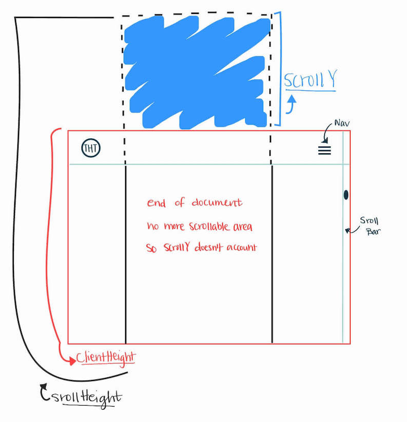
So a fully scrolled element has a scrollHeight that is equal to scrollY (what’s been scrolled) plus clientHeight (what’s visible).
What’s left is setting the width of #progress to the percent scrolled variable so progressBar.style.width = pctScrolled + '%'.
Thanks to the transition we set earlier in our CSS, the progress fill flows smoothly as the user scrolls across the page.
A simple stylish progress bar is all complete! Find the full source code on GitHub.
It only took some exceptional mathematical and artistic prowess but we made it all right.
You can customize and implement it on so many things, I’m buzzing with excitement at the very thought of it.
Or it could be I need a serious break – those height schemas just 🤯
Let’s power on. Sayōnara ✌️