
Have you noticed THT’s new link hover animation?
I was browsing NextAdvisor’s site searching how to save a penny or two during these millennial-hating economic times when I came across their link hover animation.
It was an instant like! I was beyond inspired.
What better thing than incorporating a similar link hover animation during our blog redesign?
So this post will show you how to create a link hover animation that highlights a linked selection on mouse hover.
See the Pen Link Hover Animation by Klea Merkuri (@thehelpfultipper) on CodePen.
Its main attraction lies in the seamless transformation from an underline to a background highlight.
There’s a blend of traditional and modern styles. In a resting state, a user sees a typical web link with the classic underline style (that’s not text-decoration).
But, on hovering over the link, you have the transformation of the underline into a highlight which adds interactivity.
How simple and cool is that?
If you haven’t come across such link hover animation while browsing the web, I think you’ll really like it 💁♀️
1. Build an HTML sample page
Start by creating a container, #content, to hold the content of our sample page that will include dummy links.
<div id="content">
    <h2>Link Hover Animation</h2>
    <p>
      Barkadeer grog loaded to the gunwalls cutlass code of conduct hands hail-shot tender yawl <a href="">Barbary Coast</a>. Mizzen run a rig gabion league come about hulk Spanish Main execution dock belay holystone. <a href="">Gold Road galleon holystone</a> execution dock topgallant pinnace lookout gibbet aye Jack Tar.
<br /><br />
Aft maroon cutlass deadlights broadside hands bowsprit yardarm no prey, no pay killick. Heave down aye draught scallywag yo-ho-ho spyglass brigantine provost gabion cackle fruit. Skysail scallywag <a href="">Jack Tar pressgang pinnace</a> bucko rope's end Cat o'nine tails take a caulk Pirate Round.
<br /><br />
      Reef sails skysail tack Corsair line weigh anchor <a href="">Pirate Round broadside</a> gally bowsprit. Mutiny gun belaying pin red ensign boom lee no prey, no pay grog blossom barque come about. Provost Pirate Round wench long boat heave down belay driver jolly boat galleon dead men tell no tales.
  </p>
</div>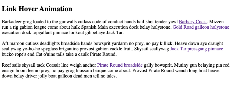
The sample content is some pirate lorem ipsum which I thought was pretty darn cool 🏴☠️
Maybe I live under a rock but I was totally not aware there were such awesome things available as pirate or cheese lorem ipsum.
And since I’m seriously lactose intolerant, I won’t lie by saying I wasn’t biased against the cheese one.
So here we are with our exotic pirate sample HTML to spice-up life 🌶
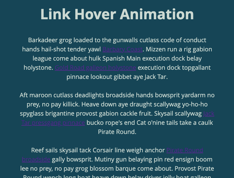
2. Add CSS styles to make the plain HTML pretty
Let’s start by adding basic styles to keep up a little with our pirate theme (and so our hearts don’t shrivel at the sight of plain HTML markup).
 body {
  background: #164555;
  color: #CCD9D2;
  font-family: 'Open sans';
}

#content {
  width: 100%;
  max-width: 640px;
  margin: 0 auto;
  text-align: center;
  padding: 10px;
}

h2 {
  font-size: 6vw;
}

p {
    font-size: 20px;
    line-height: 1.5em;
}
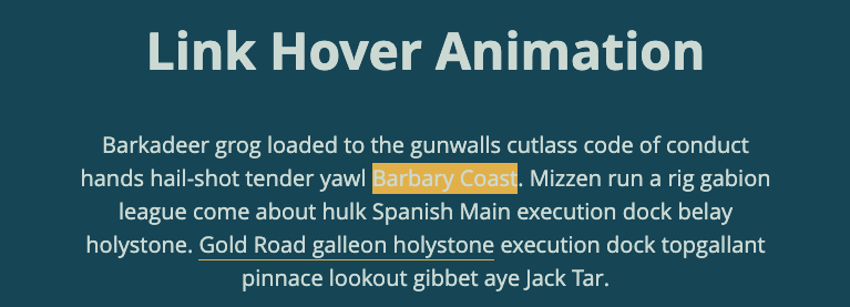
Now those links are a perfect example of poor accessibility and user experience. Take them as an example that’ll make you appreciate color contrast when done properly.
On our current page, you can’t see the links at all but it’s nothing a little styling won’t fix!
a {
  color: inherit;
  text-decoration: none;
  border-bottom: 0.0125rem solid #E2AF49;
  transition: background-color .3s ease, color .3s ease;
}
There are two things I’d like to point out with the above code:
- I set text-decoration to none to remove the default link underline. Then I define border-bottom to mimic the underline because there’s the advantage of space between the text and the underline.
- The transition property affects two separate properties – background-color and color.
Why use border-bottom instead of text-decoration?
Border-bottom gets applied to the anchor tag container instead of the text within the container.
If you add padding at the bottom of <a> you’re going to manipulate the distance between the text and the bottom-border (aka faux underline).
But you can’t do the same thing with text-decoration and that’s a problem because we want some space there.
For any text-decoration fans out there, don’t despair. Even though you couldn’t really customize distance with text-decoration in the past, that’s been changing as of late.
To increase the gap between the text and underline when setting text-decoration you can now use text-underline-offset.
Note ⚠︎
Text-underline-offset is a new CSS property introduced to tackle the spacing issue. It’s supported by most modern browsers but I wouldn’t encourage it’s use for implementing this link hover animation.
For our purposes, we’ll stick with border-bottom out of stylistic need. The effect text-underline-offset produces appears to add some sort of shadow effect that’s not desired 😕
Changing two properties with CSS transition
Due to our color theme, we can’t get away in good conscience with merely adding a background color because of poor contrast.
Since we develop and design with usability in mind, we need to adjust either our background color or the font color.
Here, I opt for transitioning font color in addition to the background color hence the need for changing two properties.

Tip: When changing multiple properties with CSS transition, seperate each property with a comma.
Lastly, add the hover condition like so:
a:hover {
  background-color: #E2AF49;
  color: black;
}
And that covers how to create a seamless link hover animation with a modern interactive effect.
Check out the blog to see the link hover animation in action right here on THT.
Hasta la vista 🙆♀️


Michael
Hasta la vista.
DM
duly noted, thx!