
Ready to tackle freeCodeCamp’s product landing page project?
I’d say the biggest challenge for this project was choosing a single product to focus on.
After considerable deliberation (aka five minutes of churning ideas) I settled on the skincare brand, The Ordinary, as my product.
I highly recommend you go for something that interests you to motivate you to do your best work!
This post will be a guided solution to creating a product landing page that meets the requirements set forth by FCC’s user stories.
I provide two solutions:
- One is with a simple form, very similar to the reference.
See the Pen Product Landing Page (Simple Form) by Klea Merkuri (@thehelpfultipper) on CodePen.
- The other is with an advanced form and more intricate layout that is a great challenge to take on.
See the Pen Product Landing Page (Advanced Form) by Klea Merkuri (@thehelpfultipper) on CodePen.
Latest FCC challenge solution How To Build A Survey Form (freeCodeCamp Challenge)
1. Build a header with navigation
Start with #main as the main “body” container. Inside, create a header element that includes two components: a product logo and a menu.
The product logo needs to be an image (or you risk not passing) which a quick Google search should provide.
Tip: If your product of choice is not as easily found, you can create an image logo yourself using a free tool like Canva.
Meanwhile, the menu is going to be located inside a nav element (short for “navigation”) and it should include at least three items.
Each item is going to be an anchor link that will scroll a user to the corresponding section on the landing page.
Tip: Don’t worry about the anchor link behavior for now – just make sure to make each menu item a link!
<div id="main">

  <header id="header">
<!--     logo -->
    <a href="https://logovectordl.com/the-ordinary-logo-vector-svg/" target="_blank"><img src="https://logovectordl.com/wp-content/uploads/2020/12/the-ordinary-logo-vector.png" id="header-img" /></a>

<!--     navigation -->
    <nav id="nav-bar">
      <ul>
        <li><a href="" class="nav-link">Shop</a></li>
        <li><a href="" class="nav-link">Reviews</a></li>
        <li><a href="" class="nav-link">Guides</a></li>
      </ul>
    </nav>
  </header>

</div>
Why the product logo is a link
The product logo doesn’t need to be a link. I included mine as such to credit the source of the logo.
Since no user story requires a logo link, you can absolutely choose to skip making it one.
2. Styling the header
So far, there are no styles on our product landing page and things are looking odd, to say the least.
There are a few things we need to address, such as:
- making the logo smaller
- getting rid of the list style on the menu
- fixing the navbar components on a single line at the top of the page
Before we dive into styling the header, let’s add some styles to #main to act as “global” styles.
One such “global” style will be the font family of our landing page.
@import {
  url("https://fonts.googleapis.com/css2?family=Raleway&display=swap");
}

#main {
  font-family: Raleway, sans-serif;
  font-size: 16px;
  letter-spacing: 0.025em;
  line-height: 20px;
  box-sizing: border-box;
}
I’m not specifying a font weight because I want to use Raleway regular which happens to be the default (it’s equivalent to font-weight 400).
Note 👇
I’m using @import to directly embed the Google fonts external stylesheet in the CSS file like I did in How To Build A Survey Form (freeCodeCamp Challenge).
For how to include an external stylesheet in the HTML file, check out 3 Ways You Can Add CSS To HTML.
Sizing and positioning the product logo
The product logo should go on the top right-hand side of #main.
Notice how there is also some sort of padding or margin as neither the logo nor the nav is flush against the edges of the page.
Though I’m getting somewhat ahead here – let’s, first, tackle the ridiculous size of this logo. It’s an easy thing to do, all that’s necessary is to give the image width:100px.
Making the nav look less like a list
Next up is the menu which, I admit, is looking less like a menu and more like a to-do list.
To get rid of the list style – the bullets and indenting – use list-style-type:none on <ul>.
Place the menu on the same line as the logo by setting display:inline-block for nav.
Then, take out the link styles from the menu items, the .nav-links.
.nav-link {
  text-decoration: none;
  color: #000000;
}
Positioning header elements
Time to set a display of flex and justify the logo on the left.
I’m using flexbox because it’s required to use at least once in this project. Plus, why not? It makes life easier.
Tip: My favorite flexbox guide is always in front of me when using flexbox. I don’t know why, but I always forget the property syntax.
Specify the display of flex on the parent <header> element. Add padding left and right as well.
header {
  padding: 15px 50px 0 50px;
  display: flex;
  justify-content: space-between;
}
Go back to the list and give <ul> a display of flex to have each list item occupy the same line. Using margin-right, create space between the list items.
nav ul li:not(:last-of-type) {
  margin-right: 40px;
}
Finish off the header for the time being by fixing it at the top so that when a user scrolls down the product landing page, the header stays where it is.
Add position:fixed, top:0, and left:0 to the header and set width:100%.
Since we have no content to induce a scroll effect (yet), I used some lorem ipsum for testing.
One thing I notice straightaway: there is a need for a background color as the header is transparent.
Take care of the transparent background by setting background-color:#FCFCFC on #main and giving the header white background color.
3. Add an advanced subscription form
A perfect place to put our form-building skills to use is the subscription form area.
Related: How To Build A Dynamic Input Field With A Floating Label.
Though as far as forms come, this is a relatively simple case. The only form element we need is an email input that uses HTML5 validation.
We just need to make sure our form submits to the provided mock URL (reference User Story #12).
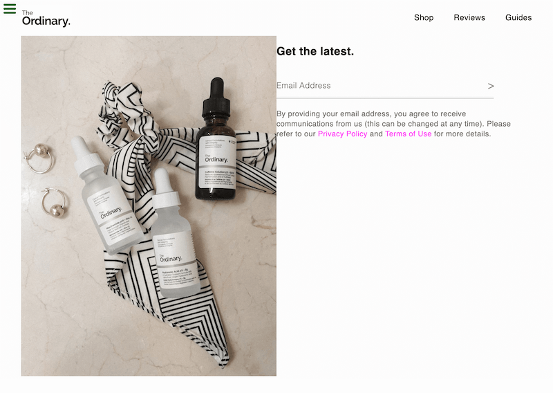
I’ll up the game on this subscription element so it’ll be more involved than the one in the sample. Mines will have a picture on the left side with the subscription form next to it, on the right.
Fancier, no? We’re doing this anyway, let’s be a little extra 🙂
Product picture on the left
Begin with a parent wrapper, #subscribe, which will contain two children – #subscribe__img and #subscribe__form.
Add a product image to #subscribe__img and give it, along with its parent, some styles.
Set a display of flex on #subscribe so that the two children stand next to each other.
<div id="subscribe">
    <div id="subscribe__img">
      <img src="https://images.unsplash.com/photo-1600180582428-052961148e58?ixlib=rb-1.2.1&ixid=MnwxMjA3fDB8MHxwaG90by1wYWdlfHx8fGVufDB8fHx8&auto=format&fit=crop&w=736&q=80" alt="The Ordinary skincare product shot on a marble table with gold earrings and black and white scrunchie.">
    </div>

    <div id="subscribe___form"></div>
</div>
#subscribe {
width: calc(100% - 100px);
margin: 0 auto;
display: flex;
justify-content: center;
}
#subscribe__img, #subscribe__form {
width: 50%;
}Meanwhile, setting the right and left margins to auto will center #subscribe whereas justify-content will center the children of #subscribe.
Make the image responsive so it resizes depending on the screen size using:
#subscribe__img img {
  width: 100%;
  height: auto;
}
For now, it’s looking good. Let’s add the form and readjust anything as needed.
Advanced subscription form on the right
Luckily, there’s isn’t much to do here since I’ll be using a floating label subscription form I’ve already created as a stand-alone project.
The best part is that it was inspired by The Ordinary’s subscription form so it more than fits with the theme of this landing page!
It’s not merely going to be a cut-and-paste job though. I’ll adjust certain things based on the project requirements.
As a word of warning, repurposing code is actually harder than you’d think!
To start, I grabbed the HTML of the floating label form, added it to #subscribe__form, and made slight alterations.
     <div id="subscribe__form">
      <div id="sub__promo">
        <div id="regimen">
          <a href="#">
            <span id="reg-subtitle">Unsure where to begin?</span>
            <span id="reg-title">Build my Regimen</span>
          </a>
        </div>
       <div id="submit-action">
          <h3 id="title">Get the latest.</h3>
        <form id="form" action="https://www.freecodecamp.com/email-submit">
          <label for="email">Email Address</label>
          <input type="email" id="email" name="email" placeholder="me@me.com" />
          <input type="submit" id="submit" value=">" aria-label="Subscribe" />
        </form>
        <p class="sub__foot"></p>
        <p class="sub__foot">By providing your email address, you agree to receive communications from us (this can be changed at any time). Please refer to our <a href="#">Privacy Policy</a> and <a href="#">Terms of Use</a> for more details.</p>
       </div>
      </div>

    </div>
I don’t want to use placeholder text for the email input as the label will act as such, but it’s a requirement so I’m adding it as an empty string (hoping to pass).
To the @import rule, I added the Raleway family to the other two used in the form. And I applied box-sizing to everything, removing it from just #main.
@import {
  url("https://fonts.googleapis.com/css2?family=Josefin+Sans&family=MuseoModerno:wght@100;400&family=Raleway&display=swap");
}

* {
  box-sizing: border-box;
}
Bringing in some styles from the floating label stylesheet and adjusting per needs:
#title {
  font-family: 'Josefin Sans', sans-serif;
  font-size: 1.4125rem;
}

label, .sub__foot {
  color: #757575;
}

label {
  font-weight: 100;
  font-size: 16px;
  position: relative;
  top: 25px;
  transition: all 0.2s ease-in-out;
}

.sub__foot {
  font-size: 15px;
  line-height: 20px;
  font-weight: 400!important;
  padding-right: 40px;
  margin-top: 20px;
  transition: all 0.2s ease-in-out;
}

.sub__foot a {
  color: #ff01f5;
  text-decoration: none;
}

#email, #submit {
  background-color: inherit;
}

#email {
  width: 85%;
  height: 40px;
  outline: none;
  font-size: 20px;
  padding: 10px 40px 10px 0;
  border-top: none;
  border-left: none;
  border-right: none;
  border-bottom: 1px solid #AAAAAA;
}

#submit {
  position: relative;
  right: 30px;
  top: -6px;
  border: none;
  width: 2.5rem;
  height: 2.5rem;
  background-color: inherit;
   font-family: 'MuseoModerno', sans-serif;
  font-size: 140%;
  font-weight: 100;
  color: #8C8C8C;
}

#submit:hover {
  cursor: pointer;
}

.isActive {
  font-size: 80%;
  top: 5px;
}
Repurposing the floating label form’s JavaScript
From the available JavaScript code of the floating label form, trim and edit accordingly.
A couple of changes to keep in mind:
- I renamed a few variables (ex: email instead of input).
- There’s no custom validation since we’re using HTML5 built-in validation.
- We’re resetting the input value and throwing an error if the form is submitted without a value in the input field.
const label = document.querySelector('label');
const email = document.querySelector('#email');
const main = document.querySelector('#main');
const btn = document.querySelector('#submit');

// capture changes in input value
email.addEventListener('input', () => {
  if(email.value === '') {
    label.classList.remove('isActive');
  } else {
    label.classList.add('isActive');
  }
});

// click out of input
main.addEventListener('click', function(e) {
  if(e.target === email || e.target === btn && email.value !== '') {
    label.classList.add('isActive');
  } else if(e.target !== email && email.value === '') {
    label.classList.remove('isActive');
  }
});

// reset input value on form submission and throw error if no value submitted
document.querySelector('form').addEventListener('submit', (e) => {
  // check if email input has no value
  if( email.value === '' ) {
    e.preventDefault();
    document.querySelector('.sub__foot').innerText = 'This field is required';
    document.querySelector('.sub__foot').style.color = 'red';
    email.classList.add('invalid-border');
  }

   email.value = '';

});
Note: If no value is entered and the form is submitted, I stop the form submission using
e.preventDefault()and proceed on throwing an error.
I carried over the invalid-border class, inserting it into the stylesheet as follows:
.invalid-border {
  border-bottom: 5px solid red;
}
How to vertical-align using flexbox
Let’s position the form at the bottom of #subscribe__form by giving #subscribe__form a display of flex and centering its content along the main axis.
#subscribe__form {
  display: flex;
  justify-content: center;
}
Position #sub__promo at the bottom using align-self and give it some dimensions along with a respective display of flex to move #submit-action to the bottom of #sub__promo in turn.
#sub__promo {
  width: 450px;
  height: 80%;
  padding: 0 20px;
  align-self: flex-end;
  display: flex;
}

#submit-action {
  align-self: flex-end;
  padding-bottom: 50px;
}
For visualization’s sake, I added some background colors to see what exactly is happening!

Working with the empty space above the form
Keeping in line with The Ordinary’s design aesthetic, I’m going to add a minimalist informational action item. It’ll go inside #sub__promo, above #submit-action.
        <div id="regimen">
          <a href="#">
            <span id="reg-subtitle">Unsure where to begin?</span>
            <span id="reg-title">Build my Regimen</span>
          </a>
        </div>
I want to position #regimen absolutely so it’s taken out of the flow of the page because I envision it coming out from the right edge of the page.
 #regimen {
  background-color: #DDD6D0;
  width: 40%;
  padding: 0 0 10px 10px;
  position: absolute;
  right: 0;
  top: 25%;
}
For the next part, I inspected the reference component and “borrowed” the background originally used for the arrow when styling the link.
#regimen a {
  display: block;
  font-size: 1.4375rem;
  line-height: 1.6857rem;
  padding-bottom: 2rem;
  background: transparent url(https://theordinary.com/on/demandware.static/Sites-deciem-us-Site/-/en_US/v1652453291994/images/icons/svg/next.svg) no-repeat scroll 0 100%;
  background-size: 3rem;
  font-family: Raleway, sans-serif;
  color: #22121f;
  text-decoration: none;
  padding: 1.25rem 0.625rem 1.25rem 0;
}
And to add the finishing touch…for now:
#reg-subtitle {
  display: block;
  font-size: 15px;
  line-height: 18px;
  margin-bottom: 4px;
}

#reg-title {
  display: block;
}
4. As an alternative, add a simple subscription form on the top
If you want to achieve something similar to the reference so you can pass the test and get on with more interesting projects in life, follow along.
Begin by creating a form with all requirements. This will be a stripped-down version of the more advanced form…in a way.
 <div id="subscribe">
      <h3 id="promo-title">Get your personal regimen.</h3>
      <form action="https://www.freecodecamp.com/email-submit" id="form">
        <input type="email" name="email" id="email" placeholder="Enter your email..." />
        <input type="submit" id="submit" value="Subscribe" />
      </form>
    </div>
Center the simple #subscribe and resize the form title.
#subscribe {
  width: 400px;
  margin: 0 auto;
  text-align: center;
  margin-top: 50px;
}

#subscribe h3 {
  font-size: 150%;
}
To stack the email input and submit input, I use a flex display with a column direction.
Aligning the items in the center will correct the default stretch of the elements.
#subscribe form {
  display: flex;
  flex-direction: column;
  align-items: center;
}

#subscribe input {
  margin: 10px 0;
}
Next, style the submit button. I added some hover effects to make it more interactive.
#subscribe input[type='submit'] {
  width: 30%;
  background-color: #E1DED9;
  border: none;
  padding: 10px 0;
  font-size: 110%;
}

#subscribe input[type='submit']:hover {
  cursor: pointer;
  background-color: #E3E3E3;
  box-shadow: 0 0 2px #E1DED9;
  color: #333333;
}
Likewise, style the email input. Make sure to remove the blue border by setting the outline to none.
#subscribe input[type='email'] {
  width: 70%;
  border-top: none;
  border-left: none;
  border-right: none;
  border-bottom: 1px solid #AAAAAA;
  background-color: transparent;
  font-size: 110%;
  outline: none;
  transition: all 0.2s ease-in-out;
  padding: 10px;
}

#subscribe input[type='email']:hover {
  border-bottom: 5px solid #AAAAAA;
}
>> Tip <<
If you used autocomplete for the input’s value in a browser like Chrome, background color of light blue appears.

You can remove the input’s background color on autocomplete by using the following:
#subscribe input[type='email']:-webkit-autofill,
#subscribe input[type='email']:-webkit-autofill:hover,
#subscribe input[type='email']:-webkit-autofill:focus,
#subscribe input[type='email']:-webkit-autofill:active{
    -webkit-box-shadow: 0 0 0 30px #FCFCFC inset;
}
Extra: How to reset email input on form submission
If you submit the form, you’ll be redirected to the dummy URL provided in the action attribute.
When you click the back button to go back to the landing page, notice how the email entered still appears in the input.
Now you need to delete the entered text which isn’t a great user experience. We can correct this!
To clear the input field on form submission, listen for the submit event on the form element and set the email input value to an empty string.
const email = document.querySelector('#email');

document.querySelector('form').addEventListener('submit', () => {
  email.value = '';
})
And you’re done! The simple form is really quite simple. Let’s move on to the rest of the product landing page.

Adjusting the fixed header
Oh oh, slight problem. Subscribe isn’t fully visible because the fixed header gets removed from the flow of the page.

To correct the view of #subscribe, wrap the main content – what’s not the header or footer – into a parent wrapper, <main></main>. Give this wrapper a margin at the top.
Hint: You might need to use different top margin dimensions for the simple form and the advanced form. Adjust accordingly.
For the simple form, simply give main a padding-top:100px.
While for the advanced form, do two things:
- set a height on the header (likewise, skip setting a height and use the inspect tool to get the height of the header). I chose to set
height:76pxon the header. - give main a top margin equal to the height of the header. This way, the product image’s top edge will align with the bottom of the header.
5. Creating a shop section
From the reference, we see that the next section is a mixture of icons and text.
The text is placed beside its corresponding icon which we’ll easily do with flexbox.
You can use icons, pictures, or whatever best suits your product. I opted for pictures.
First, I created a #shop container with three children with a class of feat-prod.
Each child stands for a featured group. Within each featured group, there are two children – one containing the product image and one containing the marketing description.
<div id="shop" class="content">
    <div id="skin" class="feat-prod">
      <div class="img"><img src="https://theordinary.com/dw/image/v2/BFKJ_PRD/on/demandware.static/-/Sites-deciem-master/default/dw52615ade/Images/products/The%20Ordinary/rdn-niacinamide-10pct-zinc-1pct-60ml.png?sw=540&sh=540&sm=fit" alt="The Ordinary skin products."></div>
      <div class="marketing-desc">
        <h3>Skincare Products</h3>
        <p>Nullam efficitur, tortor eget tempor rutrum, velit dolor bibendum ante, eu varius neque ex a elit. Nulla eleifend lorem ex, ac rhoncus nisi rhoncus in.</p>
      </div>
    </div>

        <div id="makeup" class="feat-prod">
      <div class="img"><img src="https://theordinary.com/dw/image/v2/BFKJ_PRD/on/demandware.static/-/Sites-deciem-master/default/dw94bc05db/Images/products/The%20Ordinary/Colours/rdn-concealer-30-y-8ml.png?sw=540&sh=540&sm=fit" alt="The Ordinary makeup products."></div>
      <div class="marketing-desc">
        <h3>Makeup Products</h3>
        <p>Maecenas vestibulum ullamcorper erat viverra facilisis. Vestibulum rutrum aliquam diam ultricies viverra.</p>
      </div>
    </div>

        <div id="hair" class="feat-prod">
      <div class="img"><img src="https://theordinary.com/dw/image/v2/BFKJ_PRD/on/demandware.static/-/Sites-deciem-master/default/dw5b9adf9c/Images/products/The%20Ordinary/rdn-behentrimonium-chloride-2pct-conditioner-240ml.png?sw=540&sh=540&sm=fit" alt="The Ordinary hair products."></div>
      <div class="marketing-desc">
        <h3>Hair Products</h3>
        <p>Proin imperdiet consectetur accumsan. Maecenas sit amet ligula ex. Aliquam nisi dolor, facilisis quis lectus nec, convallis elementum massa.</p>
      </div>
    </div>
  </div>
Then I broke apart the styles on #subscribe by removing the container’s width and alignment onto a class called content. I added this class to #subscribe and to #shop.
.content {
  width: calc(100% - 100px);
  margin: 0 auto;
}
Proceed on centering the shop section. Then, assign a display of flex to each div with a class of feat-prod so the image and marketing description in each lies side-by-side.
#shop {
  margin: 50px 0;
}

.feat-prod {
  display: flex;
  justify-content: center;
  width: 700px;
  margin: 0 auto;
}

.img {
  margin: 40px;
}

.img img {
  transform: scale(1.4);
}

.marketing-desc {
  margin: 40px 0;
}
6. Embedding a video
To embed the product video, I created a parent wrapper with an id of reviews.
Then I grabbed a YouTube URL of my product and inserted it via an iframe.
If you’re getting your video from YouTube, there is an embed code you can copy and paste into your HTML.
<div id="reviews" class="feat-prod">
    <iframe id="video" width="560" height="315" src="https://www.youtube.com/embed/XsDXNBF3vDk" title="YouTube video player" frameborder="0" allow="accelerometer; autoplay; clipboard-write; encrypted-media; gyroscope; picture-in-picture" allowfullscreen></iframe>
  </div>
Give #reviews a class of feat-prod to apply the center alignment and that’s really all we need to do for this section.
7. Including the guides section
The last section to add is the guides section which corresponds to the pricing section of the reference.
I start with a #guides wrapper that contains three guides, each in a container with a class of guide.
Each guide container, in turn, has four components:
- guide title wrapped in its own div so as to display as a ribbon on top
- price (an unbeatable one!)
- list with guide details (set as lorem ipsum)
- button with a call to action
<div id="guides" class="content">
    <div class="guide">
      <div class="guide-title"><span>Regimen Guide</span></div>
      <p class="price">Free</p>
      <ul>
        <li>Lorem ipsum.</li>
        <li>Lorem ipsum.</li>
        <li>Lorem ipsum dolor.</li>
        <li>Lorem ipsum.</li>
      </ul>
      <button type="button">SELECT</button>
    </div>
    <div class="guide">
      <div class="guide-title"><span>Vitamin C Guide</span></div>
      <p class="price">Free</p>
        <ul>
          <li>Lorem ipsum.</li>
          <li>Lorem ipsum.</li>
          <li>Lorem ipsum dolor.</li>
          <li>Lorem ipsum.</li>
        </ul>
        <button type="button">SELECT</button>
    </div>
    <div class="guide">
      <div class="guide-title"><span>Shade Guide</span></div>
      <p class="price">Free</p>
        <ul>
          <li>Lorem ipsum.</li>
          <li>Lorem ipsum.</li>
          <li>Lorem ipsum dolor.</li>
          <li>Lorem ipsum.</li>
        </ul>
        <button type="button">SELECT</button>
    </div>
  </div>
</div>
Give #guides a display of flex, center its content, and add space to each of the guides.
#guides {
  margin: 80px auto;
  display: flex;
  text-align: center;
}
Get rid of default list styles, like the bullet, and assign a line-height of 1.8rem.
#guides ul {
  list-style-type: none;
  line-height: 1.8rem;
  margin: 0;
  padding: 0;
}
Shape each guide into a box with a border and a colored banner at the top containing the guide title.
.guide {
  width: calc(100%/3);
  border: 1px solid #DDD6D0;
  margin: 0px 20px;
}

.guide-title {
  background-color: #DDD6D0;
  padding: 20px 0;
  font-size: 1.1rem;
}
Next, I’m fixing the font size for the prices prior to moving on to styling the button.
To keep in line with The Ordinary’s theme, I fashioned the button after the “Add to basket” button on their purchase page. Doing so means, also, adding the hover effects to each button with the transition in color!
.price {
  font-size: 1.4rem;
  font-weight: 600;
}

#guides button {
  margin: 20px 0;
  padding: 10px 40px;
  font-size: 1.1rem;
  border-radius: none;
  border: 1px solid black;
  background-color: inherit;
  color: black;
  font-weight: 600;
  transition: all .4s ease;
}

#guides button:hover {
  background-color: #757575;
  color: white;
  cursor: pointer;
  border: 1px solid #757575;
}
8. Placing a footer on the page
Bringing the product landing page to a close, insert a footer.
Within the footer, there are two components:
- a footer menu with three items
- a copyright claim
 <footer class="content">
    <div id="foot-menu">
      <ul>
        <li><a href="#">Privacy</a></li>
        <li><a href="#">Terms</a></li>
        <li><a href="#">Contact</a></li>
      </ul>
    </div>
    <div id="copyright">
      <p>Copyright 2022, The Ordinary by THT.</p>
    </div>
  </footer>
We end up with something that isn’t that bad. In fact, you can do away with the default list styles and you’ll get a decent footer without much work!
footer {
  background-color: #DDD6D0;
  padding: 20px 20px 5px 0;
  line-height: 0.8rem;
  font-size: 0.9rem;
}
Add text-align:right to footer and make the footer menu occupy the top line of the footer using flexbox.

#foot-menu ul {
  list-style-type: none;
  margin: 0;
  padding: 0;
  display: flex;
  flex-direction: row;
  justify-content: flex-end;
}
The first three properties – list-style-type, margin, and padding – get rid of the default list styles. While the following three properties, make each menu item occupy the top row of the footer.
Note: You apply flex properties to the parent so they affect the children.
Here, flex-direction and justify-content apply to each of the list items in the unordered list.
Give a margin to the right of each menu item except the last one, to give them some space. And get rid of the default link styles from each menu item.
#foot-menu ul li:not(:last-of-type) {
  margin-right: 10px;
}

#foot-menu a {
  text-decoration: none;
  color: #000000;
  font-weight: 600;
}
9. Adding anchor links to menu items
The navigation menu currently is a dummy – aka it does nothing.
One of the requirements is that clicking a nav-link will take you to the corresponding section on the landing page. I do this using anchor links.
An anchor link can be created using the href attribute of the link tag. So each of the nav menu items will have an href that references the id of the section we want to anchor it to.
Note: Anchor Links
An anchor link’s href looks like this: href=”#mysectionid”.
Such a link will take you to the section on the page with an id of mysectionid.
If you had a full URL as your href address then an anchor link will look like this: href=”https://www.demo.com/#mysection“.
When updating the nav menu items with anchor links, the nav will look like so:
    <nav id="nav-bar">
      <ul>
        <li><a href="#shop" class="nav-link">Shop</a></li>
        <li><a href="#reviews" class="nav-link">Reviews</a></li>
        <li><a href="#guides" class="nav-link">Guides</a></li>
      </ul>
    </nav>
For some flare, add smooth scrolling using scroll-behavior:smooth to the universal selector (where we defined box-sizing).
The smooth scroll will prevent the instantaneous jerk to the section when a user clicks on the link by making the scroll smooth and fluid.
10. Responsive using media queries
Before we wrap this project, there are a few things we need to address:
- layering of elements, like the featured products and regimen banner
- sizing of elements when on smaller screens using media queries
- sizing of elements when on larger screens using media queries
- mobile menu for smaller screens
In the next steps, I’ll tackle each of those points so we can finish strong!
1) Use z-index to correct layering
The layering issue arises because of the fixed header which just so happens to have a z-index lower than the items overtop (like featured products and the regimen banner).
Once I determine the cause of the problem, I can easily correct it by giving the header z-index:5, placing it above all other elements on the page.
Here the layering comes down to the z-index hierarchy of different CSS properties. Absolute positioning and transform just happen to have higher z-index values than fixed positioning.
2) Adjusting element dimensions for small screens
I really like the header, but it needs tweaking for large and small screens.
Currently, on large screens, there is far too much space between the regimen banner and the subscription form.
On smaller screens, however, the opposite happens – everything overlaps and gets distorted!
So I’ve determined the need for two media queries – one for widths 1468px or higher and, another, for widths 960px or smaller.
For smaller widths, the #subscribe components will collapse so that only #subscribe__form and its components will be visible on the screen. I do this by setting the display of #subscribe__img to none.
Then, adjust the positions and widths of #sub__promo and its components.
I want #regimen to have a larger width on smaller screens, but revert to a smaller width on medium ones. To make this transition seamless, add transition: width 0.4s ease-in to #regimen.
Hint 🤫
Add the transition to where you first styled #regimen – not the one defined in the media query.
That’s because you want the transition to take effect once the styles change due to the media query adjustments!
@media (max-width: 960px) {
  #subscribe__img {
    display: none;
  }

  #subscribe {
    min-width: 500px;
    height: 500px;
  }

  main {
    margin-top: 100px;
  }

  #subscribe__form {
    width: 100%;
  }

  #sub__promo {
    width: 100%;
  }

  #regimen {
    width: 80%;
  }

  #submit-action {
    width: 80%;
    justify-content: flex-end;
  }

}
Meanwhile, for the shop section, the product images will collapse on smaller screens.
I do this by setting their display to none, then proceed on centering #shop to adjust for the loss of the featured image.
  .feat-prod .img {
    display: none;
  }

   #shop {
    margin: 0 auto;
  }
Note: I add this (and the following code) into the media query defined above!
For the guides, change the flex-direction to a column so each guide stacks in the center and adjust the width of each guide.
  #guides {
    flex-direction: column;
    align-items: center;
  }

  .guide {
    width: 100%;
    max-width: 400px;
    margin-bottom: 10px;
  }
Above, I declare each guide as full-width, though, no bigger than 400px.
Follow by making the footer full-width on smaller screens using width: 100vw!important.
Note: The !important is necessary to override the default styles of the content class we set on footer.
3) Adjusting element dimensions for large screens
Now, on larger screens, there isn’t much to do apart from maintaining a smaller width for content and centering #shop.
@media (min-width: 1468px) {

  .content {
    width: calc(100% - 500px);
  }

  #shop {
    margin: 0 auto;
  }

}
4) Create a mobile navigation menu
If you check the reference, on smaller screens the nav items stack and, at some point, the entire nav menu stacks beneath the logo.
Creating a responsive menu may not be the objective of this project, but we all know that’s not going to stop us from doing our best job!
I’ll go a step further here by creating a hamburger menu. When clicked, the nav menu will appear underneath the navbar.
But, if you’d like to go ahead with the simpler route (like with the subscription form), then I’ll walk you through that option as well.
Option 1: Simple stacked menu on small screens
When on screens sized 610px or smaller, header elements like the nav menu and the logo will stack.
All we need here is a media query to wrap the header elements so they stack. Then I center align and add a background to the menu (stylistically keeping in line with the advanced form format).
@media ( max-width: 610px) {
  header {
    flex-wrap: wrap;
    justify-content: center;
    padding-left: 0;
    padding-right: 0;
  }

  #nav-bar {
    background: rgba(225, 222, 217, 0.8);
    width: 100%;
  }

  main {
    margin-top: 150px;
  }

  nav ul {
    justify-content: center;
  }
}
Go ahead and submit the product landing page.
Should you be following the simple form code closely and end up with an error for the fixed nav-bar requirement, this should help you troubleshoot.
- make sure to remove the top padding on header (turn 15px to 0px)
- comment out entirely the header styles in the media query for screens 610px or smaller
freeCodeCamp’s new checker tool is quite strict and wouldn’t let me pass with the flex-wrap property set in the media query. And it took me far longer to realize this than I’d like so, please, don’t repeat my mistake.
That’s it, you’re done. If you’re up for a challenge, though, give Option 2 a try!
Option 2: Mobile navigation “hamburger” menu
My burger is going to be a lean one with only two “patties”. Each of the menu bars is a span element.
But #mobile-menu is only the control for the actual menu found in #mobile-nav.
So, to recap, our mobile navigation is a combo of a control (#mobile-menu) and a menu (#mobile-nav).
A couple of things to note:
      <div id="mobile-menu">
        <button type="button" aria-expanded="false" aria-controls="mobile-nav">
          <span></span>
          <span></span>
        </button>
      </div>

      <div id="mobile-nav">
        <ul>
          <li><a href="#shop" class="mob-link">Shop</a></li>
          <li><a href="#reviews" class="mob-link">Reviews</a></li>
          <li><a href="#guides" class="mob-link">Guides</a></li>
        </ul>
</div>- aria-expanded and aria-controls are there for accessibility
- aria-controls points to the id of the element the button is controlling
- aria-expanded indicates the state of the controlled element (aka expanded/collapsed or hidden/displayed)
Styling the hamburger menu
With only the code above, we don’t get much of anything other than this:

It looks terrible by itself, but that’s why we have styles!
Start by styling the menu “burger” first – aka the span tags. Make them into small rectangles with slightly rounded edges.
#mobile-menu span {
  display: block;
  width: 30px;
  height: 3px;
  border-radius: 20px;
  margin-bottom: 5px;
  text-align: center;
  background: #000000;
}
To make things easier, let’s hide the menu we have for bigger screens in the 960px media query using:
  nav > ul {
    display: none;
  }
Then get rid of the default background and border from the #mobile-menu button and turn the cursor into a pointer when hovering over it.
#mobile-menu button {
  background: none;
  border: none;
}

#mobile-menu button:hover {
  cursor: pointer;
}
Move onto #mobile-nav, giving it an absolute position and full-width with some background color.
Stack the mobile navigation menu items and remove their default link styles.
#mobile-nav {
  position: absolute;
  left: 0;
  top: 75px;
  width: 100%;
  background: rgba(225, 222, 217, 0.8);
  display: flex;
  flex-direction: row;
  justify-content: center;
}

#mobile-nav ul {
  flex-direction: column;
  justify-content: center;
  align-items: center;
  padding: 0;
}

#mobile-nav ul li {
  margin: 0 0 10px 0;
}

.mob-link {
  text-decoration: none;
  color: black;
}
Seeing things in position much better now, move the #mobile-menu button in the middle of the header by:
- giving #mobile-menu
height:calc(100% - 15px) - setting
position:relativeandtop:50%on #mobile-menu button
This is what we have so far:

Making the mobile menu interactive and animated
I want the hamburger menu to turn into an X when a user clicks on it. To do this, I’ll create two classes that will transform each of the burger patties into an X shape.
Let’s define left-x, which will turn the top bar, and right-x, which will turn the bottom bar.
Shift the bottom bar up using a relative position and move it up using top to achieve the X.
.left-x {
  transform: rotate(45deg);
  transform-origin: center;
}

.right-x {
  transform: rotate(-45deg);
  transform-origin: center;
  position: relative;
  top: -8px;
}
So far, nothing should happen since we haven’t assigned these two classes on the spans.
To check if we did it correctly, go into your script file and do three things:
- define the mobile menu variables you’ll need to reference
- define two functions: one to show the mobile menu, the other to hide it
- add the left-x and right-x classes to showMobileMenu() and remove them from hideMobileMenu()
const mobMenu = document.querySelector('#mobile-menu');
const icons = document.querySelectorAll('#mobile-menu span');
const mobBtn = document. querySelector('#mobile-menu button');
const mobNav = document.querySelector('#mobile-nav');

const showMobileMenu = () => {
    icons[0].classList.add('left-x');
    icons[1].classList.add('right-x');

}

const hideMobileMenu = () => {
    icons[0].classList.remove('left-x');
    icons[1].classList.remove('right-x');

}
Toggle functions using JavaScript
Now, I want to mimic the class toggle action only with the two functions above.
In a way, the button click should toggle between showMobileMenu() and hideMobileMenu().
I’ll create a variable called isClicked and set it to false. This is a control boolean variable which I can check each time before toggling between the two functions.
Note: Define the variable as a let not a const since we’ll be updating its value!
Listening to the click event on the button, I check whether isClicked is false.
- if it’s true, execute showMobileMenu() and update isClicked to true
- if it’s false, execute hideMobileMenu() and update isClicked to false
let isClicked = false;

// drop down menu toggle action
mobMenu.addEventListener('click', () => {
  if( !isClicked ) {
    showMobileMenu();
    isClicked = true;
  } else {
    hideMobileMenu();
    isClicked = false;
  }

});
Adding fluid transitions and animation
Go back to our styles and add transition: all 0.2s ease-in-out on the span to make the X fluid.
Then go to #mobile-nav and add visibility:hidden since we’ll make it visible in the two functions on click.
Note: We’re not setting display to none here because #mobile-nav has a display of flex.
What we have so far:
I’d prefer if the menu didn’t just pop into existence on click – some animation will do wonders for user experience.
Create the effect of the mobile navigation menu dropping from above using a transition with time delay.
- set
height:0pxandtransition: all 0.5s ease-in-out, visibility 0s 0.2son #mobile-nav - toggle the height to 120px when executing showMobileMenu() and to 0px when executing hideMobileMenu()
Note: I go into more detail on achieving a transition when working with visibility and display in How To Build An Interactive Menu Component.
Tip: Don’t forget to toggle the aria-expanded attribute on the button during the click event! (hint: use setAttribute())
The completed mobile menu toggle functions look as follows:
const showMobileMenu = () => {
    mobNav.style.visibility = 'visible';
    mobNav.style.height = '120px';
    icons[0].classList.add('left-x');
    icons[1].classList.add('right-x');
    mobBtn.setAttribute('aria-expanded', true);
}

const hideMobileMenu = () => {
    mobNav.style.visibility = 'hidden';
    mobNav.style.height = '0px';
    icons[0].classList.remove('left-x');
    icons[1].classList.remove('right-x');
    mobBtn.setAttribute('aria-expanded', false);
}
Making responsive and tying up loose ends
First, hide #mobile-menu using display:none and display it only for screens 960px or less using display:block.
Second, we’ve got a slight problem with the state of the mobile menu when it’s clicked and the screen size changes.
Notice how the mobile navigation remains open even when the screen is bigger than 960px.
Even though the #mobile-menu hides and we get the usual menu, #mobile-nav is still showing and, once you size the window, we end up with an activated mobile menu.
What I want instead is to reset the mobile menu once the window resizes which I can achieve using the resize event listener.
 window.addEventListener('resize', () => {
  if( window.innerWidth > 960 ) {
    hideMobileMenu();
    isClicked = false;
  }
});
Once the window resizes, the callback that checks the width of the window fires.
If the width is greater than 960px, I hide the mobile menu and set isClicked to false. This deactivates the mobile menu, thus, resetting it!
5) Submit and troubleshoot
Can you believe it? We’re nearly done – all that’s left to do is submit the code.
The only requirement that didn’t pass was the placeholder requirement. If you recall, I left this as an empty string hoping it’ll pass – my hopes were dashed.
Turns out there needs to be something there, but this will conflict with my floating label design.
As a solution, I set some placeholder text and proceed to hide the placeholder using CSS.
#email::placeholder {
  color: transparent;
}
Try submitting again and pat yourself on the back, we’re done 🙌 .
You can find the full source code on GitHub for both the simple form and the advanced form.
In the meantime, don’t forget to follow THT on socials to never miss a new project, solution, or our extreme awesomeness!
‘Till next time, friends! Happy coding.


