
Ready to dive into the fascinating world of lists and conditional logic in React?
In part five of our React project, we’re going to explore the powerful combination of working with lists and conditional logic in React.
You’ll see just how they can make your web applications even more dynamic and user-friendly 🙌
As developers, we often need to display dynamic content that changes based on certain conditions or render lists of items, such as displaying a list of products, comments, or user profiles.
React provides us with some powerful tools to tackle these common scenarios efficiently and effectively.
In this blog post, we’ll cover the basics of working with lists and conditional logic in React, and we’ll dive into practical examples to illustrate how these concepts work in a real-world application.
And, if you need to catch up, here’s what you’ve missed:
- How To Start Your React Journey: Create React App (Part 1)
- How To Build Dynamic React Components With JSX (Part 2)
- How To Add Styles To React Components (Part 3)
- How To Master React State & Event Handlers (Part 4)
Rendering lists in React
So far, in List.js, we’re destructuring the USERS arry passed down through props.users in two variables, name and age.
But that was only because the USERS list contained a single user which is not the realistic case. As more users are added to the data list, we’ll have more than just one item.
The current setup, however, always extracts a single item – the first item – from USERS. Instead of this static behavior, we need to loop over USERS to generate a ListItem for each user.
In React, render lists using map(), a built-in JavaScript array method that makes a copy and transforms an array based on a callback function parameter.
Essentially, the map() method transforms an array of objects into an array of JSX elements which React dynamically renders.
The List.js code now looks like so:
import ListItem from "./ListItem";

import styles from "./List.module.css";

const List = (props) => {
  // props.users is [{}]
  // let {name, age} = props.users[0];

  return (
    <ul className={styles.resp_list}>
      {props.users.map((user, index) => (
        <ListItem name={user.name} age={user.age} key={index} />
      ))}
    </ul>
  );
};

export default List;
Note the addition of a new keyattribute on the ListItem component.
Keys are identifiers that address performance issues and bugs by helping React identify individual list items. You can add the React key property to any component.
Set the key equal to a unique value that helps identify all items and their placements in the list. This way, React doesn’t need to unnecessarily re-render all components when only one is updated.
If no unique identifier exists in the data, such as an ID, pass a second argument to the map callback that sets the index as a key.
This is what I did above, though, when possible, try to avoid using the index as a unique identifier since it runs into bugs.
Hint 🤯
Thekeyproperty is for React’s internal use and won’t show as a property on the HTML element in the DOM. To see it, use something like the React browser developer tools!

Defining React conditionals
Time to tackle a crucial piece of this first React project – conditional logic 🎊
Luckily for us, conditional logic in React doesn’t differ much from how it’s used in Vanilla JS.
For instance, you can easily define if-statements as usual outside of the return statement.
However, you cannot use if-statements, or loops, inside curly braces. Rather, opt for ternary expressions such as:
// Full
{ condition-to-check ? (response if met) : (response if not met) }

// Short
{ condition-to-check && (response if met) }
With that out of the way, let’s consider where we need conditional logic in this project.
So far, we’ve hidden the modal using a dynamic class but we need to actually control its display based on the existence of an input error.
I’ll start by defining two new stateful variables – err and errMsg.
// Form.js

let [err, setErr] = useState(false);
let [errMsg, setErrMsg] = useState();
By not passing an initialization value for errMsg, I’m essentially setting it to undefined. This is optional, you could set it to an empty string.
The purpose of each viable is:
err– A boolean that acts as a control variable when checking if there is an input error.errMsg– The error message to display in the modal body whenerris true.
Inside of formSubmitHandler define the logic to check if there’s an error.
// Check if input has error
    if (name.length === 0 || age.length === 0) {
      setErr(true);
      setErrMsg("Please enter a valid name and age (between 1-100).");
      return;
    }
Note ‼️
Make sure to place this before storingnameandageinto thedataobject! We don’t want to store, let alone pass along for display, empty values.
Now, let’s render Modal conditionally like so:
{err && <Modal error={errMsg} onError={errHandler} />}I’m using a ternary expression to check if err is true. Based on the conditional logic defined, err is true if either name or age are empty.
If there is an error, Modal renders and takes on two new properties that hold the error message and error action.
The error action is there to reset the display of Modal by controlling err through the modal.
const errHandler = () => {
    setErr(false);
  };
By assigning errHandler as a property, we can access it in Modal so it fires on click of the close button.
Modal.js
Moving onto Modal, let’s do the following:
- Clean up our earlier conditional,
props.className && props.className, checking if any styles are passed via props for the overlay wrapper (since we’re no longer using CSS to control display). - Display the error message passed through props in the modal body,
<p>{props.error}</p>. - Assign the modal action passed through props on the Button,
onClick={props.onError}.
As a little side note, onClick is treated as a custom property on the Button component because it’s not an HTML element.
If you recall, Button happens to be one of our two reusable UI components. We didn’t specify a generic onClick action on our button so let’s do that now.
Button.js
Add an onClick property to the button with a conditional checking if such a property exists.
👉 onClick={props.onClick && props.onClick}
Hey! We’ll be refining the way we check for these custom properties later on with some new syntax 😉
The conditional is necessary to avoid errors since not all Button components will have onClick action.
This is similar to what we did with custom styles on component instances earlier!
With this done, let’s head back to Form.js and see what we’ve accomplished.
Form.js
When the form is submitted with an error, we get:

To dismiss the error modal, we click on the cancel button like so:
Splendid 👍
Let’s proceed by adding the pre-defined form__err class error styles to the inputs.
This isn’t as straightforward as it sounds. For one, we can’t use the err control variable to check the error status because we change the error status on dismissal of the modal.
If we use err, the only time the error styles apply is when the modal is displaying which defeats the purpose since you can’t see anything underneath 🤦♀️
When the user cancels out of the error modal, the styles will cease to apply since the state of err changes to false (hence no modal showing).
What to do?
For one, we can always define another control variable solely for the application of the error input styles.
But there’s another way to do it with existing variables by checking the existence of our error message.
Initially, the error message is undefined though it takes on a string value once there is an error. Up to this point, we never really cleared the error message 😬
Note: This method will get the job done but it’s not ideal – you really do want to create another control for style application.
At the moment, I’ll chain an else-statement to the error logic like so:
// Check if input has error
    if (name.length === 0 || age.length === 0) {
      ...
    } else {
      setErrMsg();
    }
The ideal way would be to reset the error message in the error action handler so it’s controlled by the dismissal of the modal. However, doing so prevents the error input styles from showing.
If you now add errMsg && styles.form__err to the form, we get:

Again, not the best way to do it but it’s an option 🙃
Rendering components conditionally
Did you know you can store JSX content in variables as values?
This makes it possible to define any conditional logic that pertains to the rendering of certain JSX components outside of the return statement, keeping the code readable.
Let’s put this to use by displaying an alternative to the user list when there are no users added.
Currently, there’s always at least one user because we initialize the array as such.
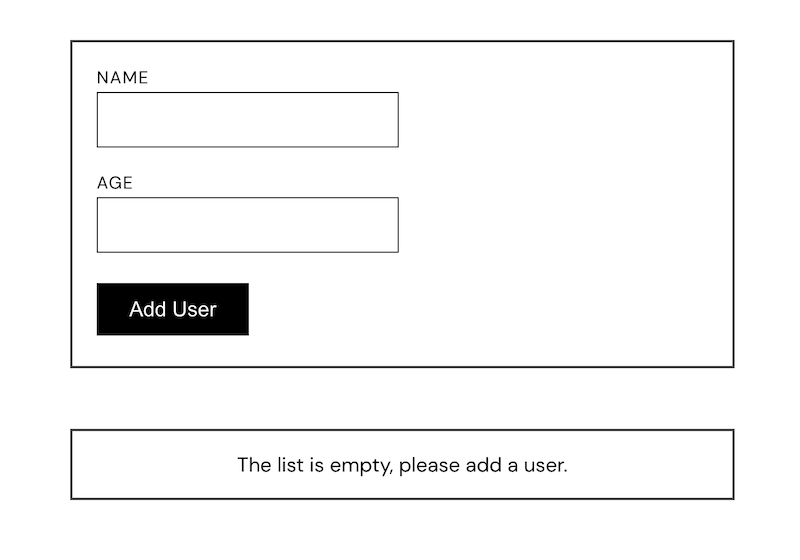
So, first, delete the existing user in USERS, then create a variable noUser that holds the alternative component.
let noUser = <p className={styles.list_empty}>The list is empty, please add a user.</p>
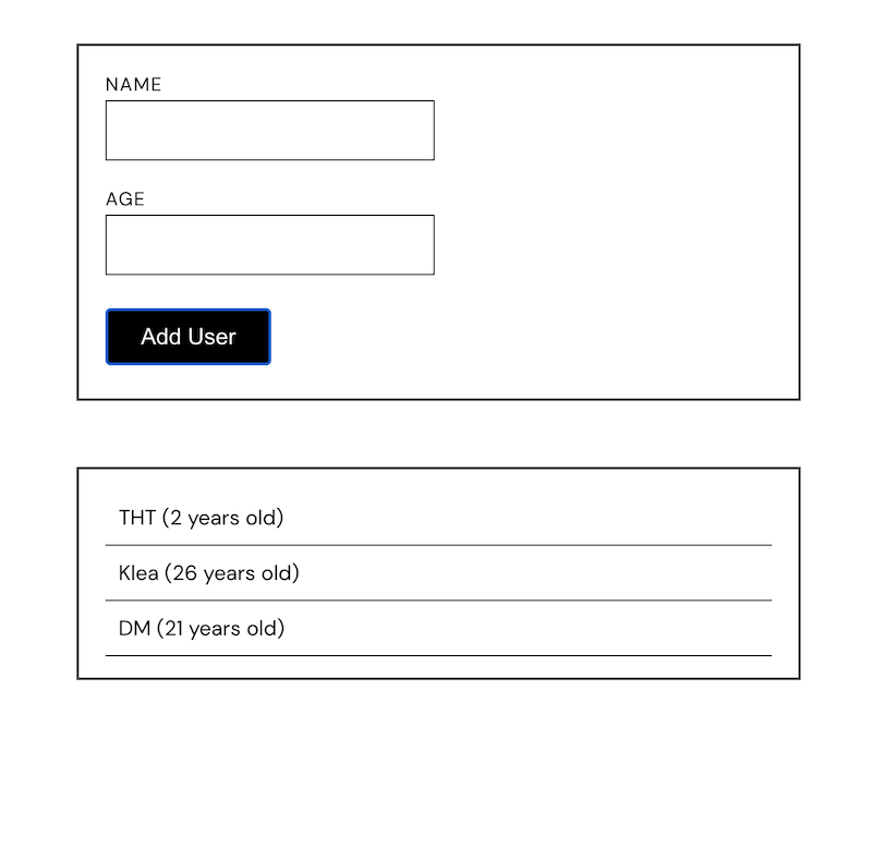
if(users.length > 0) {
noUser = <List users={users} />;
}
If there’s content in users (the stateful variable initialized with USERS), set noUser to the List component.
Inside the Card, we now render noUser. (Admittedly, I should’ve named this something else since “noUser” becomes awfully misleading. But, then, I should’ve also been far more discrete with my age, #mistakes) 😒
Tip 🤓
You can have a different return statement if the entire snippet of the component changes conditionally. Thereturnends a statement so anything after won’t be read, hence, only the snippet of the met conditional renders.
Read: A Really Quick Refresher On JavaScript Function Concepts
Can you believe it? Part five is done – we’re one post away from completing this first React app.
We’ve now introduced a “brain” for our app so it’s now a sophisticated pretty thing that displays information.
The upcoming part six will bring it all to a climax, introducing a couple more advanced features that will make us React-ive 😁
Find the code on GitHub. I’ll see ya on the next one!
Be productive ✌️


