
Table of Contents
Ready to give your React components a stylish makeover?
Today, we’re diving into the exciting world of adding styles to React components and how you can effortlessly elevate the visual appeal of your web applications!
Styling is a crucial aspect of creating engaging user interfaces, and React provides us with various ways to add styles to our components.
From inline styles to CSS modules, and even third-party libraries, we’ll cover it all in this blog post.
As a little recap, thus far we’ve (a) started a React project using create-react-app and (b) built custom JSX components.
This third part of the React project series will walk you through different approaches to add styles to React components and help make web applications look stunning.
With some practical examples and tips along the way, you’ll be well on your way to creating beautiful, visually appealing web applications that leave a lasting impression on your users 🤗
Let’s get the ball rolling with part three: styling React components.
How to add inline styles
To add inline styles in React use the style attribute of built-in HTML elements with a slightly altered syntax.
Inline styles in React look like this: style={{}} .
The style attribute on a React component takes an object with the CSS property acting as the key.
Properties with a dash (ex: “background-color”) need either (1) quotes or (2) camelcase.
Hint 💫
We go over naming conventions in How To Build Dynamic React Components With JSX (Part 2).
Notice the double curly brackets?
The first pair represents the usual React syntax for dynamically rendering JS code in JSX while the second pair represents the JS object literal holding the CSS styles.
Heading onto Class.js, let’s add a width and background color to the Card component.
const Card = (props) => {
  return (
    <div style={{ width: "500px", backgroundColor: "pink" }}>
      {props.children}
    </div>
  );
};

export default Card;
As a further step, you can add conditional logic based on control variables to create dynamic inline styles.
Example: style={{color: !isValid ? "red" : "black"}}
What’s happening? We set the color property to either red or black based on the value of isValid (a boolean that’s either true or false).
How to add dynamic classes
An alternative to inline styles is classes which help us avoid inline clutter.
Use classes to add dynamic styles in React by:
- Making a CSS file for each component file
- Adding CSS rules to the CSS stylesheet
- Importing the CSS file in its corresponding JS component file
- Using the attribute
classNamein place ofclass(since “class” is a reserved word in React)
So let’s head back to Card.js where we added inline style earlier and follow the outlined steps.
- Create Card.css
- Extract the width and background color onto Card.css, removing the inline style
- Import Card.css into Card.js
- Add the
card_wrapperclass to the component
Hey! I changed the background color from pink to yellow to distinguish things!
Tip 🤓
Use a template literal to inject a JS expression and add more than one dynamic class to a component. Ex:className={`my-class ${!isValid ? "new-class" : ""}`}. Here “new-class” is a dynamic class because it’s not hardcoded on the component. Instead, it depends on the value ofisValid.
Something to keep in mind is that importing CSS files doesn’t scope styles to a single component file.
Styles on the CSS files are globally scoped so they spill over to components. That means Card.css styles are accessible in App.js!
In the following example, I change the background color to light blue and assign the card_wrapper class from Card.css to the App component.

As you see, App renders the styles of the card_wrapper class regardless of the fact the stylesheet is that of Card.css.
That’s problematic because classes across various components of the application are bound to overlap 😔
You can’t possibly remember all used classes and this gets even more complicated when multiple people work on the same project.
To address style spilling, my class instructor proposed two options: styled-components and CSS modules.
Styled-Components
Install the styled-components external package to help you build components with attached styles that only affect the working component.
Import its styled object where you want to use the styles. Then use a special syntax to return components that are no longer in JSX.
The special syntax looks like this: obj.method `.. ..`.
obj.methodcomes from the package import`.. ..`backticks are JS syntax for tagged template literals
You insert component styles between the backticks. Some syntactical nuances involve getting rid of selectors and using & (ampersand) as a component placeholder (like in SASS) for pseudo selectors and nested elements.
With styled-components you can actually pass props and access them using a template literal.
I’m not delving deeper into styled-components because I didn’t go with this option. Why? Because there’s a learning curve and I’m not a fan of mixing CSS with what’s already a mix of HTML and JavaScript (aka JSX) 😵💫
I prefer keeping my stylesheets separate to avoid clutter which is what styled-components was causing.
CSS Modules
CSS modules comes configured with start-react-app . All we need to do is make use of it!
Now, go back to the Card.css file we created earlier and rename the file as Card.module.css.
Import styles from the CSS file instead of importing just the file (which is what resulted in un-scoped styles). Here, styles is an object that pulls every class defined in its respective stylesheet as a property.
Tip: The name of the object is up to you! I choose to call it
stylesyet it could be anything you fancy 🙃
CSS modules makes our classes unique and scopes them behind the scenes.
Moving onto the Card component, set className={styles.class} . Remember to use a template literal if stringing on more than one class!
Tip 👇
If the class name has an invalid syntax, like “background-color”, then dostyles[”background-color”]. Using brackets instead of dot notation isn’t React-specific, it’s common in referencing JS object properties.
Since CSS modules requires we import the styles of a specific stylesheet as an object, it ensures they’re not carried over to other components.
If you want to use the styles from Card.module.css in the App component (as done earlier), you’ll need to import the stylesheet in App.js first. Earlier we didn’t import the file yet easily accessed the styles!
Going forwards, I’ll be using CSS modules but feel free to use what floats your boat!
Styling the project components
The rest of the post involves adding styles to all our components.
We’ll be creating module stylesheets, importing the style objects, and applying them to the components.
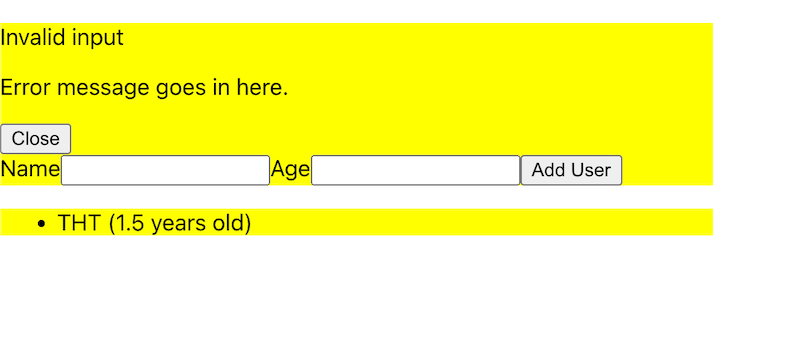
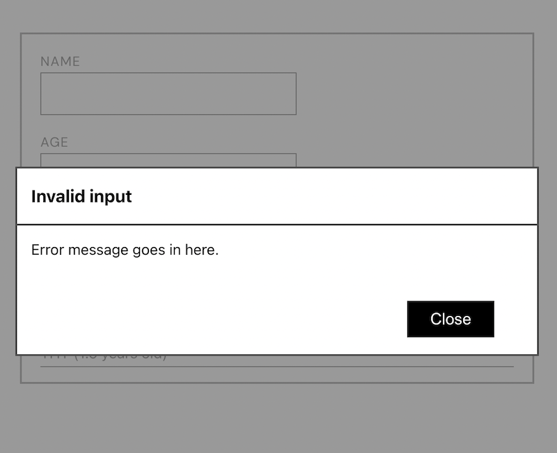
To start off, I’ll set the display of Modal to none so as to tackle the Form and List without initial conflicts.
Since the Modal is a fixed position element, it’s going to get in our way 💁♀️
Then a few notable steps:
Global scoped styles
Import two Google fonts with desired font weights into index.css because we’d like to access them across components.
By importing the styles in index.css, we’re globally scoping and keeping our code DRY (we’d otherwise have to import the Google stylesheet on every component).
index.css

@import url('https://fonts.googleapis.com/css2?family=DM+Sans&family=Poppins:wght@300;500;700&display=swap');
Instance-specific styles
Add or override existing component styles, such as those of reusable components like Card and Button, using a simple conditional.
So, the className of the Button component now looks like this: className={`${styles.btn} ${props.className && props.className`}.
In addition to the CSS styles defined in Button.module.css (that act as defaults to all Button components), we have a shorthand conditional that does two things:
- Checks if there’s a
classNameproperty passed viaprops - Assigns any existing styles set through
propsto the Button component
Tip: You can name the custom styles on the Button component something other than
classNameif it’s too confusing 💁♀️
Go a step further to simplify what we just did by using optional chaining instead. Optional chaining allows us to shorten our conditional like so: props?.className.
Before this, the conditional was necessary to avoid getting errors in case there was no className property passed through props.
However, the optional chaining operator, ?. , makes validation of the property easy and simple by resolving into undefined (instead of an error) should the property not exist.
I found the addition of instance-specific styles to the Button and Card components necessary when styling the Modal component.
It’s good practice to expect instances of customization in styles of reusable components so take that into account!
Note: I’m not going into detail of the CSS styles chosen for the components since we’re not focusing on CSS here. You can find all the styles for reference on GitHub!
We end this post with all our initial styles for this project complete.

They’re by no means set in stone, we might adjust or add additional later on. What matters is that we know how to add styles to a React project 🙃
Next up is part four touching on component communication and event handlers to start moving information across this baby.
Be awesome, bayi ✌️